No. 003lusion.co
Lusion
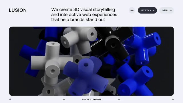
Creative studioAn immersive studio site combining three-dimensional textures with generous space.
Discover light theme sites defined by white, pale colors, and generous space. Look through actual screens to see how product interfaces, photographs, illustrations, and text are organized.
Notice the amount of space, the readability of body text, and the boundary between background and imagery to discover ways of creating a light, airy screen.
| Studies | 44 of 81 (54%) |
|---|---|
| Top use categories | Light × Product & SaaS (16), Light × Creative studio (9), Light × Design tools (8) |
| Often paired with | Typography (24), Minimal (17), Editorial (13) |
| Representative studies | Lusion, Pentagram, Craft |
An immersive studio site combining three-dimensional textures with generous space.
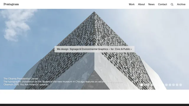
A full-bleed project photo and a sentence-shaped filter let visitors explore the studio’s work by discipline and sector.
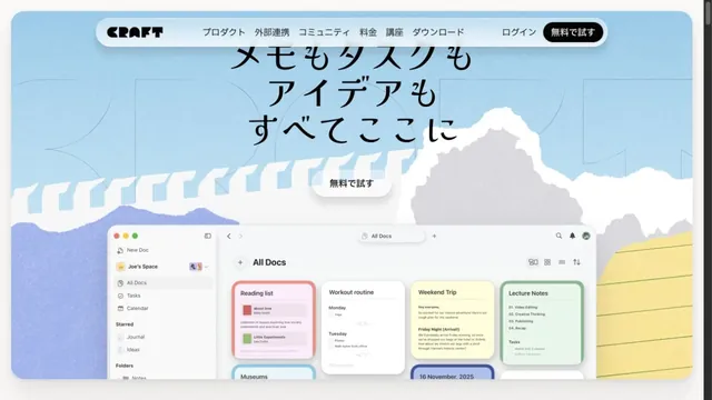
Illustrations of paper and clouds depict a space for writing.
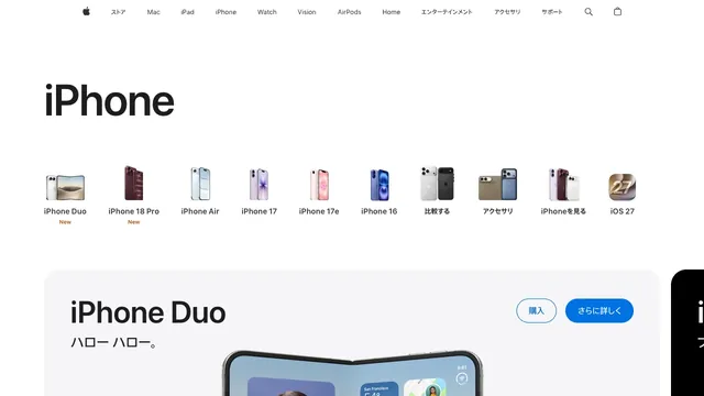
Small product silhouettes introduce the lineup before the page moves into individual products and purchase links.
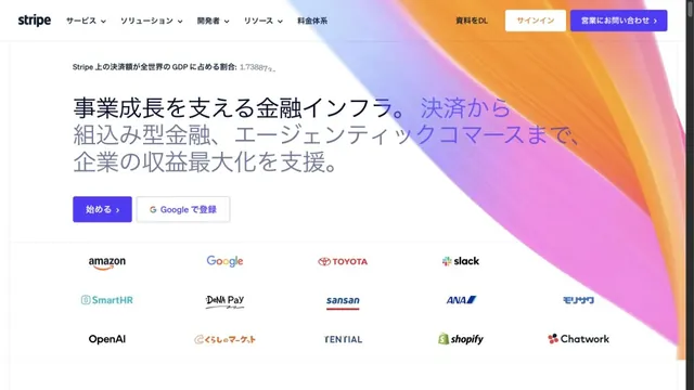
Luminous gradients paired with clear typography.
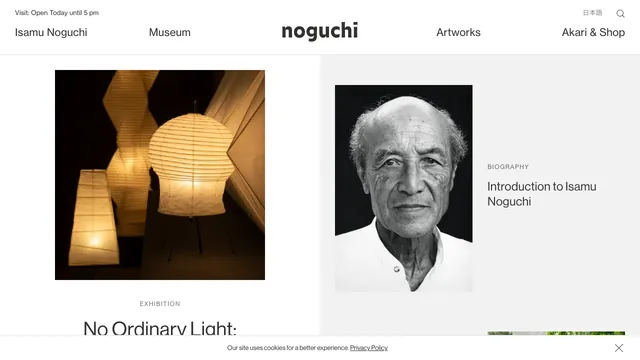
A two-part layout gives the exhibition and biography separate spaces, with white space drawing attention to the photographs.
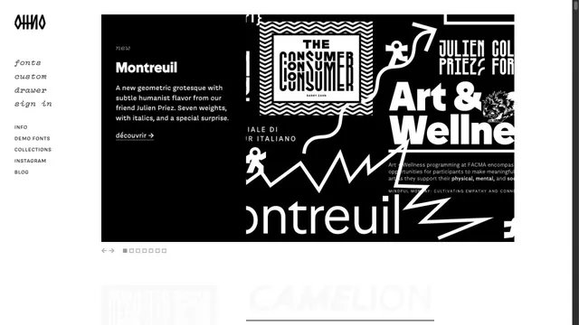
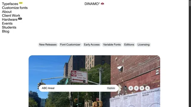
A typeface showcase centered on the shapes of letters.
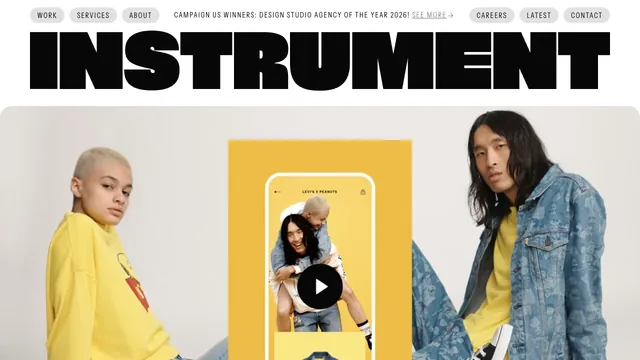
A heavy wordmark and restrained navigation set up a large reel of the studio’s work.
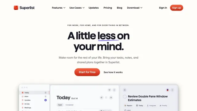
Soft white and a compact red call to action make everyday tasks feel lighter.
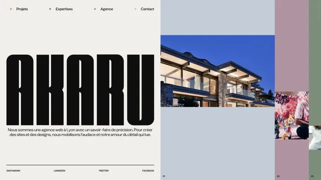
An asymmetric studio entrance built from an extremely tall logo and strips of project photography.
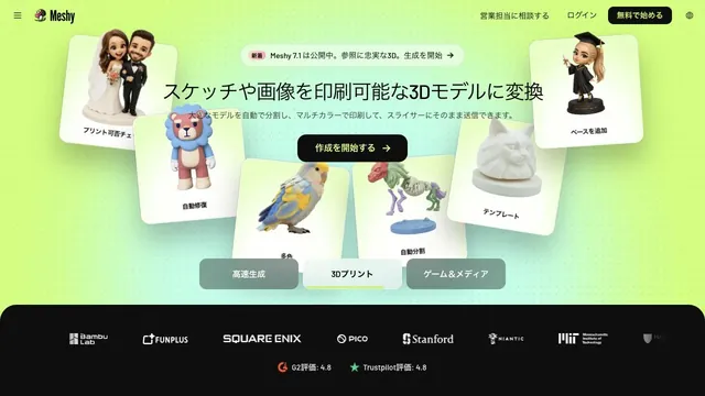
Lime-green light and 3D samples show what can be generated on the very first screen.
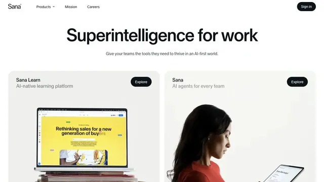
A quiet white product hub presenting two products through a shared card structure.
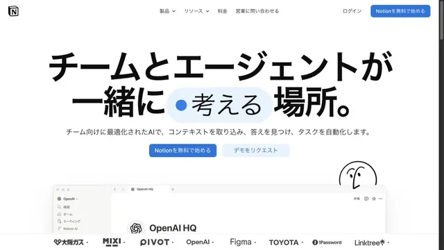
White space and large type explain how to use the workspace.
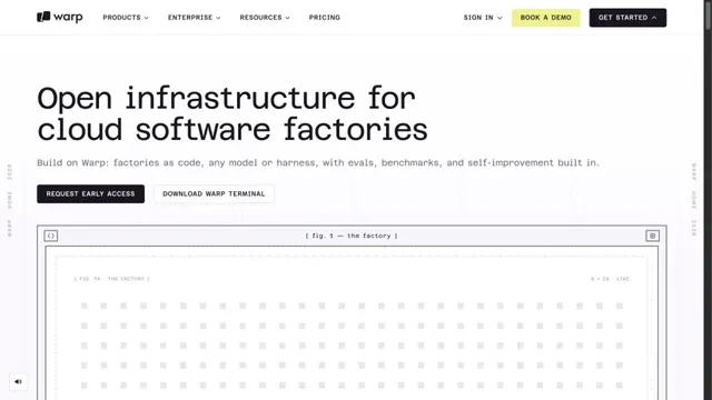
A white grid and large monospaced type create a technical character.
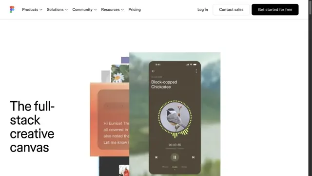
Overlapping examples of creative work convey the range of the tool.
A copy-led brand expression that switches between sans serif and serif within a single paragraph.
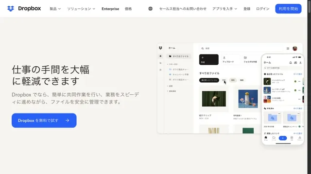
Files and screens float lightly across a soft white background.
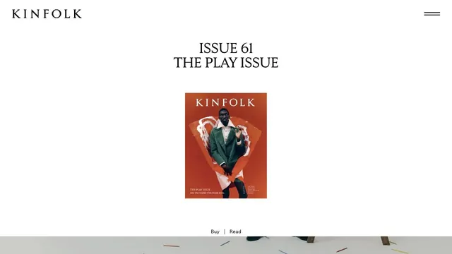
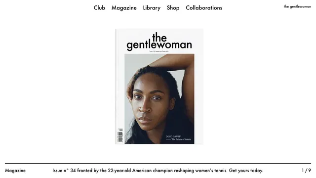
A small magazine cover set within ample space creates the sense of distance of a printed editorial object.
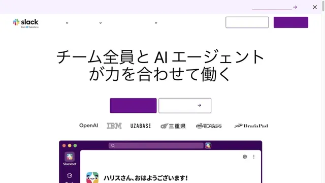
White and purple frame large headings and screens introducing teamwork.
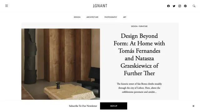
An online magazine that invites readers into an article with photography and a serif headline arranged like a magazine spread.
A magazine entrance centered on the cover portrait and white space, with explanations gathered along the page edges.
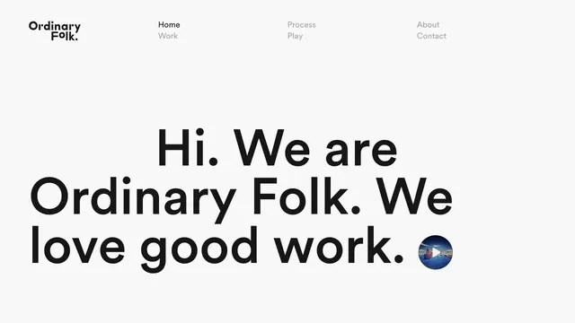
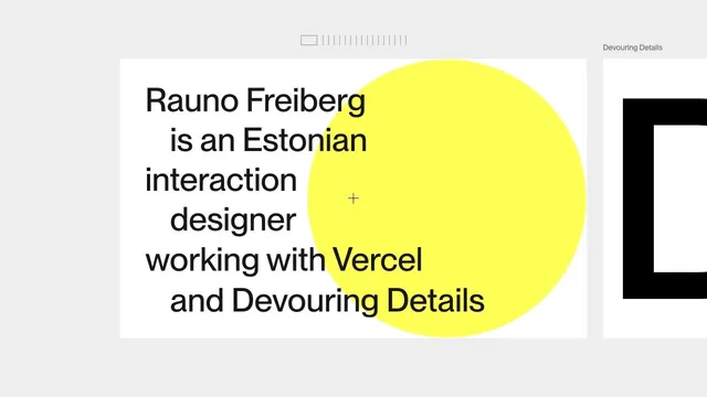
A brief introduction becomes oversized type, making the words themselves the face of the studio.
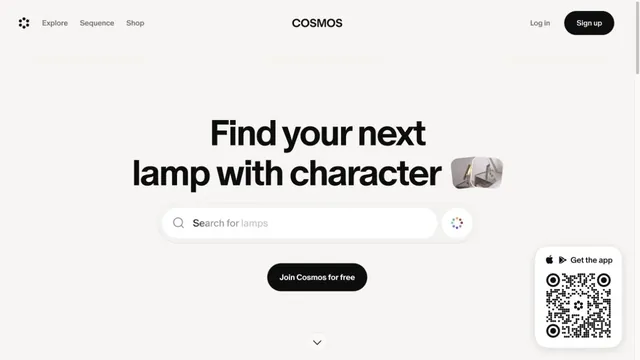
A gateway to visual discovery centered on a large search field and short heading.
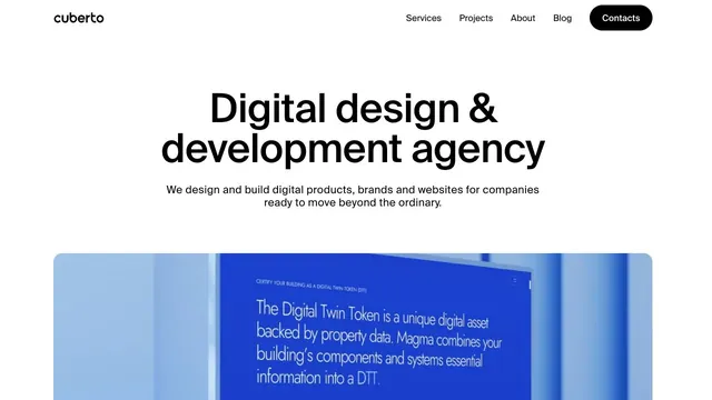
A clear, large headline and generously sized work examples immediately show what the company does.
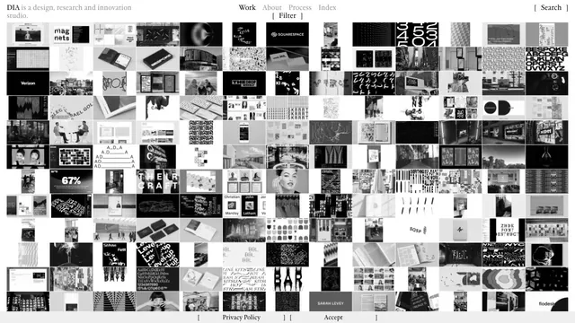
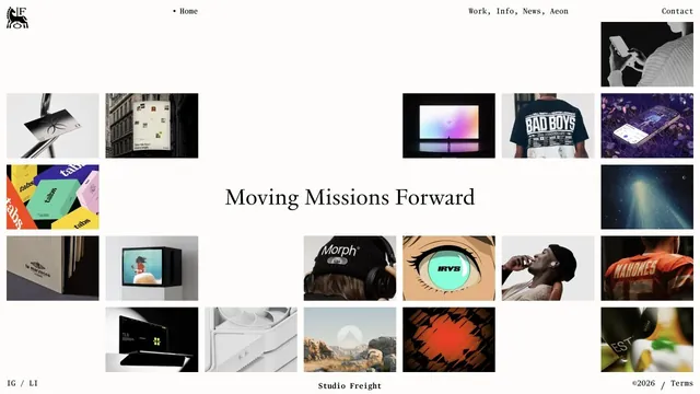
A vast body of work is packed into small tiles, making the index itself the studio's expression.
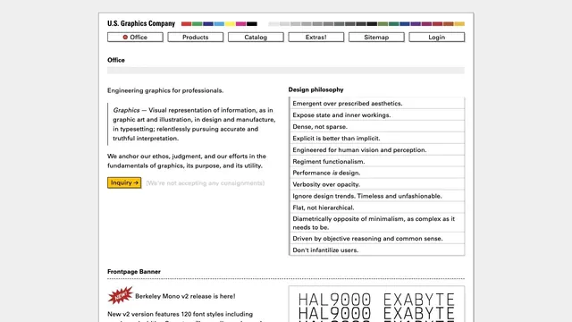
Fine rules and dense text present graphics as a tool.
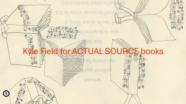
Hand-drawn lines and large red product names make the shop look like a single poster.
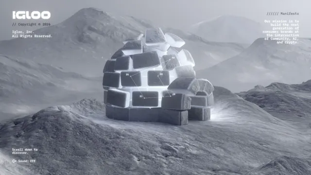
Sculptural ice and a snowy landscape draw visitors into a single world.
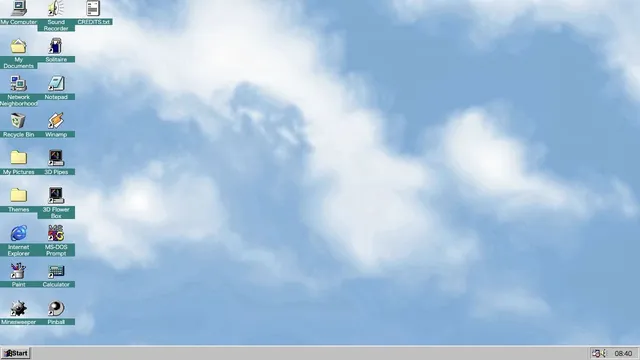
Familiar desktop controls become an entry point for exploration in the browser.
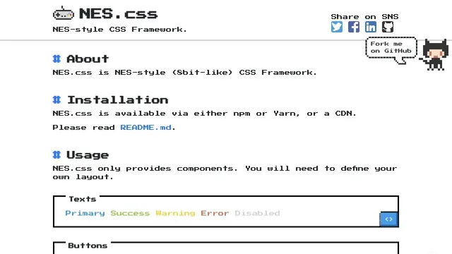
Pixel type and angular components are organized into UI examples you can actually try.
Tiles of work and serif type are combined within generous space.
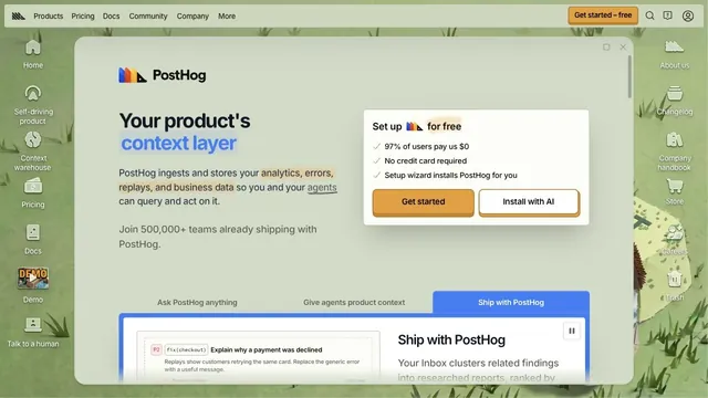
Desktop-style windows and a hand-drawn world turn entering the product into an exploration.
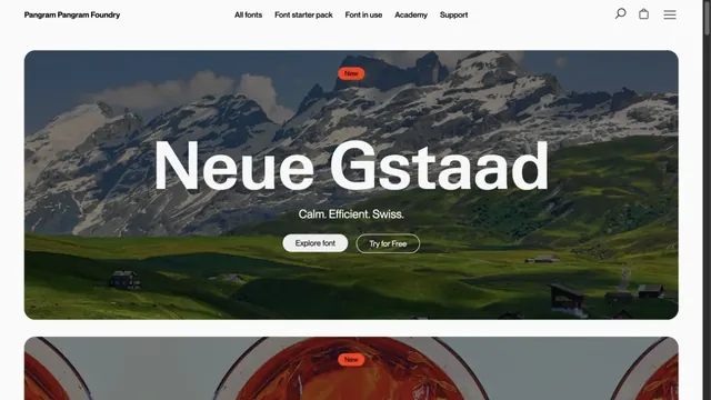
Landscape photography and large type specimens convey the character of letterforms.
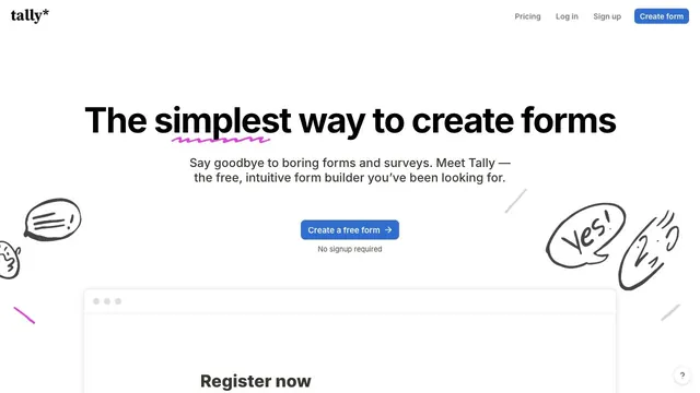
Hand-drawn speech bubbles and white space convey how approachable form creation can be.
A typeface showcase built from lists of text and bold empty space.
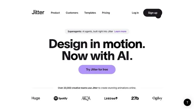
A bold two-line statement and a purple entry point focus attention on where to begin creating motion.
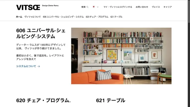
Furniture photography and orderly typography introduce products with a calm tone.
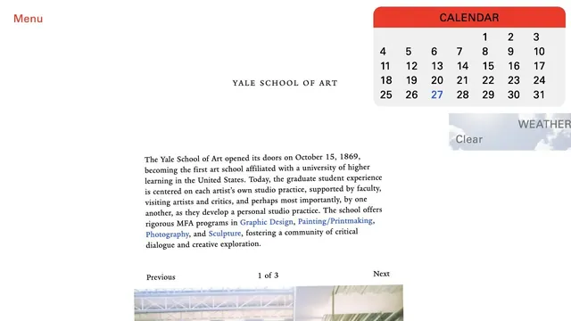
An unconventional school website where unpolished text coexists with components such as a calendar.
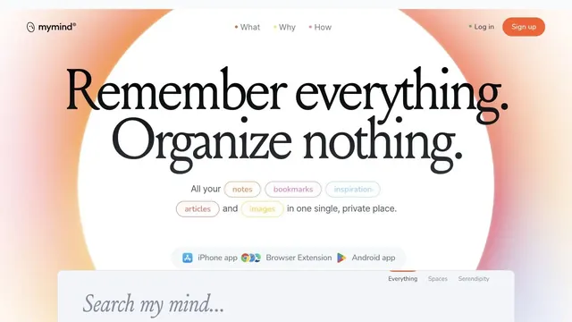
A ring of soft color and large serif type create the impression of a place to entrust your memories.
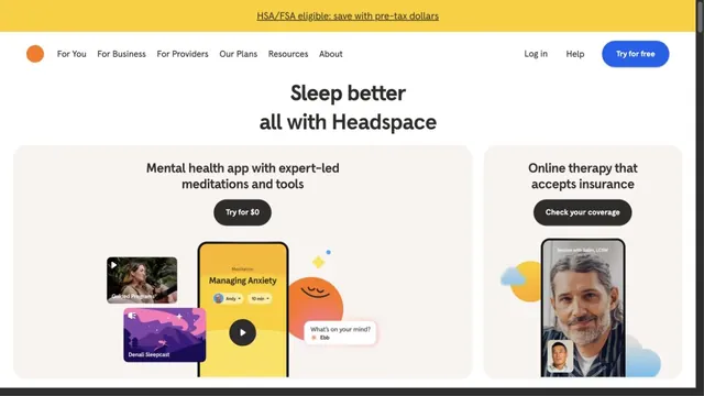
Round characters and soft colors create an approachable entry point.
A CRM entrance that brings a short value proposition and small input fields together within white space.
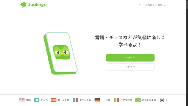
Characters and green buttons lead into learning.
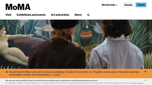
Large artwork photographs and a clear header support both viewing the work and planning a visit.
A portfolio that places an introduction on a large card, leaving room to move sideways into the work.
Pass this list of references on to your team.
Recommending a site is free. We review each one against our editorial approach.
Recommend a websitePublic pages reviewed on 2026.10.27–2026.11.13. Visit each official website for its current appearance and interactions.