No. 063vitsoe.com
Vitsœ
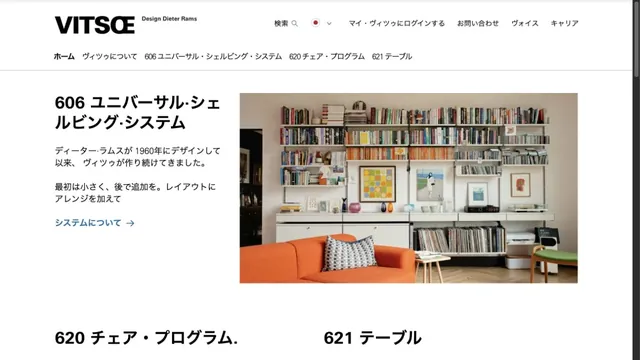
CommerceFurniture photography and orderly typography introduce products with a calm tone.
Small product silhouettes introduce the lineup before the page moves into individual products and purchase links.
Apply this idea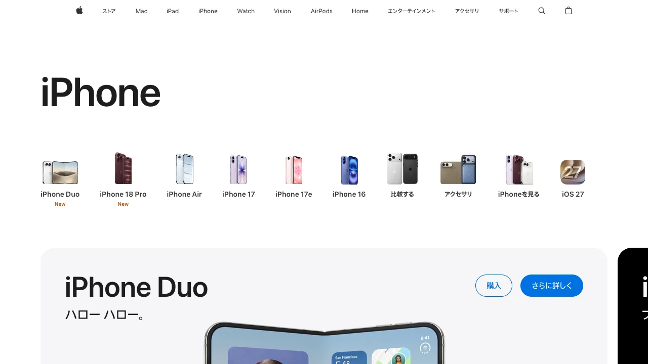
WHAT CAUGHT OUR EYE
Small photos and short model names sit at regular intervals under the category headline, making the lineup easy to scan.
White space between the lineup and the large feature cards separates browsing from reading about one model.
Buy and learn-more actions share one blue, with outline and fill giving them different visual weights.
MAKE IT YOURS
Give shoppers a compact index of comparable products first. Keep the explanation and purchase action together in each product card.
Public pages reviewed and independently presented by Design Quest.
Screens reflect the capture date. Visit the official website for its current appearance and interactions.
From study to design
Turn the study’s observations into a brief. Fill in your project details and share it with your team or an AI assistant.
Design Quest UI example
ComponentsEdit the text directly. Copy your version or save it as a Markdown file.
Pass a detail you like on to your team or friends.
Link to this study with the badge. You can also ask us to correct or remove the listing.

Furniture photography and orderly typography introduce products with a calm tone.
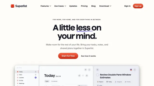
Soft white and a compact red call to action make everyday tasks feel lighter.
A quiet white product hub presenting two products through a shared card structure.