No. 023notion.com
Notion
Product & SaaSWhite space and large type explain how to use the workspace.
A quiet white product hub presenting two products through a shared card structure.
Apply this idea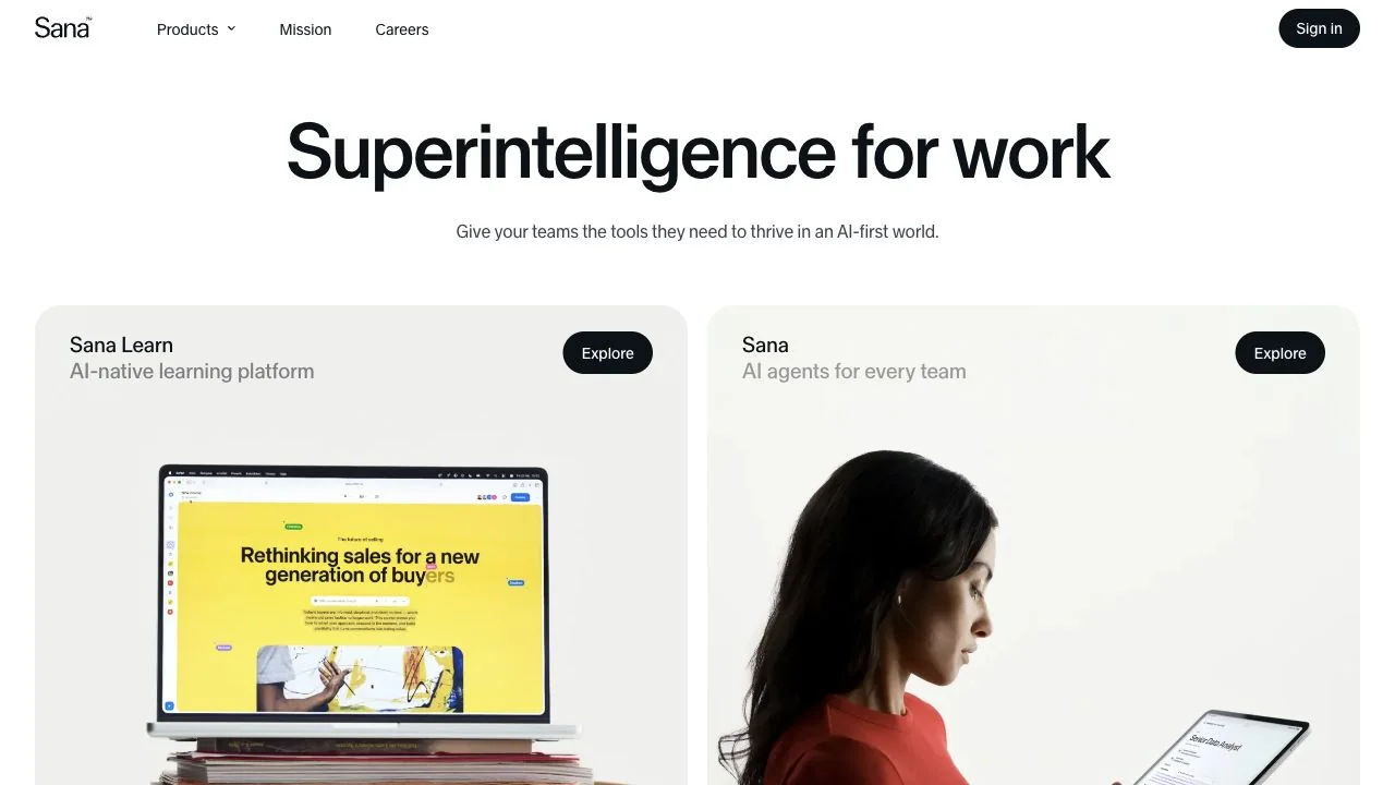
WHAT CAUGHT OUR EYE
A large headline and brief supporting text sit together in the center, leaving detailed product explanations to the two cards below.
Matching pale backgrounds, rounded corners, headline positions, and Explore button positions make the two products easy to compare.
One card uses a device photo and the other a photo of a person using the product, communicating both the functional screen and the context of use.
MAKE IT YOURS
When creating an entry point for several products, establish shared headline and link positions before giving each product a different layout. Showing the differences through image content helps keep the overall brand presentation calm.
Public pages reviewed and independently presented by Design Quest.
Screens reflect the capture date. Visit the official website for its current appearance and interactions.
From study to design
Turn the study’s observations into a brief. Fill in your project details and share it with your team or an AI assistant.
Design Quest UI example
SaaS productEdit the text directly. Copy your version or save it as a Markdown file.
Pass a detail you like on to your team or friends.
Link to this study with the badge. You can also ask us to correct or remove the listing.

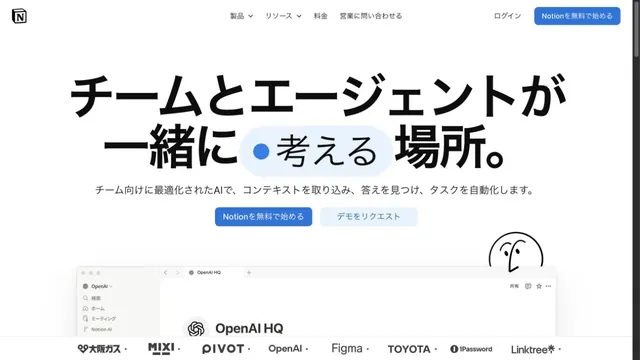
White space and large type explain how to use the workspace.
Files and screens float lightly across a soft white background.
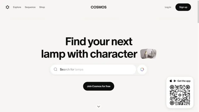
A gateway to visual discovery centered on a large search field and short heading.