No. 046dia.studio
DIA Studio
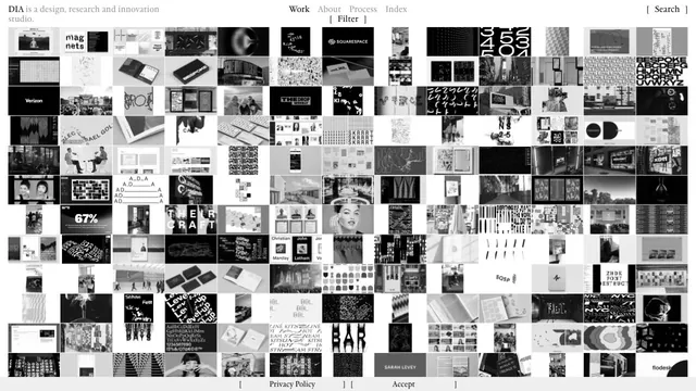
Creative studioA vast body of work is packed into small tiles, making the index itself the studio's expression.
A typeface showcase built from lists of text and bold empty space.
Apply this idea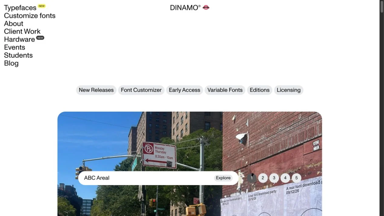
WHAT CAUGHT OUR EYE
A restrained menu at the upper left gives typography the presence expected of a typeface site.
Large empty spaces contrast with example images, bringing unexpected placement to the layout.
Navigation clusters in the upper-left corner while the work receives a broad area, creating a distinctive asymmetry.
MAKE IT YOURS
For sites with many typefaces or works, try gathering the menu into one small area. Pairing it with ample surrounding white space can give the work presence without reducing the information.
Public pages reviewed and independently presented by Design Quest.
Screens reflect the capture date. Visit the official website for its current appearance and interactions.
From study to design
Turn the study’s observations into a brief. Fill in your project details and share it with your team or an AI assistant.
Design Quest UI example
Gradient galleryEdit the text directly. Copy your version or save it as a Markdown file.
Pass a detail you like on to your team or friends.
Link to this study with the badge. You can also ask us to correct or remove the listing.

A vast body of work is packed into small tiles, making the index itself the studio's expression.
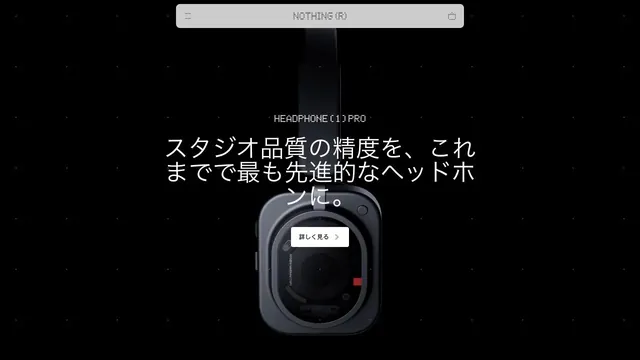
A product site that places products and brief copy in black space, using emptiness to create presence.
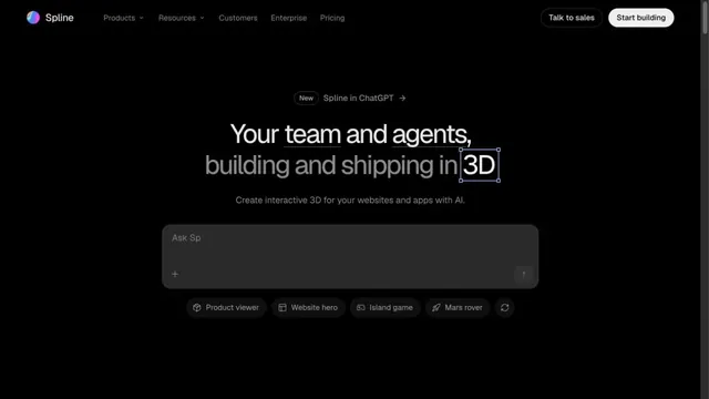
An input field in a black space shows how to start creating in 3D.