No. 008noguchi.org
The Noguchi Museum
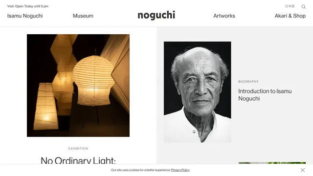
Culture & mediaA two-part layout gives the exhibition and biography separate spaces, with white space drawing attention to the photographs.
A magazine entrance centered on the cover portrait and white space, with explanations gathered along the page edges.
Apply this idea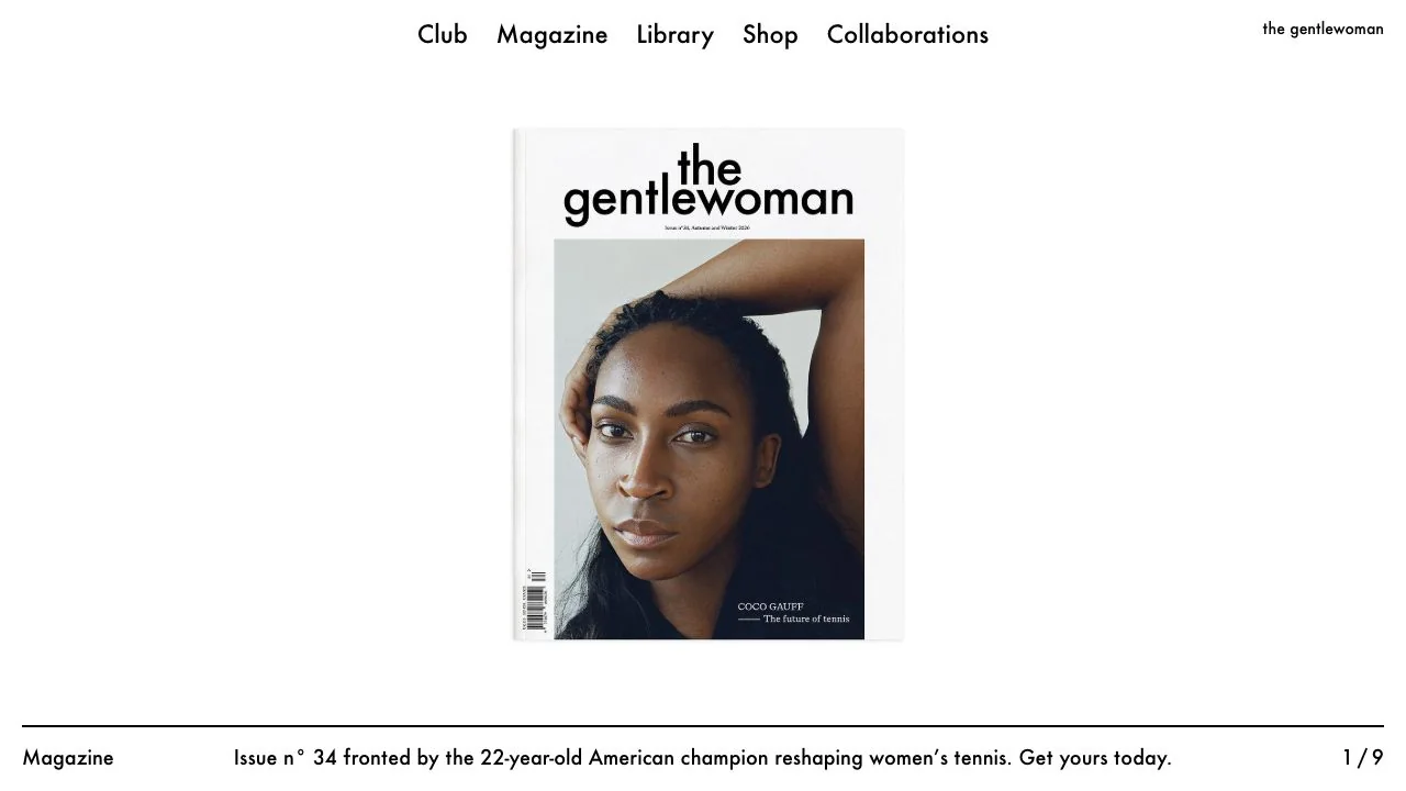
WHAT CAUGHT OUR EYE
A relatively small cover in the center of a white screen focuses attention on the portrait's gaze and colors.
The menu at the top and explanation at the bottom are kept apart, preserving uninterrupted space around the cover.
A fine rule, category name, description, and page number align along the bottom, treated like a gallery caption.
MAKE IT YOURS
To present a visual quietly, one option is to give its explanation an independent position at the edge of the screen instead of packing it directly underneath. Aligning even small category and sequence details to the same baseline makes the space feel intentional.
Public pages reviewed and independently presented by Design Quest.
Screens reflect the capture date. Visit the official website for its current appearance and interactions.
From study to design
Turn the study’s observations into a brief. Fill in your project details and share it with your team or an AI assistant.
Design Quest UI example
Gradient galleryEdit the text directly. Copy your version or save it as a Markdown file.
Pass a detail you like on to your team or friends.
Link to this study with the badge. You can also ask us to correct or remove the listing.

A two-part layout gives the exhibition and biography separate spaces, with white space drawing attention to the photographs.
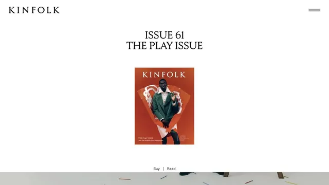
A small magazine cover set within ample space creates the sense of distance of a printed editorial object.
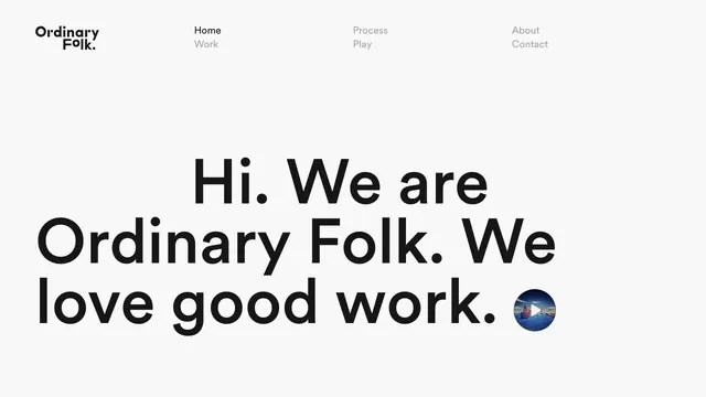
A brief introduction becomes oversized type, making the words themselves the face of the studio.