No. 061abcdinamo.com
Dinamo
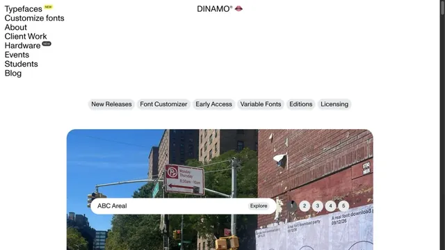
Design toolsA typeface showcase built from lists of text and bold empty space.
A vast body of work is packed into small tiles, making the index itself the studio's expression.
Apply this idea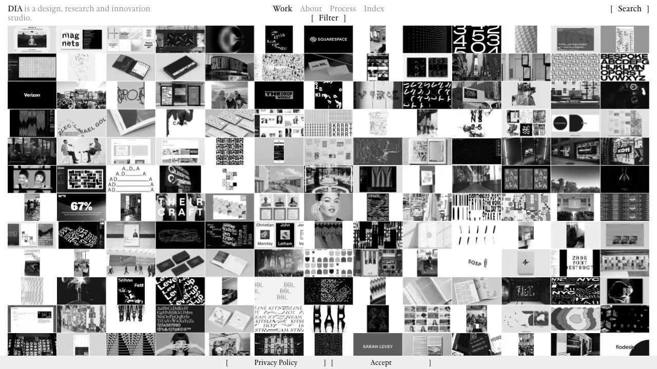
WHAT CAUGHT OUR EYE
Densely arranged small tiles of mostly black-and-white work show both the volume of projects and the range of expression at once.
Instead of generous spacing, consistent tile dimensions and arrangement rules hold the screen together.
Small Filter and Search labels at the top support both visual browsing and looking for something specific.
MAKE IT YOURS
An archive with many projects can open with a dense overview as an alternative to a list with individual descriptions. The higher the density, the more important it becomes to keep filters and search in positions where they are always easy to find.
Public pages reviewed and independently presented by Design Quest.
Screens reflect the capture date. Visit the official website for its current appearance and interactions.
From study to design
Turn the study’s observations into a brief. Fill in your project details and share it with your team or an AI assistant.
Design Quest UI example
Creative agencyEdit the text directly. Copy your version or save it as a Markdown file.
Pass a detail you like on to your team or friends.
Link to this study with the badge. You can also ask us to correct or remove the listing.

A typeface showcase built from lists of text and bold empty space.
Hand-drawn lines and large red product names make the shop look like a single poster.
A typeface showcase centered on the shapes of letters.