No. 036kinfolk.com
Kinfolk
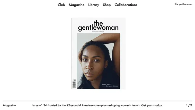
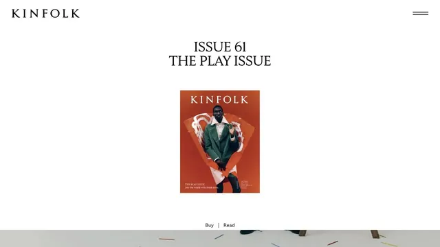
Culture & mediaA small magazine cover set within ample space creates the sense of distance of a printed editorial object.
A two-part layout gives the exhibition and biography separate spaces, with white space drawing attention to the photographs.
Apply this idea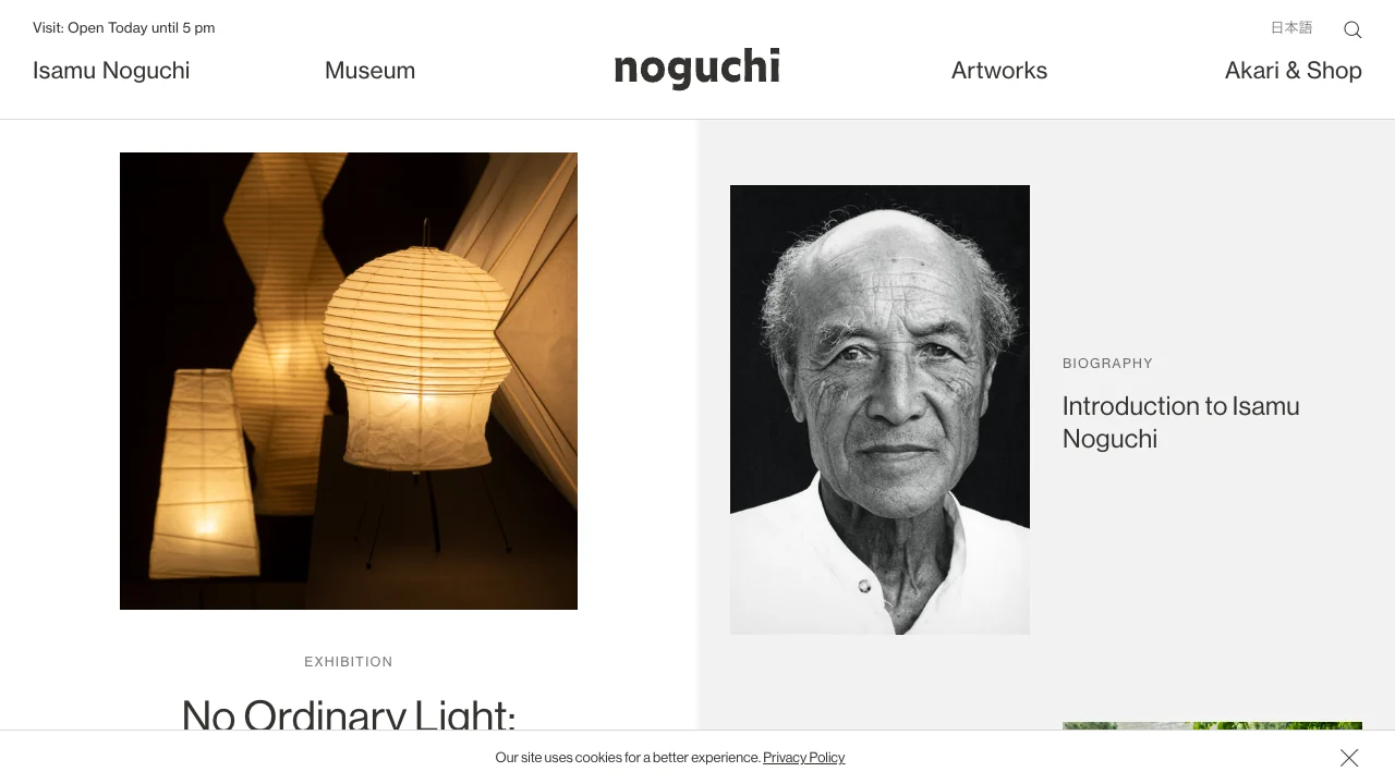
WHAT CAUGHT OUR EYE
White and pale gray distinguish exhibition and biography without extra outlines.
A warm photograph of lighting and a monochrome portrait distinguish the work from the person.
Small type labels before the headings tell readers what each image-led entry opens.
MAKE IT YOURS
For a photo-led index, group entries with tone and spacing. Short type labels help readers distinguish work from visitor information.
Public pages reviewed and independently presented by Design Quest.
Screens reflect the capture date. Visit the official website for its current appearance and interactions.
From study to design
Turn the study’s observations into a brief. Fill in your project details and share it with your team or an AI assistant.
Design Quest UI example
Gradient galleryEdit the text directly. Copy your version or save it as a Markdown file.
Pass a detail you like on to your team or friends.
Link to this study with the badge. You can also ask us to correct or remove the listing.

A small magazine cover set within ample space creates the sense of distance of a printed editorial object.
A magazine entrance centered on the cover portrait and white space, with explanations gathered along the page edges.
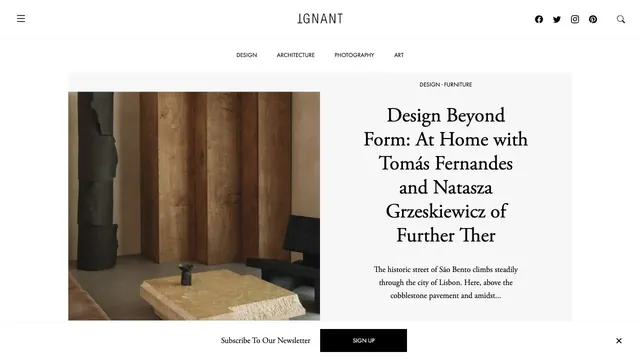
An online magazine that invites readers into an article with photography and a serif headline arranged like a magazine spread.