No. 001linear.app

Linear
Product & SaaSA near-black background and large headings convey the shape of the product.
Explore sites whose impression is defined by letterforms, type size, and typesetting. From large headlines to typeface showcases, these examples use words as visual expression.
Observe the size contrast between headings and body text, line length, letter spacing, and overlaps with photographs to learn how type alone can create rhythm.
| Studies | 40 of 81 (49%) |
|---|---|
| Top use categories | Typography × Product & SaaS (15), Typography × Design tools (12), Typography × Creative studio (6) |
| Often paired with | Light (24), Dark (13), Editorial (13) |
| Representative studies | Linear, Stripe, OH no Type Company |
A near-black background and large headings convey the shape of the product.
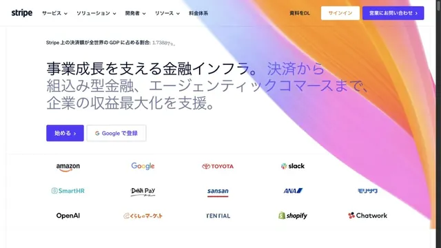
Luminous gradients paired with clear typography.
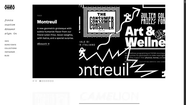
A typeface showcase centered on the shapes of letters.
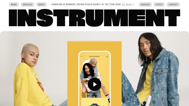
A heavy wordmark and restrained navigation set up a large reel of the studio’s work.
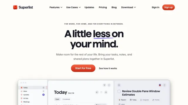
Soft white and a compact red call to action make everyday tasks feel lighter.
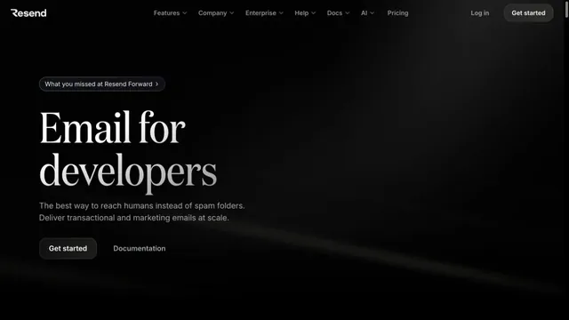
An email API site with serif headings floating in a dark space.
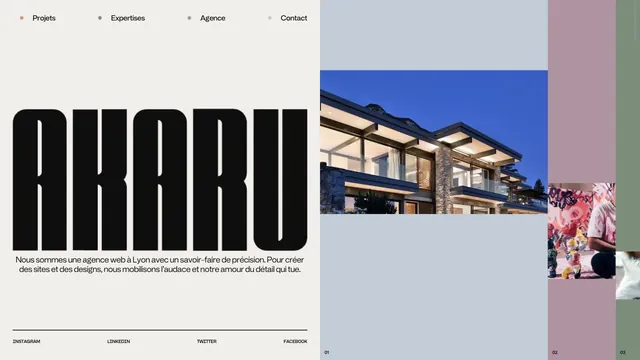
An asymmetric studio entrance built from an extremely tall logo and strips of project photography.
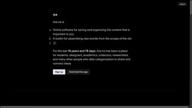
Black-and-white contrast makes a short message stand out.
White space and large type explain how to use the workspace.
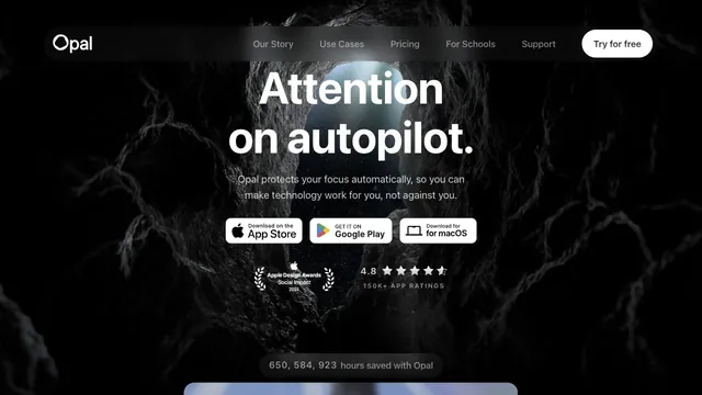
A white headline and download path stand out amid a dark, organic texture.
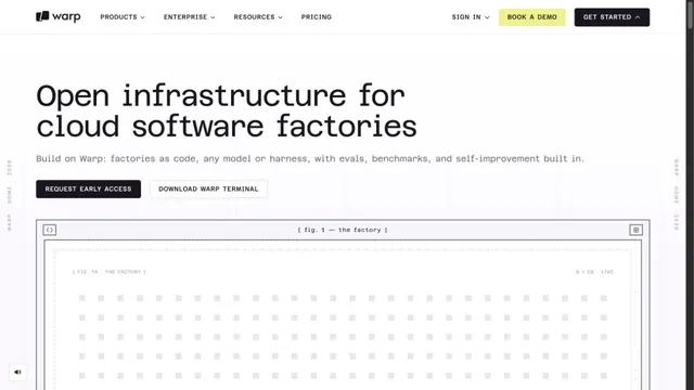
A white grid and large monospaced type create a technical character.
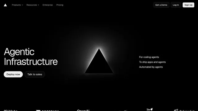
An infrastructure product entrance that anchors the eye with just a black triangle and white text.
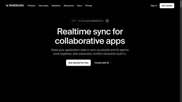
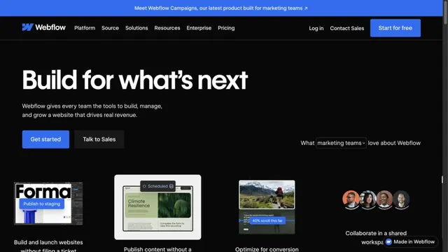
Blue accents on a black page present the product alongside its uses.
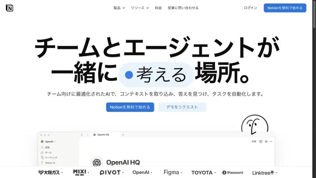
A copy-led brand expression that switches between sans serif and serif within a single paragraph.
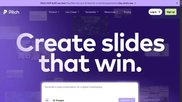
A presentation tool with large type standing out against a purple gradient.
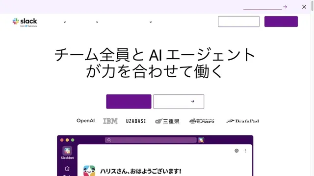
White and purple frame large headings and screens introducing teamwork.
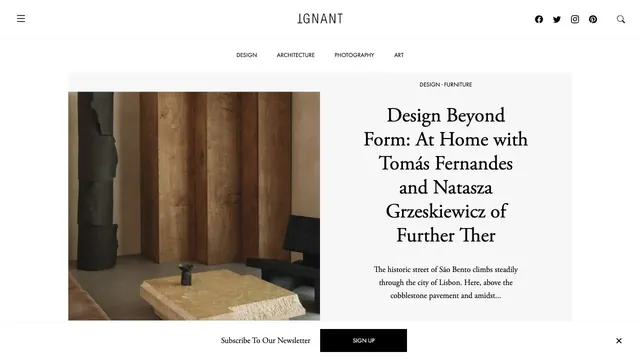
An online magazine that invites readers into an article with photography and a serif headline arranged like a magazine spread.
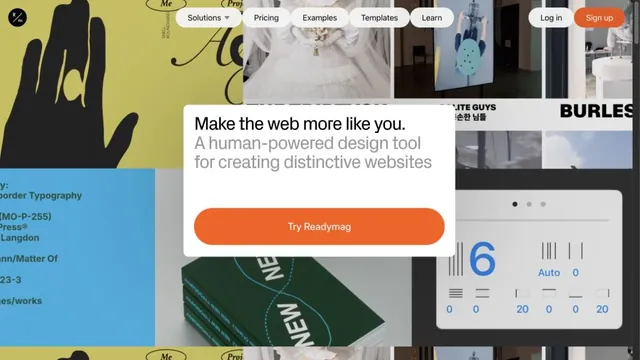
A collage of text, photographs, and examples invites free-form website creation.
A quiet collection service site focused on short text and space.
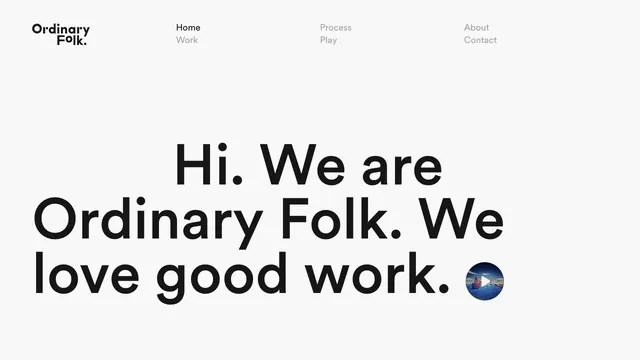
A brief introduction becomes oversized type, making the words themselves the face of the studio.
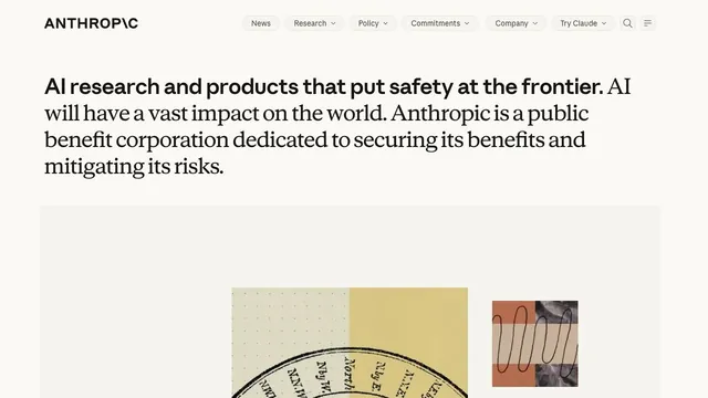
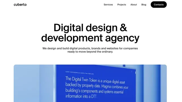
A clear, large headline and generously sized work examples immediately show what the company does.
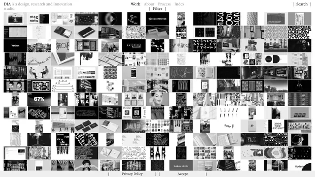
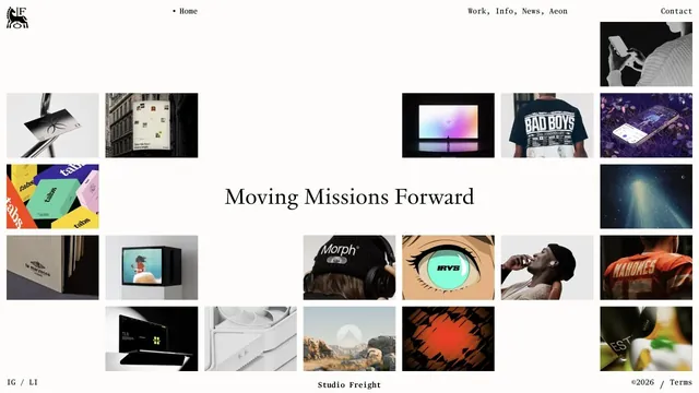
A vast body of work is packed into small tiles, making the index itself the studio's expression.
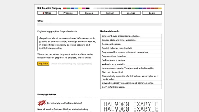
Fine rules and dense text present graphics as a tool.
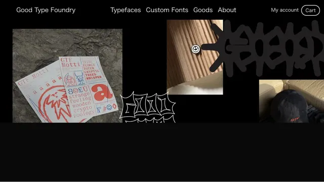
Typefaces, merchandise, and photography share a black surface, showing the material quality of letterforms.
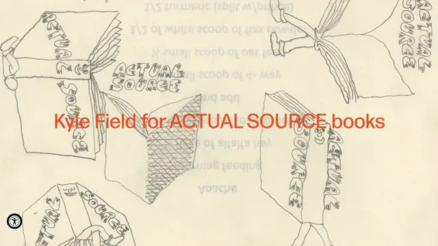
Hand-drawn lines and large red product names make the shop look like a single poster.
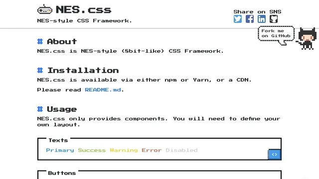
Pixel type and angular components are organized into UI examples you can actually try.
Tiles of work and serif type are combined within generous space.
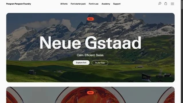
Landscape photography and large type specimens convey the character of letterforms.
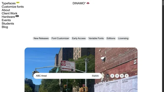
A typeface showcase built from lists of text and bold empty space.
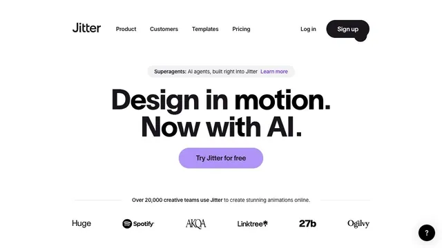
A bold two-line statement and a purple entry point focus attention on where to begin creating motion.
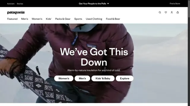
An outdoor brand's entry point, with short words layered over a large photograph.
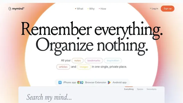
A ring of soft color and large serif type create the impression of a place to entrust your memories.
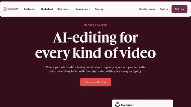
Deep wine tones and white serif type give a video editing tool an editorial voice.
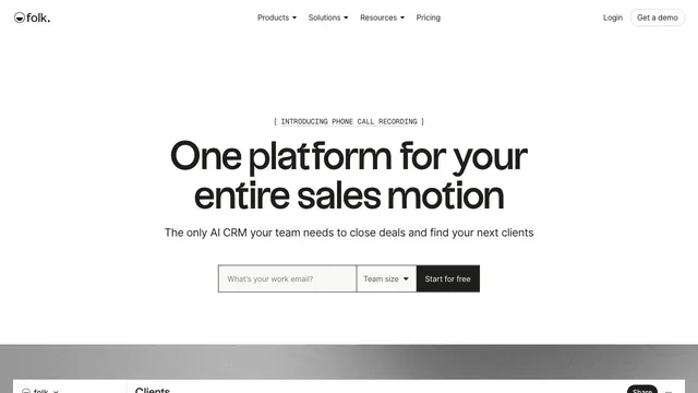
A CRM entrance that brings a short value proposition and small input fields together within white space.
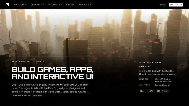
A large 3D demo and technical information share one screen, connecting visual expression with implementation.
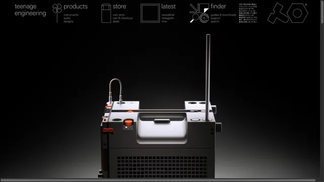
Product photographs are paired with navigation resembling technical drawings.
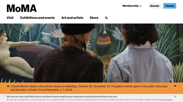
Large artwork photographs and a clear header support both viewing the work and planning a visit.
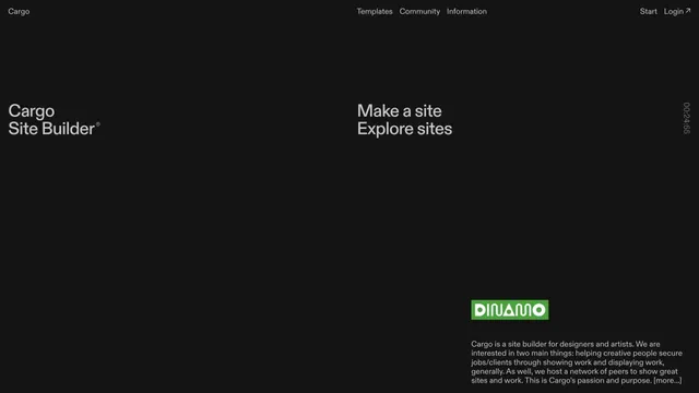
A site builder's entry point defined by expansive empty space and scattered text.
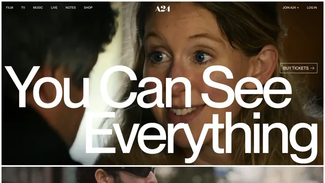
A large film image and screen-spanning type turn a film announcement into a single visual.
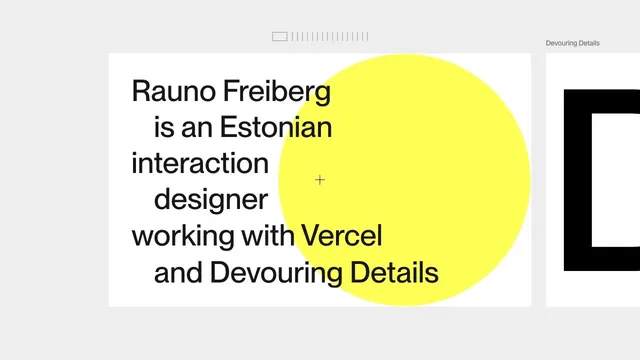
A portfolio that places an introduction on a large card, leaving room to move sideways into the work.
Pass this list of references on to your team.
Recommending a site is free. We review each one against our editorial approach.
Recommend a websitePublic pages reviewed on 2026.10.27–2026.11.13. Visit each official website for its current appearance and interactions.