No. 048usgraphics.com
U.S. Graphics Company
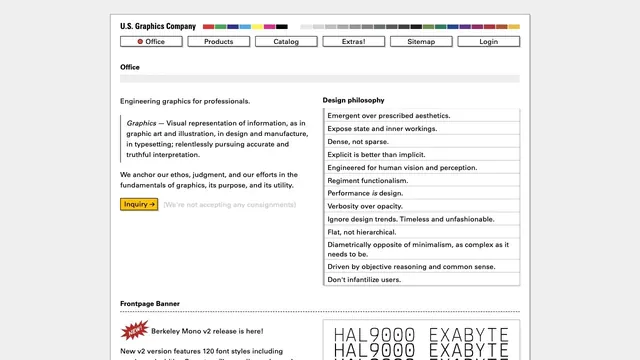
Design toolsFine rules and dense text present graphics as a tool.
Pixel type and angular components are organized into UI examples you can actually try.
Apply this idea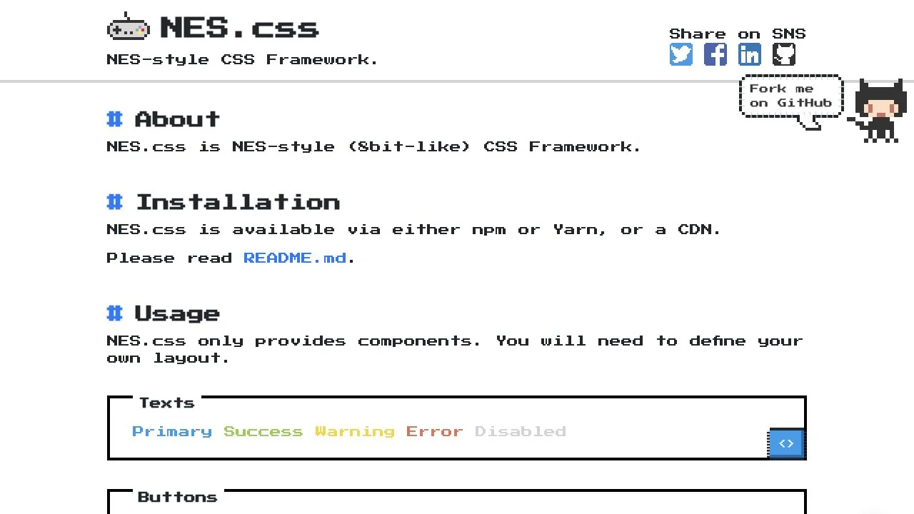
WHAT CAUGHT OUR EYE
Consistent pixelated outlines across the logo, body text, and buttons unify the resolution of the details into one visual expression.
A white background, blue links, and bold rectangular borders clearly indicate the positions of headings and controls.
Working component examples sit immediately below their explanations, letting visitors check appearance and usage together.
MAKE IT YOURS
A retro component collection needs consistency not only in its distinctive typeface but also in the rendering units of borders, shadows, and icons. Placing working interaction examples beside explanations combines a coherent visual world with easy reuse.
Public pages reviewed and independently presented by Design Quest.
Screens reflect the capture date. Visit the official website for its current appearance and interactions.
From study to design
Turn the study’s observations into a brief. Fill in your project details and share it with your team or an AI assistant.
Design Quest UI example
ComponentsEdit the text directly. Copy your version or save it as a Markdown file.
Pass a detail you like on to your team or friends.
Link to this study with the badge. You can also ask us to correct or remove the listing.

Fine rules and dense text present graphics as a tool.
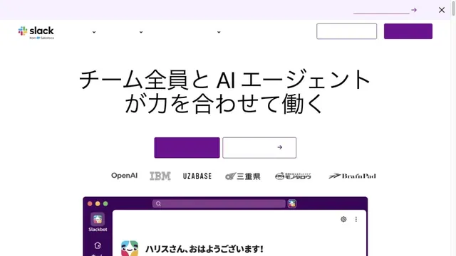
White and purple frame large headings and screens introducing teamwork.
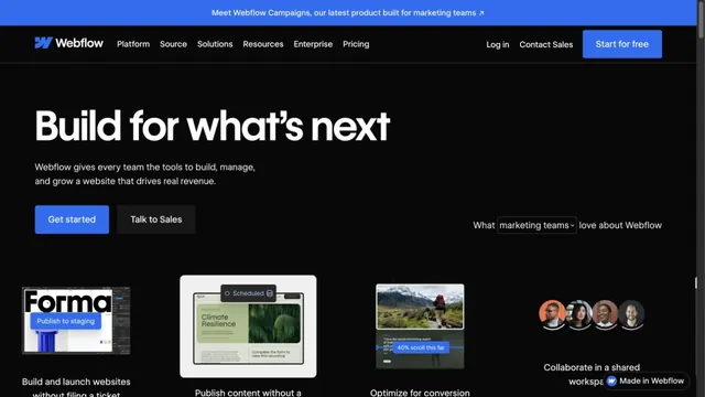
Blue accents on a black page present the product alongside its uses.