No. 061abcdinamo.com
Dinamo
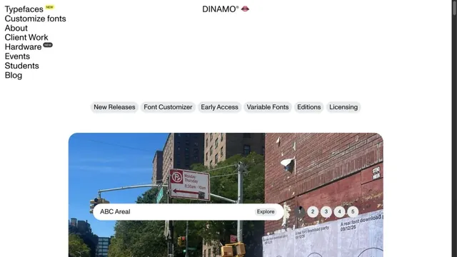
Design toolsA typeface showcase built from lists of text and bold empty space.
Hand-drawn lines and large red product names make the shop look like a single poster.
Apply this idea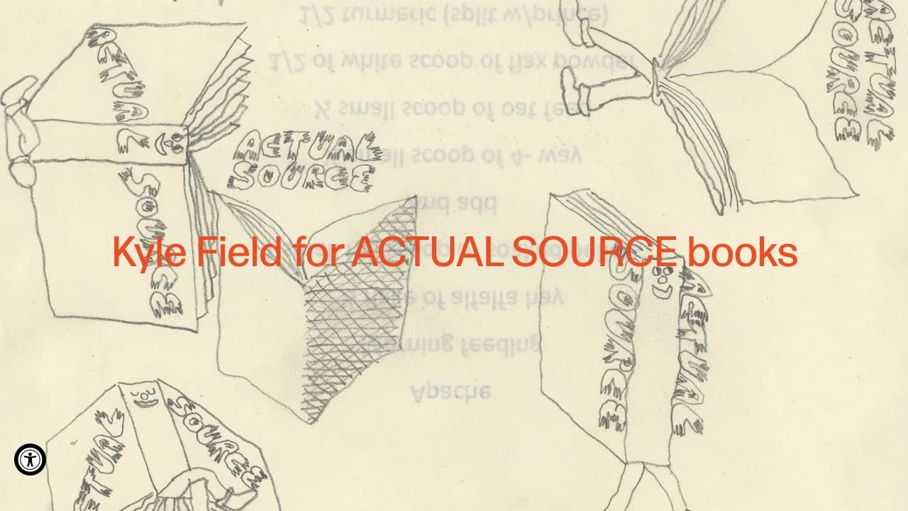
WHAT CAUGHT OUR EYE
Line drawings spread across a paper-like background, turning the product announcement itself into the visual for the entire hero.
Large red text overlays the line drawings, layering information differently from a conventional shop built around photo cards.
Short uppercase labels identify the shop categories below, combining expressive freedom with clear entry points for finding products.
MAKE IT YOURS
For collaborations or limited releases, the introduction before the product list can be composed as a single poster. The freer the announcement's expression becomes, the more useful it is to keep category and shopping controls consistent in name and position.
Public pages reviewed and independently presented by Design Quest.
Screens reflect the capture date. Visit the official website for its current appearance and interactions.
From study to design
Turn the study’s observations into a brief. Fill in your project details and share it with your team or an AI assistant.
Design Quest UI example
ComponentsEdit the text directly. Copy your version or save it as a Markdown file.
Pass a detail you like on to your team or friends.
Link to this study with the badge. You can also ask us to correct or remove the listing.

A typeface showcase built from lists of text and bold empty space.
Round characters and soft colors create an approachable entry point.
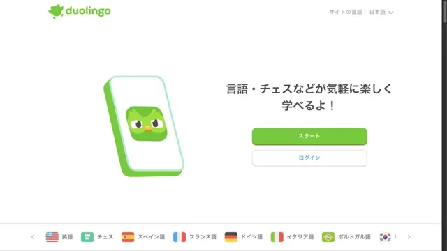
Characters and green buttons lead into learning.