No. 056nostalgic-css.github.io
NES.css
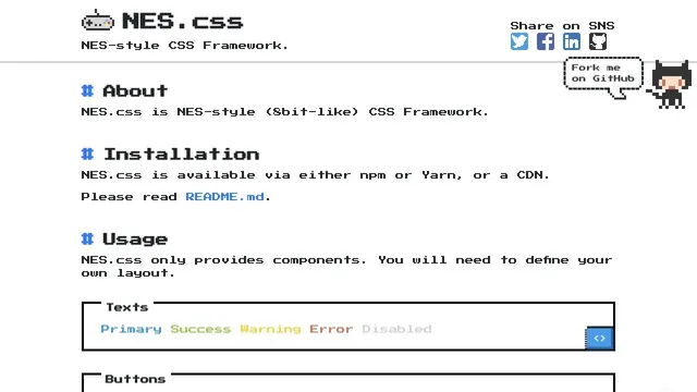
Design toolsPixel type and angular components are organized into UI examples you can actually try.
Fine rules and dense text present graphics as a tool.
Apply this idea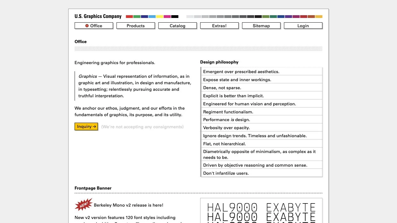
WHAT CAUGHT OUR EYE
Borders, rules, small headings, and monospaced type combine to create the information density of technical documentation.
Color swatches and small buttons form a regular arrangement at the top, giving even decoration a role in categorization and navigation.
Explanations and design principles sit in left and right columns, with rules showing their relationship even when the text lengths differ.
MAKE IT YOURS
For specialist materials, rules and consistent columns can improve readability alongside added space. Even when using small type, distinguish headings, body text, and actions through different forms so information relationships survive zooming.
Public pages reviewed and independently presented by Design Quest.
Screens reflect the capture date. Visit the official website for its current appearance and interactions.
From study to design
Turn the study’s observations into a brief. Fill in your project details and share it with your team or an AI assistant.
Design Quest UI example
ComponentsEdit the text directly. Copy your version or save it as a Markdown file.
Pass a detail you like on to your team or friends.
Link to this study with the badge. You can also ask us to correct or remove the listing.

Pixel type and angular components are organized into UI examples you can actually try.
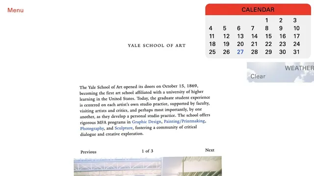
An unconventional school website where unpolished text coexists with components such as a calendar.
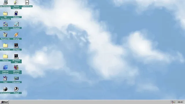
Familiar desktop controls become an entry point for exploration in the browser.