No. 014superlist.com
Superlist
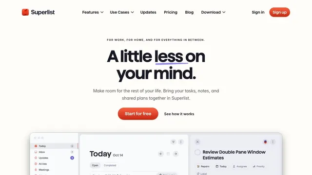
Product & SaaSSoft white and a compact red call to action make everyday tasks feel lighter.
A portfolio that places an introduction on a large card, leaving room to move sideways into the work.
Apply this idea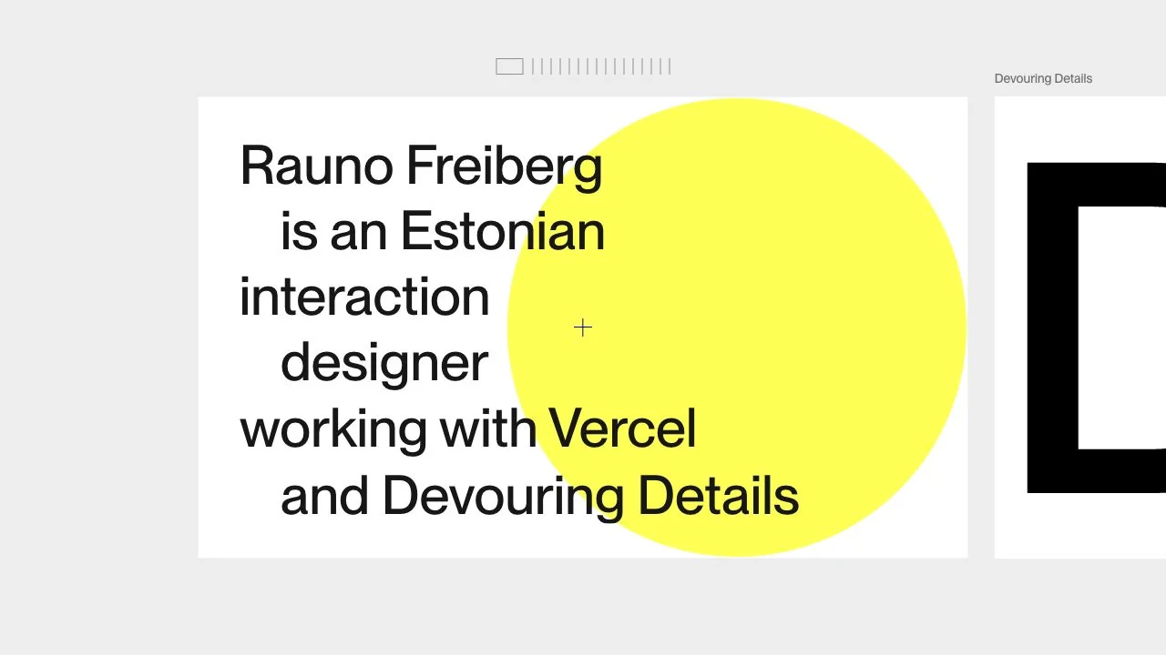
WHAT CAUGHT OUR EYE
A short introduction in large, left-aligned type becomes a poster of its own, distinct from a bulleted career history.
A vivid yellow circle behind the copy creates a memorable overlap with very few elements.
Part of the next project card peeks in from the right, visually indicating that content continues beyond the current screen.
MAKE IT YOURS
In a personal portfolio, the introduction can be edited as a card just like a project. Pairing a short text with one symbolic shape and showing a glimpse of the next piece creates a natural transition from explanation to exploration.
Public pages reviewed and independently presented by Design Quest.
Screens reflect the capture date. Visit the official website for its current appearance and interactions.
From study to design
Turn the study’s observations into a brief. Fill in your project details and share it with your team or an AI assistant.
Design Quest UI example
Creative agencyEdit the text directly. Copy your version or save it as a Markdown file.
Pass a detail you like on to your team or friends.
Link to this study with the badge. You can also ask us to correct or remove the listing.

Soft white and a compact red call to action make everyday tasks feel lighter.
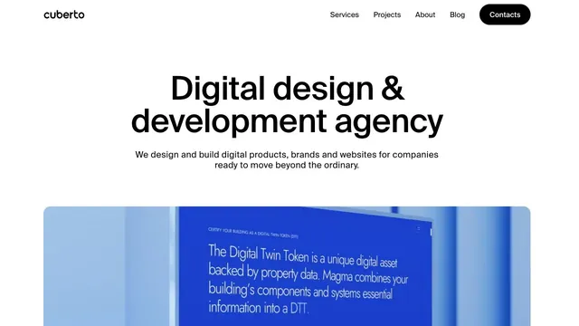
A clear, large headline and generously sized work examples immediately show what the company does.
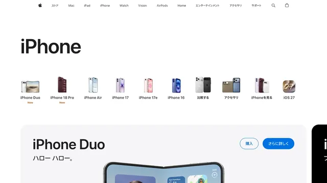
Small product silhouettes introduce the lineup before the page moves into individual products and purchase links.