No. 023notion.com
Notion
Product & SaaSWhite space and large type explain how to use the workspace.
Soft white and a compact red call to action make everyday tasks feel lighter.
Apply this idea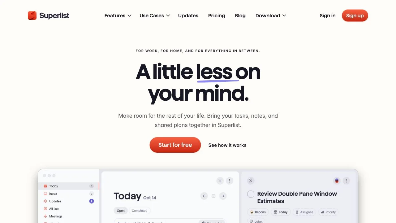
WHAT CAUGHT OUR EYE
A short, centered headline fits on two lines, surrounded by generous white space that makes the entry feel approachable.
A red primary button sits beside a text-only secondary link, using shape as well as color to distinguish the order of actions.
A softly rendered app screen appears at the bottom of the hero, connecting the copy's abstract promise to a tangible tool.
MAKE IT YOURS
For an everyday product, pair a brief promise with a single start button instead of filling the hero with features. Showing the actual UI directly below explains the use case while keeping the experience approachable.
Public pages reviewed and independently presented by Design Quest.
Screens reflect the capture date. Visit the official website for its current appearance and interactions.
From study to design
Turn the study’s observations into a brief. Fill in your project details and share it with your team or an AI assistant.
Design Quest UI example
SaaS productEdit the text directly. Copy your version or save it as a Markdown file.
Pass a detail you like on to your team or friends.
Link to this study with the badge. You can also ask us to correct or remove the listing.

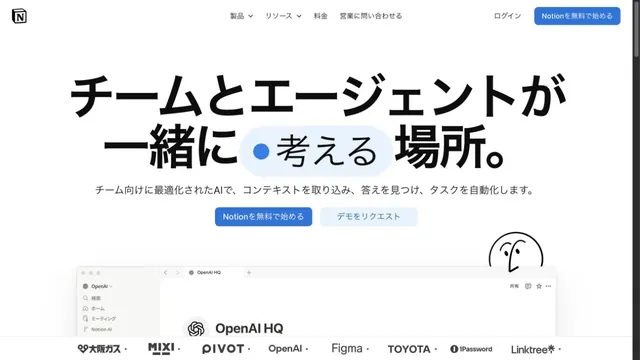
White space and large type explain how to use the workspace.
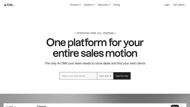
A CRM entrance that brings a short value proposition and small input fields together within white space.
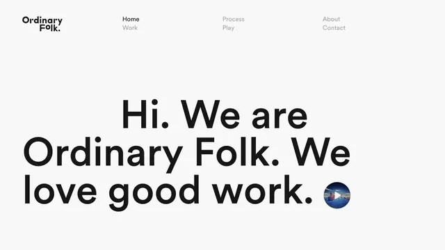
A brief introduction becomes oversized type, making the words themselves the face of the studio.