No. 046dia.studio
DIA Studio
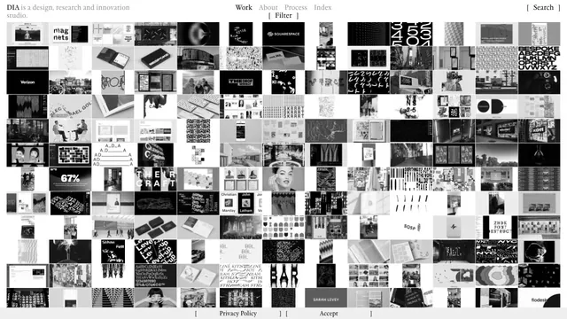
Creative studioA vast body of work is packed into small tiles, making the index itself the studio's expression.
A heavy wordmark and restrained navigation set up a large reel of the studio’s work.
Apply this idea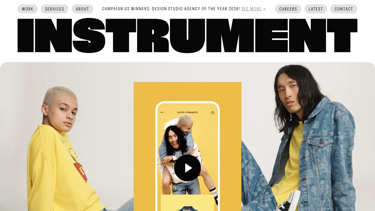
WHAT CAUGHT OUR EYE
The near full-width wordmark gives the studio name the first moment of attention.
Small gray menu pills and narrow type sit at the top, giving navigation a separate rhythm from the oversized lettering.
A rounded reel frame below the angular lettering marks the transition from the brand name to the work.
MAKE IT YOURS
Give navigation a compact row of its own, then choose one project image to follow the large wordmark. Each area has a clear job.
Public pages reviewed and independently presented by Design Quest.
Screens reflect the capture date. Visit the official website for its current appearance and interactions.
From study to design
Turn the study’s observations into a brief. Fill in your project details and share it with your team or an AI assistant.
Design Quest UI example
Creative agencyEdit the text directly. Copy your version or save it as a Markdown file.
Pass a detail you like on to your team or friends.
Link to this study with the badge. You can also ask us to correct or remove the listing.

A vast body of work is packed into small tiles, making the index itself the studio's expression.
Fine rules and dense text present graphics as a tool.
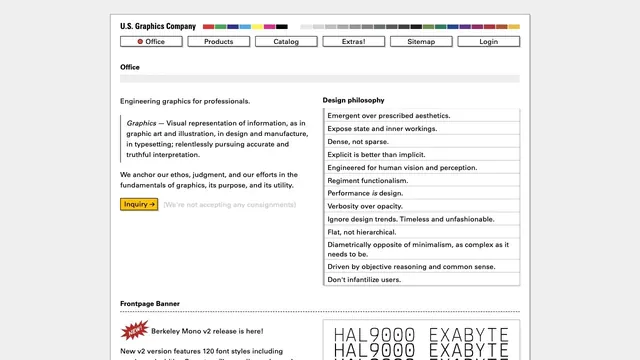
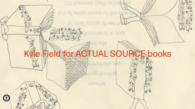
Hand-drawn lines and large red product names make the shop look like a single poster.