No. 040thegentlewoman.co.uk
The Gentlewoman
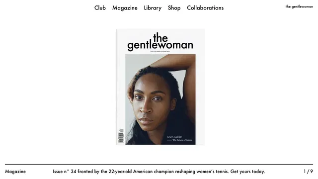
Culture & mediaA magazine entrance centered on the cover portrait and white space, with explanations gathered along the page edges.
A small magazine cover set within ample space creates the sense of distance of a printed editorial object.
Apply this idea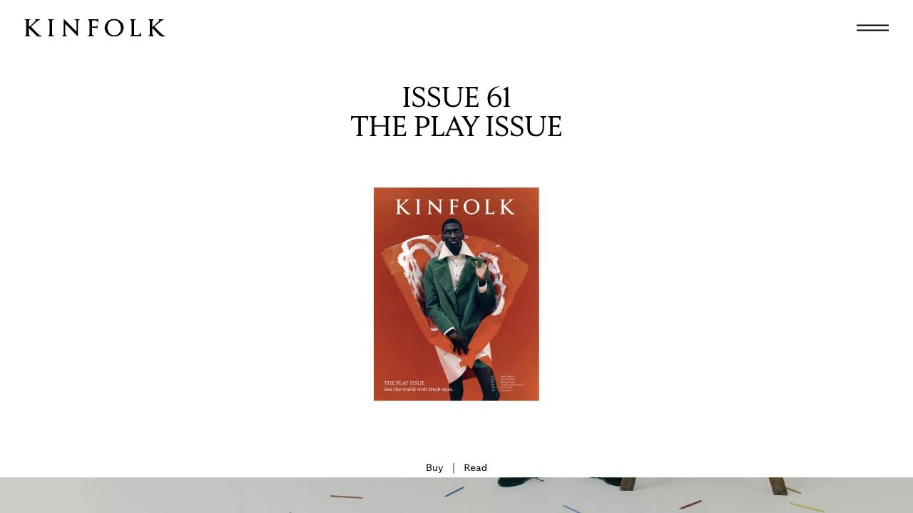
WHAT CAUGHT OUR EYE
Generous space surrounds the cover, shown at the scale of a magazine you could pick up rather than enlarged to fill the screen.
The magazine name, issue number, theme, cover, and Buy and Read links form a single vertical sequence.
A serif headline and widely spaced logo create quiet surroundings that leave the photograph's colors undisturbed.
MAKE IT YOURS
When introducing a magazine or book, enlarging its photograph is only one way to make it the focus. Leaving generous space around it and keeping the issue number and theme nearby communicates both its unity as a volume and the intended reading order.
Public pages reviewed and independently presented by Design Quest.
Screens reflect the capture date. Visit the official website for its current appearance and interactions.
From study to design
Turn the study’s observations into a brief. Fill in your project details and share it with your team or an AI assistant.
Design Quest UI example
Gradient galleryEdit the text directly. Copy your version or save it as a Markdown file.
Pass a detail you like on to your team or friends.
Link to this study with the badge. You can also ask us to correct or remove the listing.

A magazine entrance centered on the cover portrait and white space, with explanations gathered along the page edges.
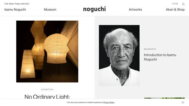
A two-part layout gives the exhibition and biography separate spaces, with white space drawing attention to the photographs.
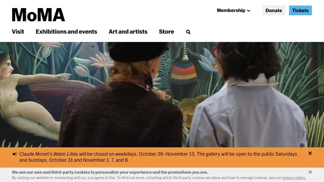
Large artwork photographs and a clear header support both viewing the work and planning a visit.