No. 007stripe.com
Stripe
Product & SaaSLuminous gradients paired with clear typography.
A ring of soft color and large serif type create the impression of a place to entrust your memories.
Apply this idea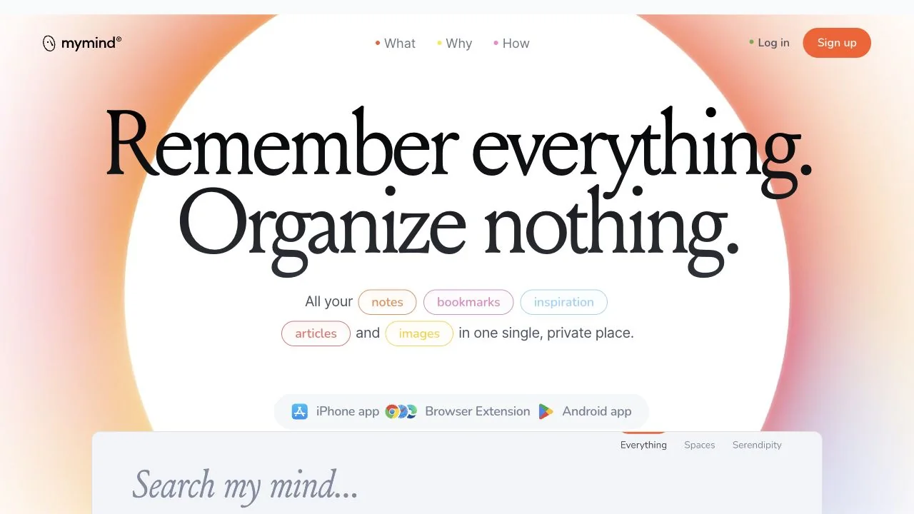
WHAT CAUGHT OUR EYE
Diffused fields of orange, pink, and purple surround a white central area, leaving a place to read the copy.
Two large serif lines are set close together, presenting a short promise as a single visual form.
Small, pale chips list the kinds of things that can be saved, providing concrete use cases immediately after the abstract copy.
MAKE IT YOURS
To create a soft visual world, use a gradient as light around the edges instead of covering the entire area behind the text. Chips with use-case examples near the short copy give the explanation substance beyond atmosphere.
Public pages reviewed and independently presented by Design Quest.
Screens reflect the capture date. Visit the official website for its current appearance and interactions.
From study to design
Turn the study’s observations into a brief. Fill in your project details and share it with your team or an AI assistant.
Design Quest UI example
SaaS productEdit the text directly. Copy your version or save it as a Markdown file.
Pass a detail you like on to your team or friends.
Link to this study with the badge. You can also ask us to correct or remove the listing.

Luminous gradients paired with clear typography.
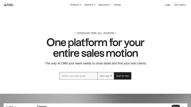
A CRM entrance that brings a short value proposition and small input fields together within white space.
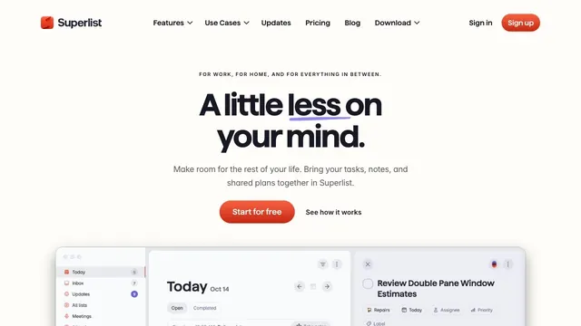
Soft white and a compact red call to action make everyday tasks feel lighter.