No. 057studiofreight.com
Studio Freight
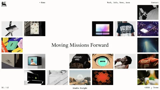
Creative studioTiles of work and serif type are combined within generous space.
An asymmetric studio entrance built from an extremely tall logo and strips of project photography.
Apply this idea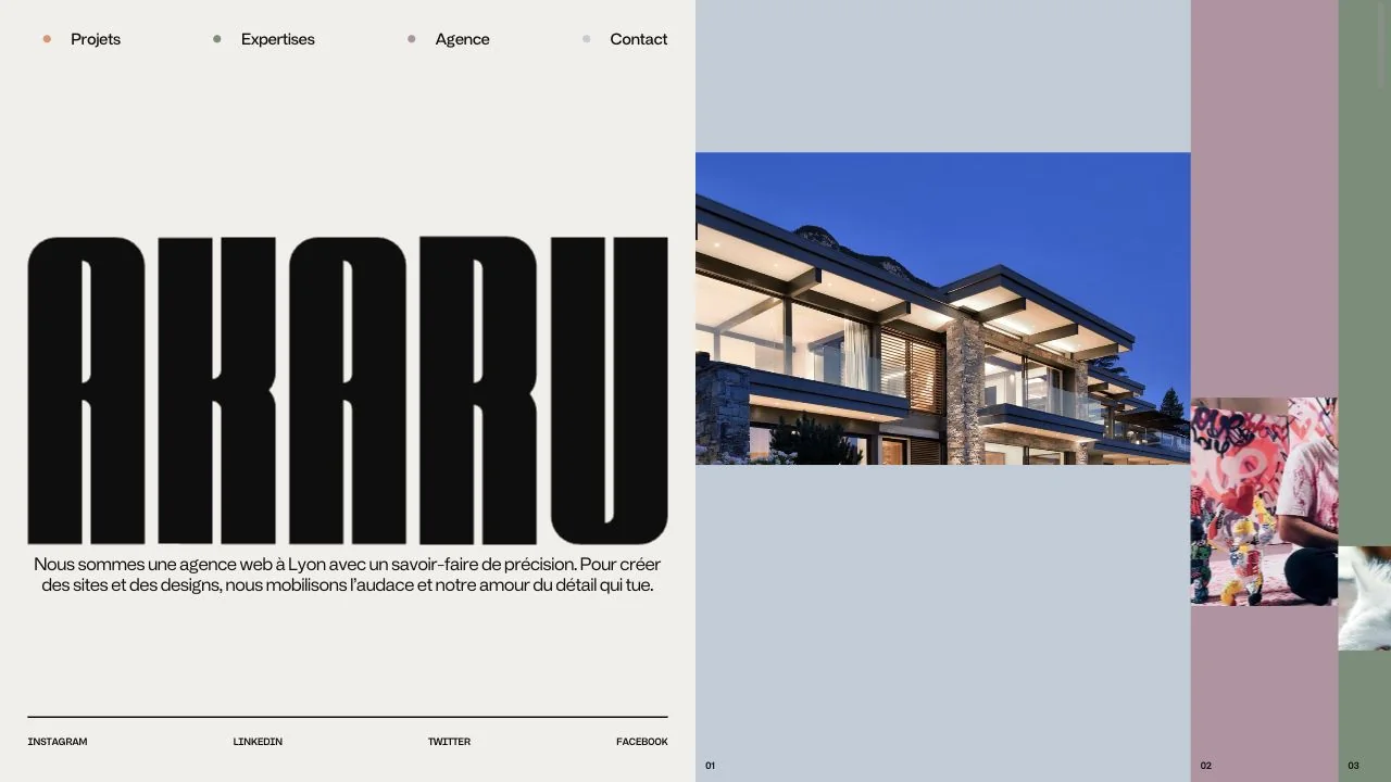
WHAT CAUGHT OUR EYE
The bold, condensed logo on the left anchors the screen, with a clearly distinct role from the project photography on the right.
Several narrow project panels run horizontally, suggesting the breadth of the work without opening the full collection.
Small descriptions and social links share a consistent left edge, retaining practical information around the bold logo.
MAKE IT YOURS
A large brand element can be contrasted with narrow photographic strips to introduce work. Aligning the small descriptions to a shared baseline helps keep information from looking scattered, even in an asymmetric composition.
Public pages reviewed and independently presented by Design Quest.
Screens reflect the capture date. Visit the official website for its current appearance and interactions.
From study to design
Turn the study’s observations into a brief. Fill in your project details and share it with your team or an AI assistant.
Design Quest UI example
Creative agencyEdit the text directly. Copy your version or save it as a Markdown file.
Pass a detail you like on to your team or friends.
Link to this study with the badge. You can also ask us to correct or remove the listing.

Tiles of work and serif type are combined within generous space.
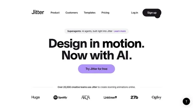
A bold two-line statement and a purple entry point focus attention on where to begin creating motion.
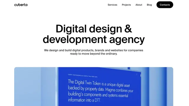
A clear, large headline and generously sized work examples immediately show what the company does.