No. 043cosmos.so
Cosmos
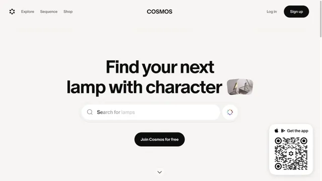
Product & SaaSA gateway to visual discovery centered on a large search field and short heading.
Files and screens float lightly across a soft white background.
Apply this idea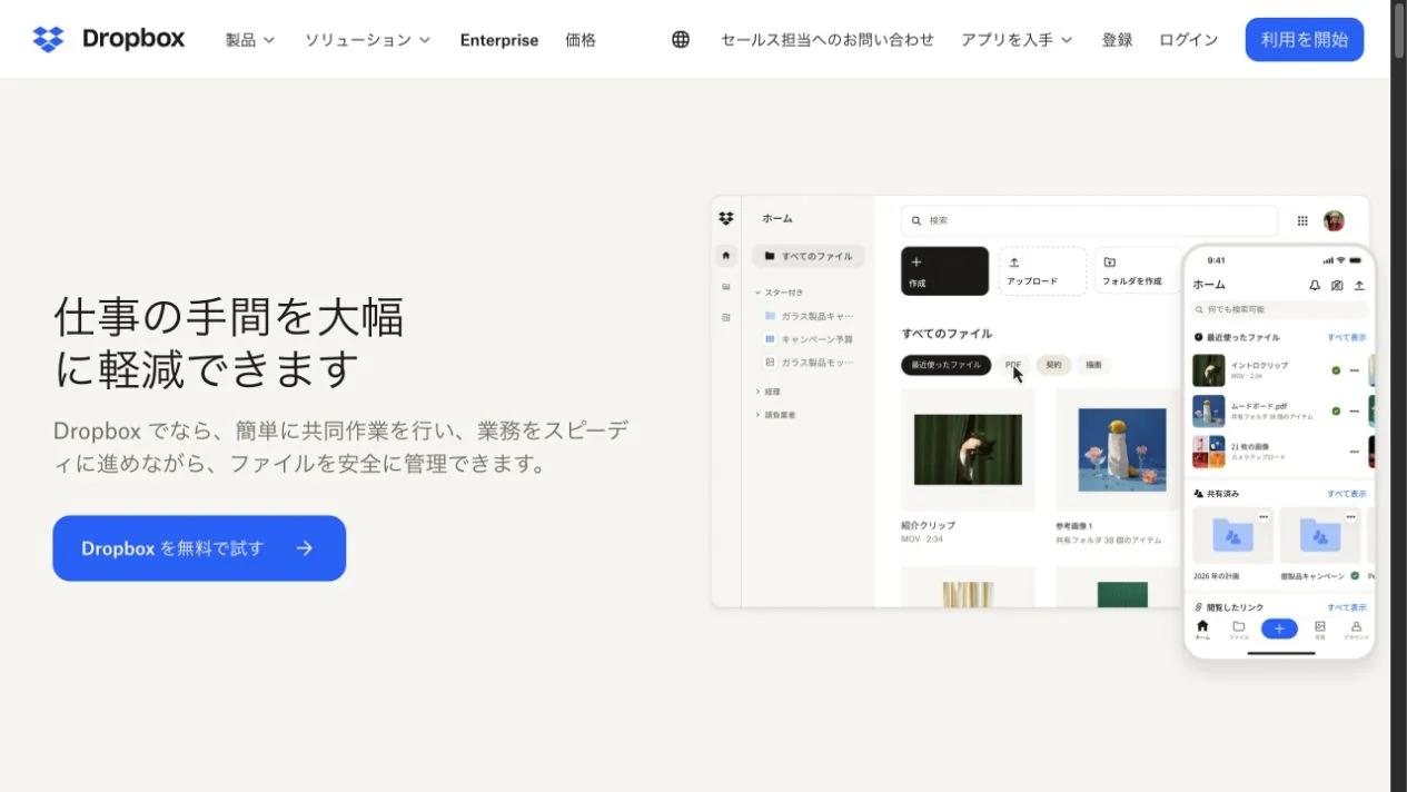
WHAT CAUGHT OUR EYE
Brief descriptions and clear buttons narrow the entry points into the information.
Layers of product screens demonstrate the experience of saving and organizing.
Generous space between the text and file list lets a feature-rich UI feel calm.
MAKE IT YOURS
When displaying an information-management tool, allow enough distance from its description and enough tonal contrast with the background. A detailed screenshot need not make the whole page's reading order equally intricate.
Public pages reviewed and independently presented by Design Quest.
Screens reflect the capture date. Visit the official website for its current appearance and interactions.
From study to design
Turn the study’s observations into a brief. Fill in your project details and share it with your team or an AI assistant.
Design Quest UI example
SaaS productEdit the text directly. Copy your version or save it as a Markdown file.
Pass a detail you like on to your team or friends.
Link to this study with the badge. You can also ask us to correct or remove the listing.

A gateway to visual discovery centered on a large search field and short heading.
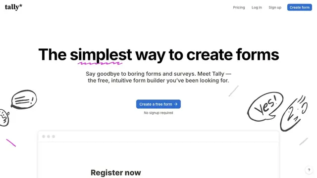
Hand-drawn speech bubbles and white space convey how approachable form creation can be.
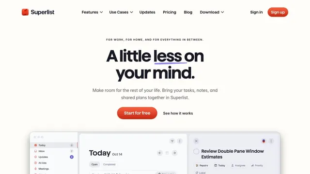
Soft white and a compact red call to action make everyday tasks feel lighter.