No. 038ignant.com
IGNANT
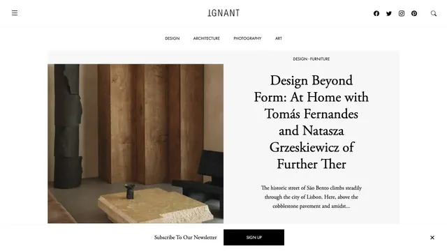
Culture & mediaAn online magazine that invites readers into an article with photography and a serif headline arranged like a magazine spread.
A copy-led brand expression that switches between sans serif and serif within a single paragraph.
Apply this idea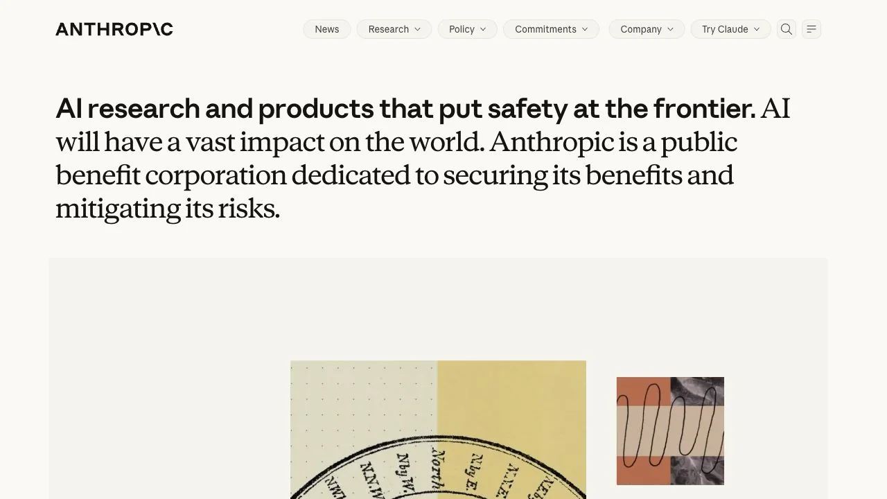
WHAT CAUGHT OUR EYE
Bold sans serif at the opening flows into serif copy, changing the voice from statement to explanation within one paragraph.
A light, paper-like background and generous line spacing create a surface for reading a longer message calmly.
Abstract printed pieces and line-based visuals below present the brand world as an editorial work, without relying solely on product screens.
MAKE IT YOURS
On a page where writing is central to the brand, map differences in typeface to differences in meaning. Placing an emphatic statement and the text explaining its reasons in a single reading sequence helps a long explanation come across as one voice.
Public pages reviewed and independently presented by Design Quest.
Screens reflect the capture date. Visit the official website for its current appearance and interactions.
From study to design
Turn the study’s observations into a brief. Fill in your project details and share it with your team or an AI assistant.
Design Quest UI example
SaaS productEdit the text directly. Copy your version or save it as a Markdown file.
Pass a detail you like on to your team or friends.
Link to this study with the badge. You can also ask us to correct or remove the listing.

An online magazine that invites readers into an article with photography and a serif headline arranged like a magazine spread.
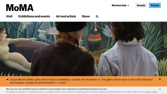
Large artwork photographs and a clear header support both viewing the work and planning a visit.
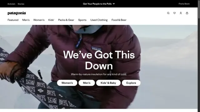
An outdoor brand's entry point, with short words layered over a large photograph.