No. 005craft.do
Craft
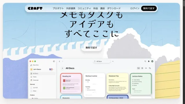
Product & SaaSIllustrations of paper and clouds depict a space for writing.
16 of the 31 Product & SaaS websites in the collection use the Light style.
Notice the amount of space, the readability of body text, and the boundary between background and imagery to discover ways of creating a light, airy screen.
Compare the first screen's message, the order in which product screens appear, and the relative emphasis of getting-started buttons.
| Studies | 16 of 81 (20%) |
|---|---|
| Share of Product & SaaS websites | 16 of 31 (52%) |
| Share of Light style websites | 16 of 44 (36%) |
| Often paired with | Minimal (8), Typography (8), Illustration (5) |
Illustrations of paper and clouds depict a space for writing.
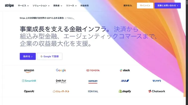
Luminous gradients paired with clear typography.
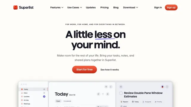
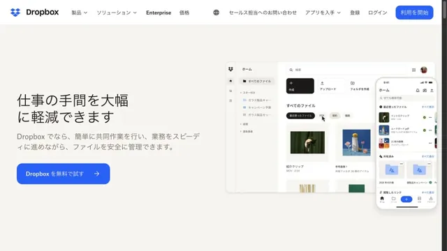
Soft white and a compact red call to action make everyday tasks feel lighter.
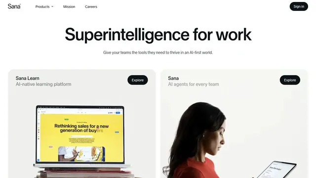
A quiet white product hub presenting two products through a shared card structure.
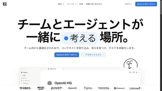
White space and large type explain how to use the workspace.
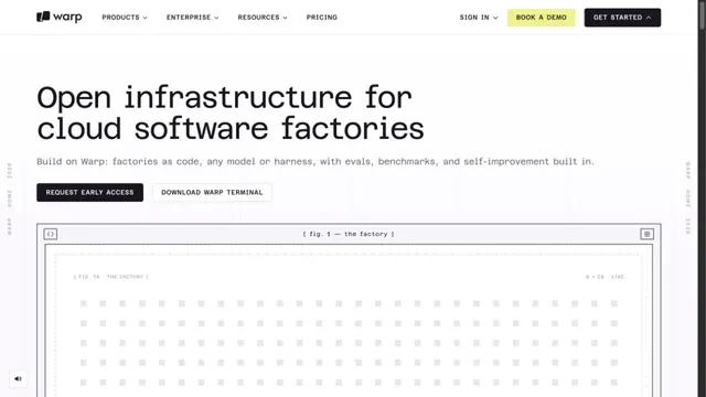
A white grid and large monospaced type create a technical character.
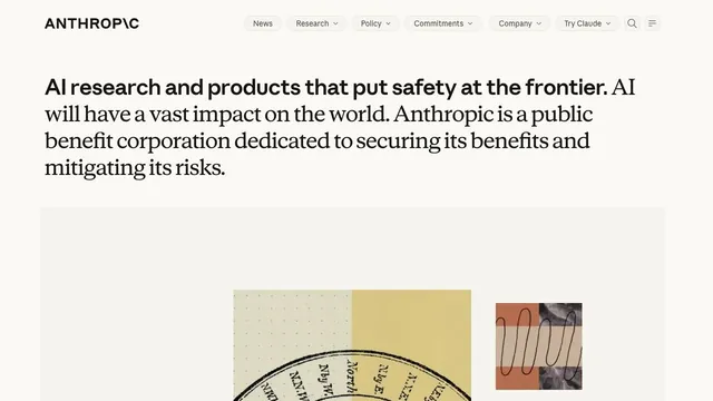
A copy-led brand expression that switches between sans serif and serif within a single paragraph.
Files and screens float lightly across a soft white background.
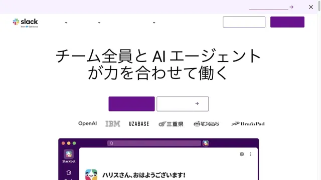
White and purple frame large headings and screens introducing teamwork.
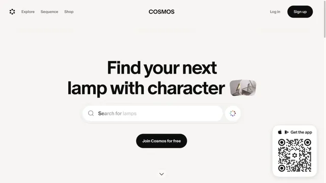
A gateway to visual discovery centered on a large search field and short heading.
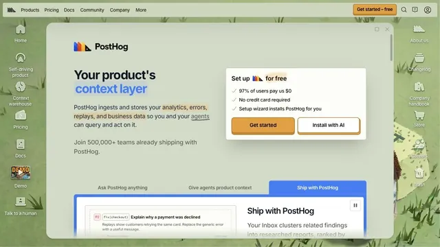
Desktop-style windows and a hand-drawn world turn entering the product into an exploration.
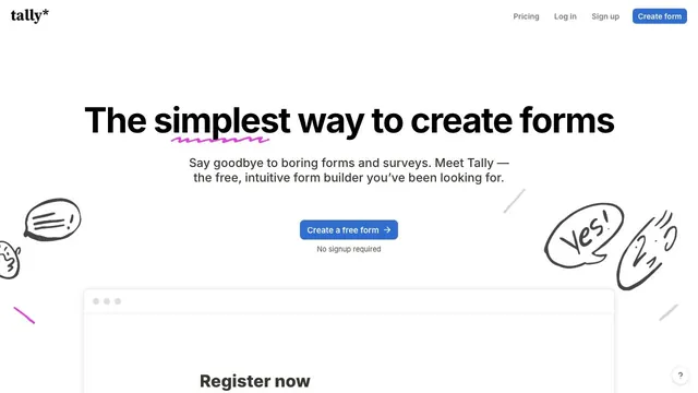
Hand-drawn speech bubbles and white space convey how approachable form creation can be.
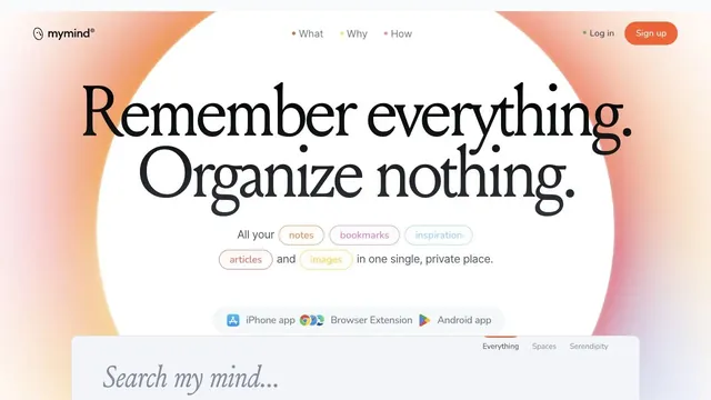
A ring of soft color and large serif type create the impression of a place to entrust your memories.
Round characters and soft colors create an approachable entry point.
A CRM entrance that brings a short value proposition and small input fields together within white space.
Characters and green buttons lead into learning.
Pass this list of references on to your team.
Public pages reviewed on 2026.10.27. Visit each official website for its current appearance and interactions.