No. 068mymind.com
mymind
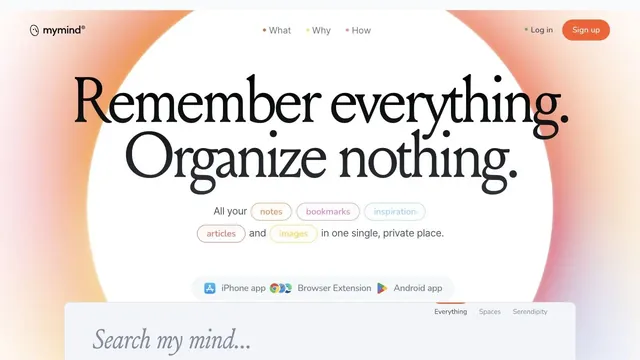
Product & SaaSA ring of soft color and large serif type create the impression of a place to entrust your memories.
White and purple frame large headings and screens introducing teamwork.
Apply this idea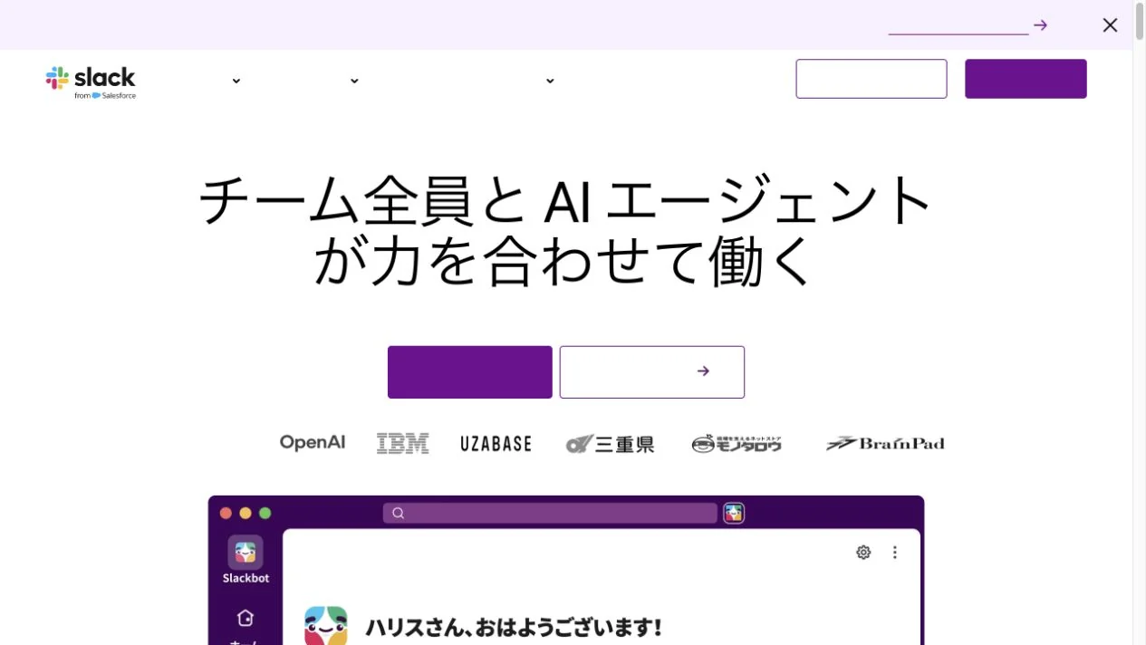
WHAT CAUGHT OUR EYE
The centered heading leads to customer companies and product screens.
Purple accents repeat in buttons and app frames.
The purple primary button sits directly below the heading, while white space and company logos keep the surrounding area uncluttered.
MAKE IT YOURS
Concentrate a strong brand color in primary actions and selected product screens, rather than only spreading it over large surfaces. White space between explanations, proof, and demos can balance brand presence with readability.
Public pages reviewed and independently presented by Design Quest.
Screens reflect the capture date. Visit the official website for its current appearance and interactions.
From study to design
Turn the study’s observations into a brief. Fill in your project details and share it with your team or an AI assistant.
Design Quest UI example
SaaS productEdit the text directly. Copy your version or save it as a Markdown file.
Pass a detail you like on to your team or friends.
Link to this study with the badge. You can also ask us to correct or remove the listing.

A ring of soft color and large serif type create the impression of a place to entrust your memories.
Luminous gradients paired with clear typography.
A copy-led brand expression that switches between sans serif and serif within a single paragraph.