No. 014superlist.com
Superlist
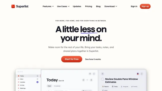
Product & SaaSSoft white and a compact red call to action make everyday tasks feel lighter.
A CRM entrance that brings a short value proposition and small input fields together within white space.
Apply this idea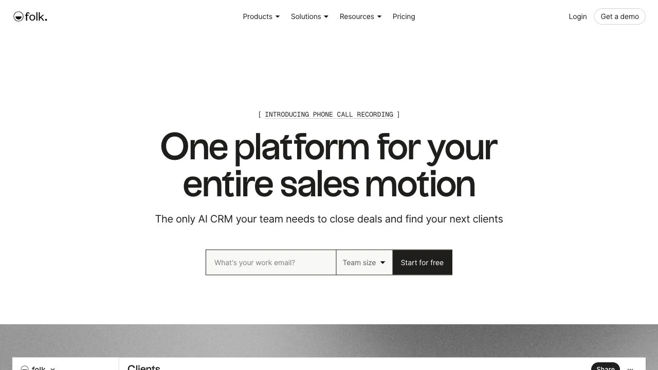
WHAT CAUGHT OUR EYE
A small announcement in square brackets and a large two-line headline establish a clear contrast in information scale.
The input field, team-size selector, and start button share one row, turning the first interaction into a single unit.
Text width and the space above and below draw the eye to the main explanation without adding colors or decoration.
MAKE IT YOURS
For a service that needs a little information at registration, the first input can sit close to the hero explanation. Keeping fields few and matching the height and boundaries of the inputs and start button shows the interaction flow without adding promotional decoration.
Public pages reviewed and independently presented by Design Quest.
Screens reflect the capture date. Visit the official website for its current appearance and interactions.
From study to design
Turn the study’s observations into a brief. Fill in your project details and share it with your team or an AI assistant.
Design Quest UI example
SaaS productEdit the text directly. Copy your version or save it as a Markdown file.
Pass a detail you like on to your team or friends.
Link to this study with the badge. You can also ask us to correct or remove the listing.

Soft white and a compact red call to action make everyday tasks feel lighter.
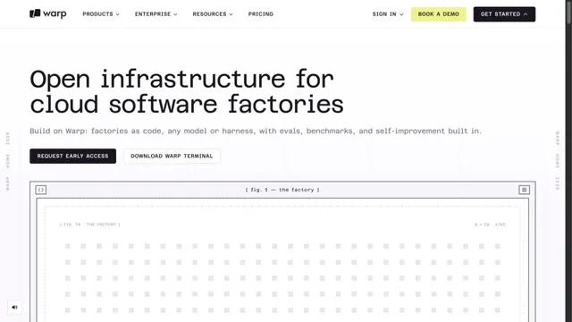
A white grid and large monospaced type create a technical character.
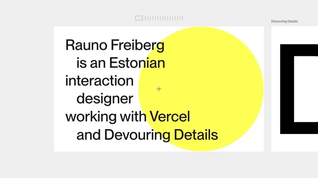
A portfolio that places an introduction on a large card, leaving room to move sideways into the work.