No. 044cuberto.com
Cuberto
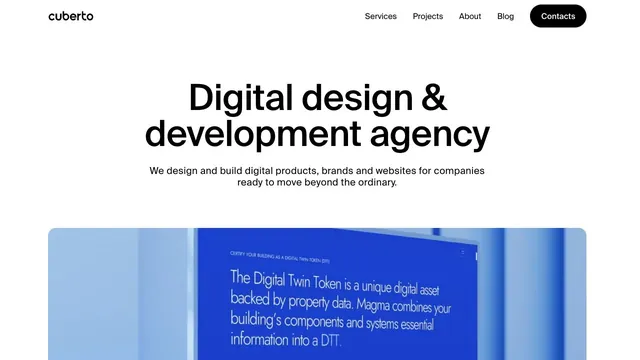
Creative studioA clear, large headline and generously sized work examples immediately show what the company does.
A brief introduction becomes oversized type, making the words themselves the face of the studio.
Apply this idea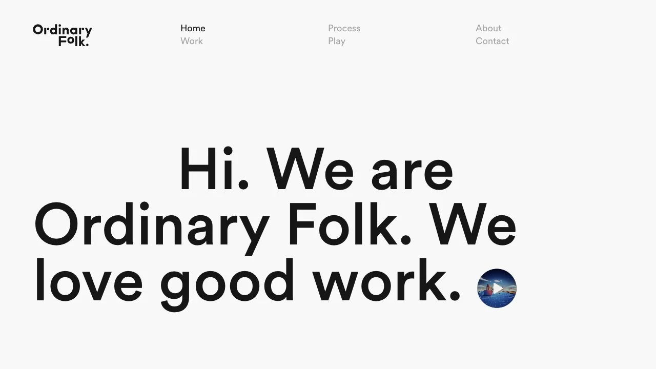
WHAT CAUGHT OUR EYE
A short, friendly statement is set large near the lower center of the screen, creating the sense of a first introduction.
A small circular video entry beside the copy hints at the studio's work without using an enormous background video.
The menu at the top is split into several small columns, matching the rhythm of space around the logo and body copy.
MAKE IT YOURS
For a creative company's introduction, a short sentence that sounds natural aloud can make a strong impression before adding more specialist terminology. A single entry point to the work connects the approachable language to the company's portfolio.
Public pages reviewed and independently presented by Design Quest.
Screens reflect the capture date. Visit the official website for its current appearance and interactions.
From study to design
Turn the study’s observations into a brief. Fill in your project details and share it with your team or an AI assistant.
Design Quest UI example
Creative agencyEdit the text directly. Copy your version or save it as a Markdown file.
Pass a detail you like on to your team or friends.
Link to this study with the badge. You can also ask us to correct or remove the listing.

A clear, large headline and generously sized work examples immediately show what the company does.
A portfolio that places an introduction on a large card, leaving room to move sideways into the work.
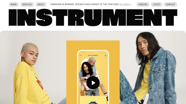
A heavy wordmark and restrained navigation set up a large reel of the studio’s work.