No. 018akaru.fr
Akaru
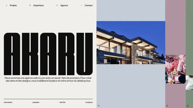
Creative studioAn asymmetric studio entrance built from an extremely tall logo and strips of project photography.
A bold two-line statement and a purple entry point focus attention on where to begin creating motion.
Apply this idea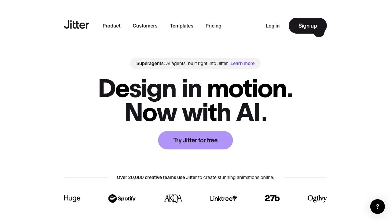
WHAT CAUGHT OUR EYE
A large, centered two-line headline establishes a scale hierarchy with the announcement above and action button below.
Only the start button is purple on an otherwise mostly black-and-white screen, associating a single color with where to click.
Customer team logos sit below the headline, followed by templates, creating a progression through credibility to concrete examples.
MAKE IT YOURS
Even a service built around motion does not need to keep its entry controls moving. Keeping the headline and CTA still and concentrating expression in the examples creates a sequence in which visitors understand before they try.
Public pages reviewed and independently presented by Design Quest.
Screens reflect the capture date. Visit the official website for its current appearance and interactions.
From study to design
Turn the study’s observations into a brief. Fill in your project details and share it with your team or an AI assistant.
Design Quest UI example
ComponentsEdit the text directly. Copy your version or save it as a Markdown file.
Pass a detail you like on to your team or friends.
Link to this study with the badge. You can also ask us to correct or remove the listing.

An asymmetric studio entrance built from an extremely tall logo and strips of project photography.
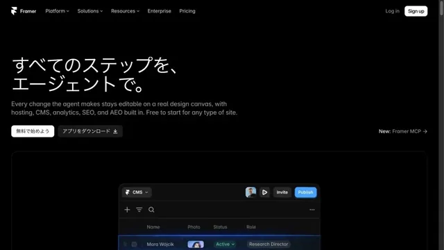
A website-building tool presented through product screens on a black background.
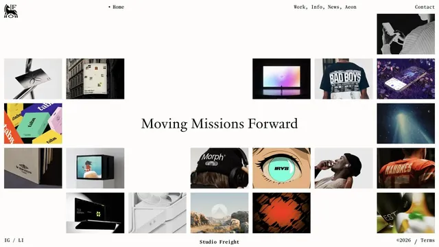
Tiles of work and serif type are combined within generous space.