No. 046dia.studio
DIA Studio
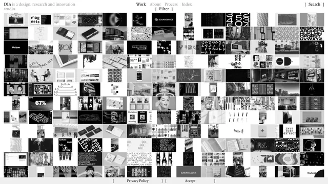
Creative studioA vast body of work is packed into small tiles, making the index itself the studio's expression.
A full-bleed project photo and a sentence-shaped filter let visitors explore the studio’s work by discipline and sector.
Apply this idea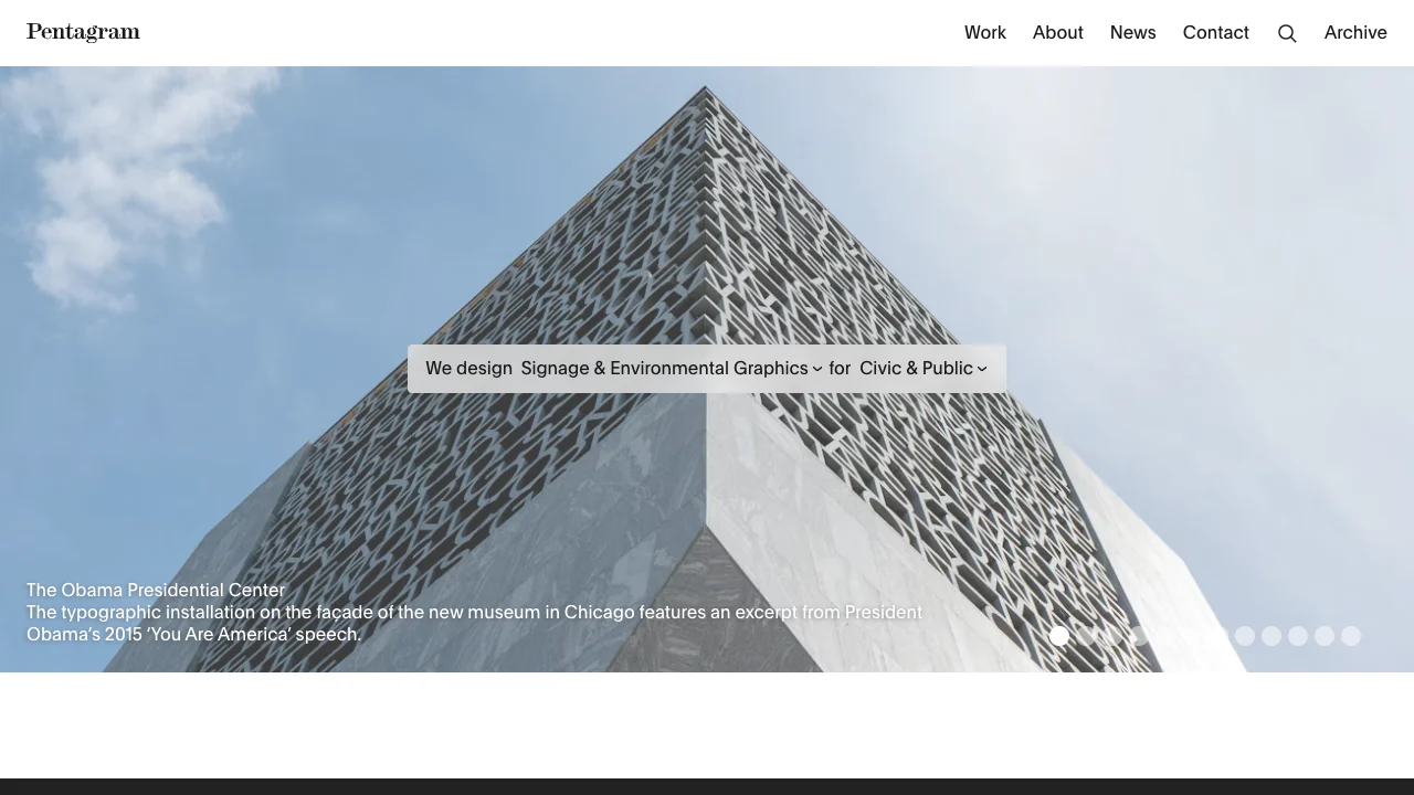
WHAT CAUGHT OUR EYE
The white header keeps the wordmark and short menu in place as the project photography changes.
The centered sentence contains two selectors, so browsing by discipline and industry reads like plain language.
The caption sits at the lower left of the image, with slide controls at the lower right.
MAKE IT YOURS
With only two filters, try placing the controls in a short sentence. Keep both the selected values and the affordance visible.
Public pages reviewed and independently presented by Design Quest.
Screens reflect the capture date. Visit the official website for its current appearance and interactions.
From study to design
Turn the study’s observations into a brief. Fill in your project details and share it with your team or an AI assistant.
Design Quest UI example
Creative agencyEdit the text directly. Copy your version or save it as a Markdown file.
Pass a detail you like on to your team or friends.
Link to this study with the badge. You can also ask us to correct or remove the listing.

A vast body of work is packed into small tiles, making the index itself the studio's expression.
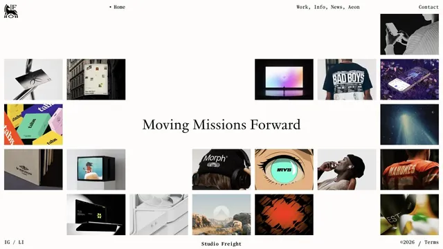
Tiles of work and serif type are combined within generous space.
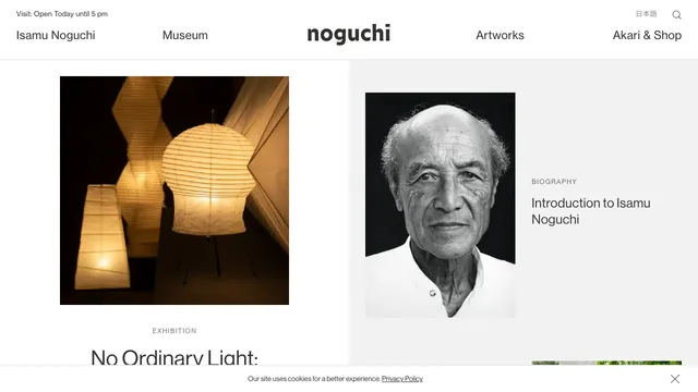
A two-part layout gives the exhibition and biography separate spaces, with white space drawing attention to the photographs.