No. 071headspace.com
Headspace
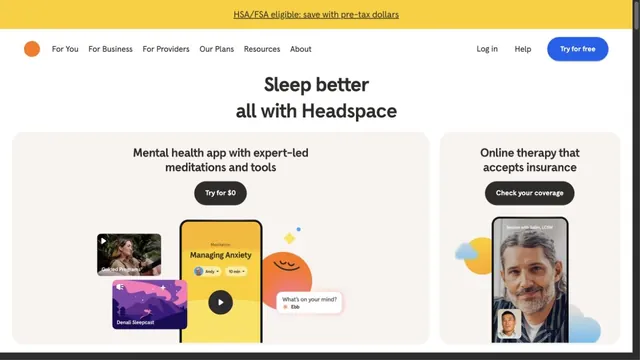
Product & SaaSRound characters and soft colors create an approachable entry point.
Desktop-style windows and a hand-drawn world turn entering the product into an exploration.
Apply this idea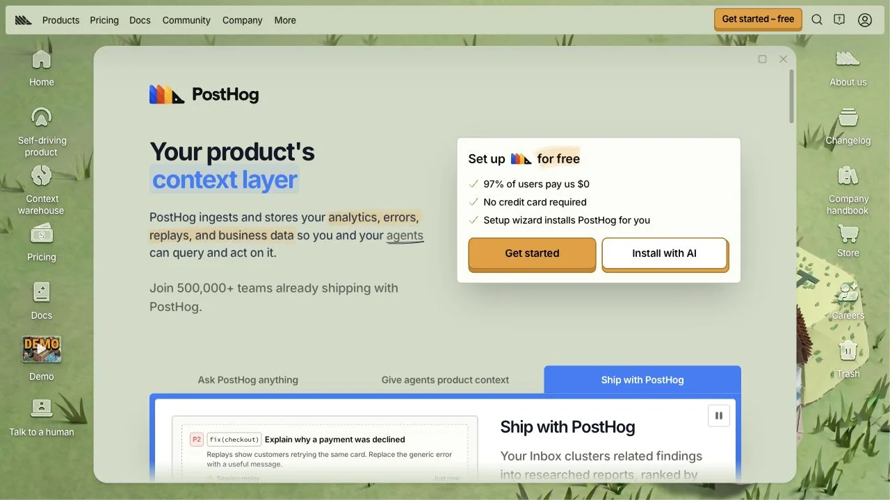
WHAT CAUGHT OUR EYE
A large window in front of the wallpaper presents the product explanation as a screen within an operating system.
The icon columns on either side lead to real destinations such as Docs and Changelog, making playfulness part of the navigation.
Inside the window, a short value proposition and getting-started button stay orderly, keeping the exterior's information density outside.
MAKE IT YOURS
Even a highly playful screen becomes easier to use when the main explanation and CTA share one calm area. Giving decorative icons real destinations brings the visual world and information architecture into alignment.
Public pages reviewed and independently presented by Design Quest.
Screens reflect the capture date. Visit the official website for its current appearance and interactions.
From study to design
Turn the study’s observations into a brief. Fill in your project details and share it with your team or an AI assistant.
Design Quest UI example
SaaS productEdit the text directly. Copy your version or save it as a Markdown file.
Pass a detail you like on to your team or friends.
Link to this study with the badge. You can also ask us to correct or remove the listing.

Round characters and soft colors create an approachable entry point.
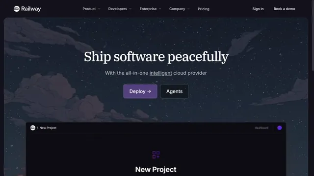
A cloud service site connecting night-sky illustrations with product screens.
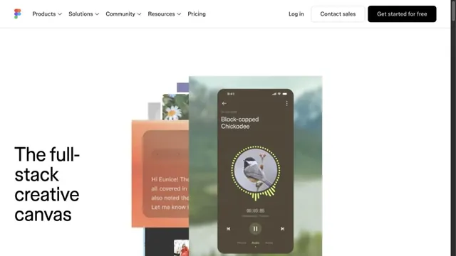
Overlapping examples of creative work convey the range of the tool.