No. 010nts.live
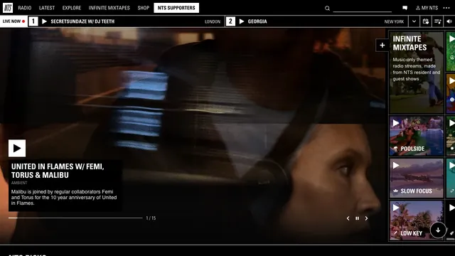
NTS Radio
Culture & mediaFine dividers and square play controls bring live radio and on-demand listening together in one view.
Explore sites defined by bold placement, strong contrast, and type and shapes with restrained decoration. Our perspective highlights how they make use of a less polished expression.
Look beyond unexpected placement to see how navigation and text readability are maintained.
| Studies | 10 of 81 (12%) |
|---|---|
| Top use categories | Design tools (4), Creative studio (2), Commerce (2) |
| Often paired with | Typography (7), Light (6), Dark (4) |
| Representative studies | NTS Radio, Instrument, Gumroad |
Fine dividers and square play controls bring live radio and on-demand listening together in one view.
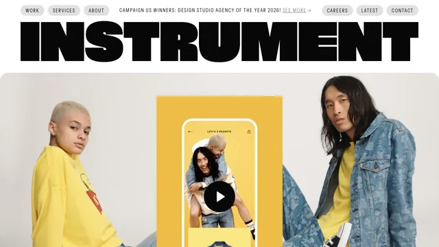
A heavy wordmark and restrained navigation set up a large reel of the studio’s work.
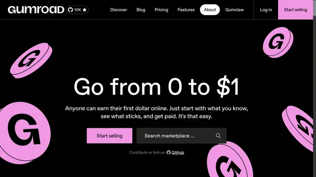
Strong black-and-pink contrast is paired with three-dimensional coins.
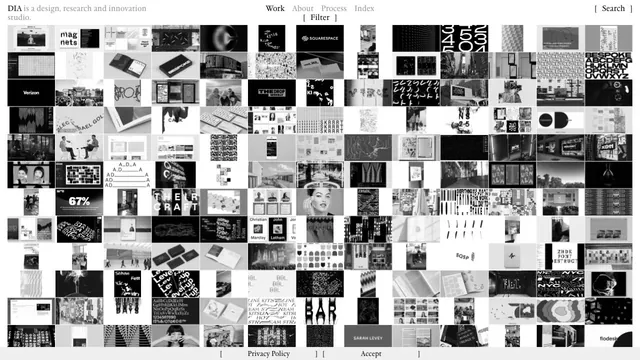
A vast body of work is packed into small tiles, making the index itself the studio's expression.
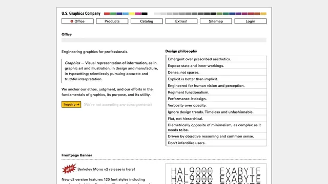
Fine rules and dense text present graphics as a tool.
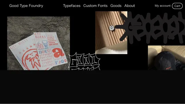
Typefaces, merchandise, and photography share a black surface, showing the material quality of letterforms.
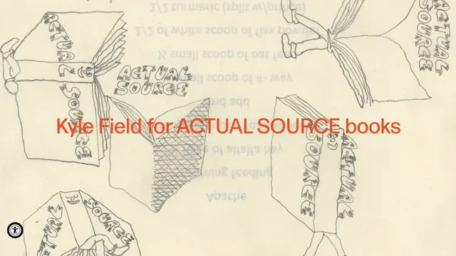
Hand-drawn lines and large red product names make the shop look like a single poster.
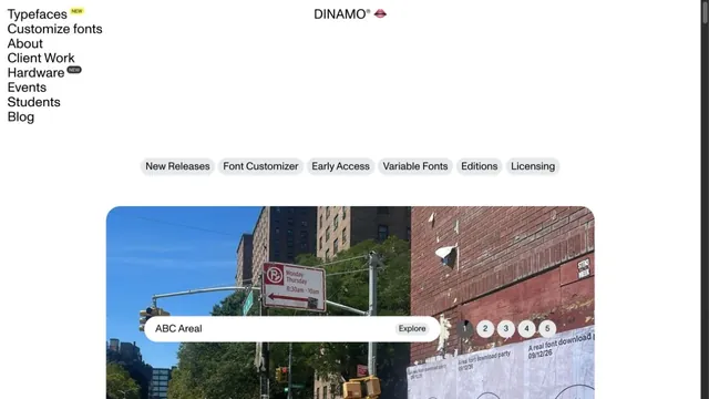
A typeface showcase built from lists of text and bold empty space.
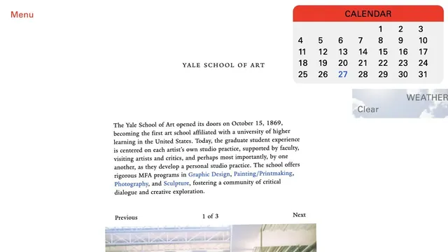
An unconventional school website where unpolished text coexists with components such as a calendar.
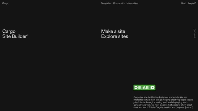
A site builder's entry point defined by expansive empty space and scattered text.
Pass this list of references on to your team.
Recommending a site is free. We review each one against our editorial approach.
Recommend a websitePublic pages reviewed on 2026.10.27–2026.11.13. Visit each official website for its current appearance and interactions.