No. 001linear.app

Linear
Product & SaaSA near-black background and large headings convey the shape of the product.
A collection of minimal websites that limit their elements and make their message clear. Compare different kinds of simplicity through combinations of color count, information density, type size, and space.
Compare what each site keeps on the first screen and what it leaves out. Even with few elements, layout and typography change the expression.
| Studies | 29 of 81 (36%) |
|---|---|
| Top use categories | Minimal × Product & SaaS (16), Design tools (4), Commerce (3) |
| Often paired with | Light (17), Dark (12), Typography (12) |
| Representative studies | Linear, Apple iPhone, The Noguchi Museum |
A near-black background and large headings convey the shape of the product.
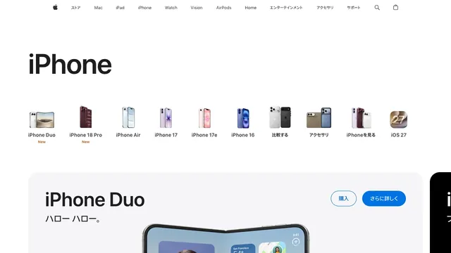
Small product silhouettes introduce the lineup before the page moves into individual products and purchase links.
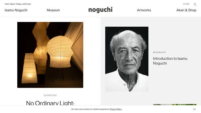
A two-part layout gives the exhibition and biography separate spaces, with white space drawing attention to the photographs.
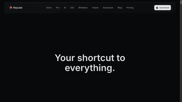
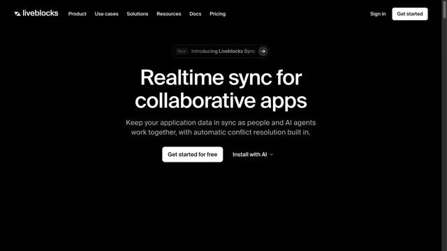
A focused landing page with white headings on a dark screen.
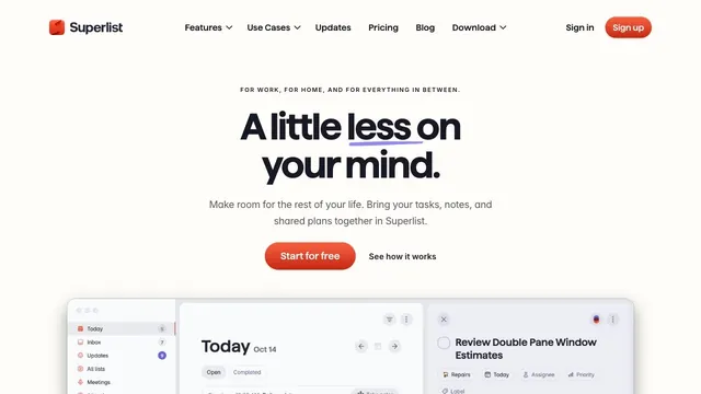
Soft white and a compact red call to action make everyday tasks feel lighter.
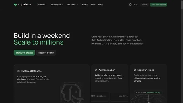
Green accents and neatly organized feature cards define the page.
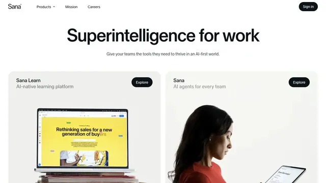
Black-and-white contrast makes a short message stand out.
A quiet white product hub presenting two products through a shared card structure.
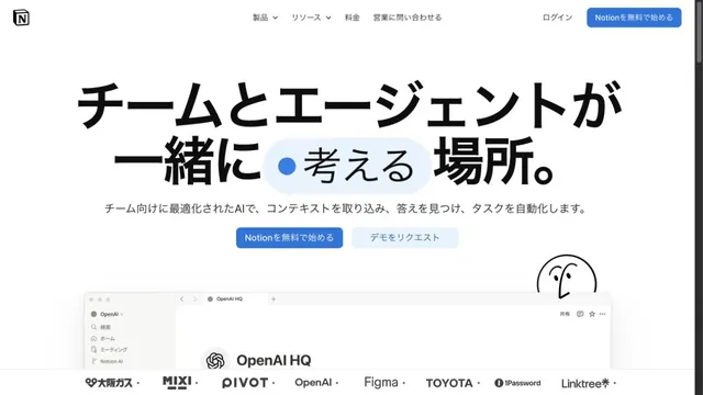
White space and large type explain how to use the workspace.
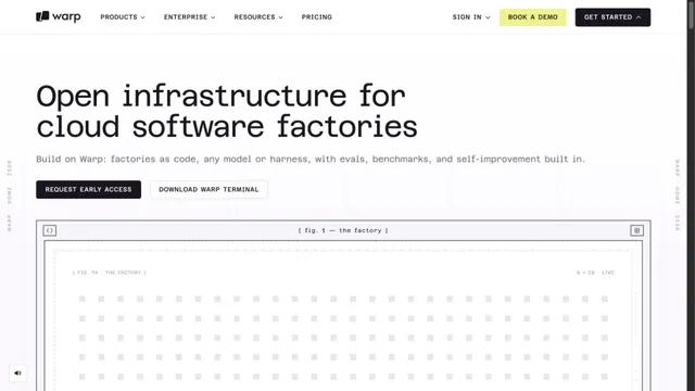
A white grid and large monospaced type create a technical character.
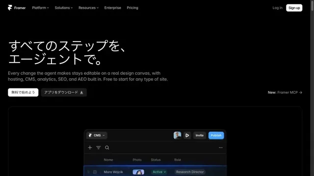
A website-building tool presented through product screens on a black background.
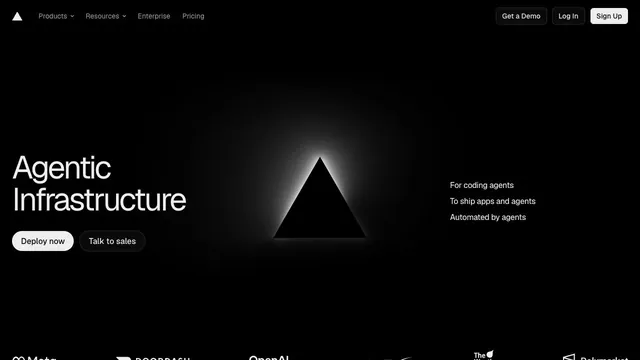
An infrastructure product entrance that anchors the eye with just a black triangle and white text.
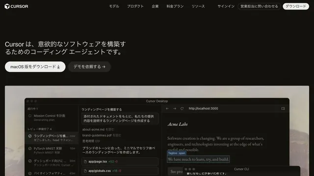
Restrained text and a large actual UI put the product itself at the center.
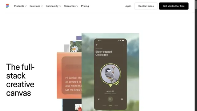
Overlapping examples of creative work convey the range of the tool.
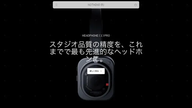
A product site that places products and brief copy in black space, using emptiness to create presence.
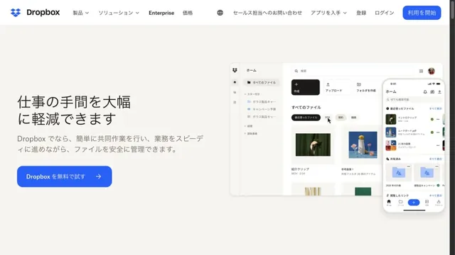
Files and screens float lightly across a soft white background.
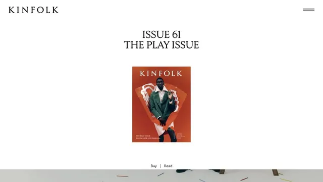
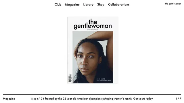
A small magazine cover set within ample space creates the sense of distance of a printed editorial object.
A magazine entrance centered on the cover portrait and white space, with explanations gathered along the page edges.
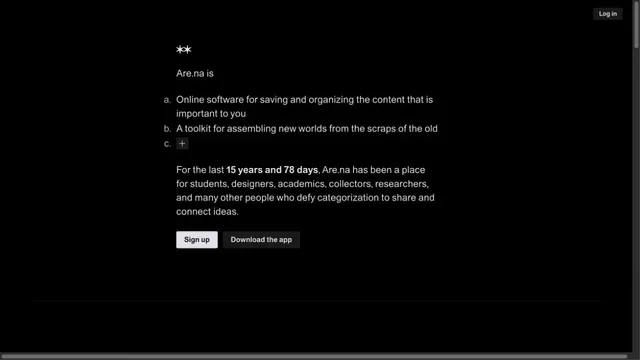
A quiet collection service site focused on short text and space.
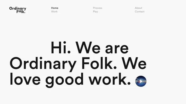
A brief introduction becomes oversized type, making the words themselves the face of the studio.
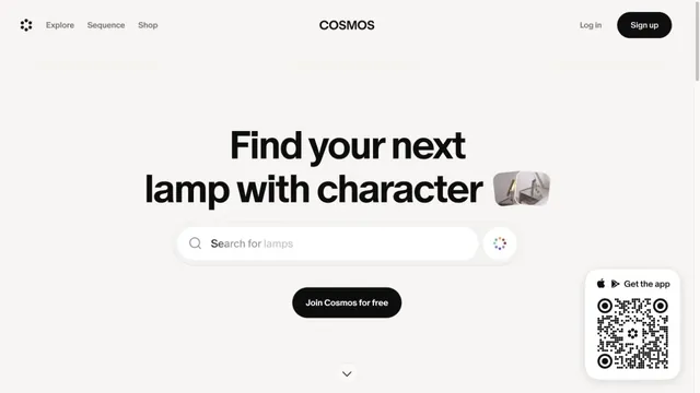
A gateway to visual discovery centered on a large search field and short heading.
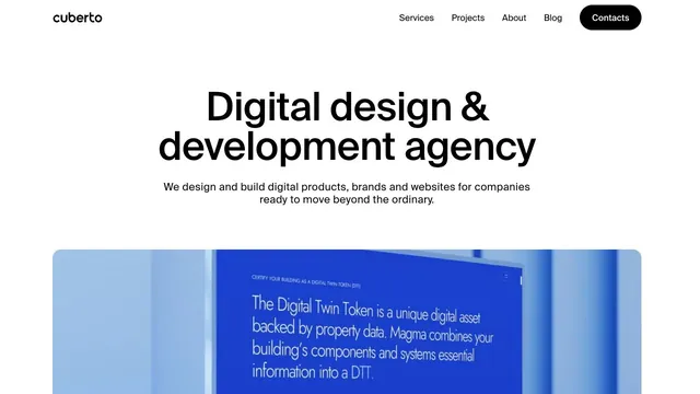
A clear, large headline and generously sized work examples immediately show what the company does.
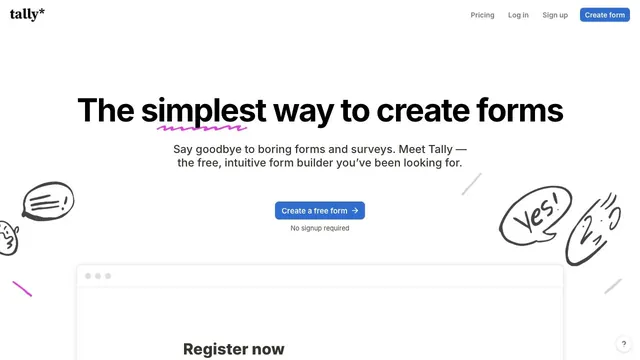
Hand-drawn speech bubbles and white space convey how approachable form creation can be.
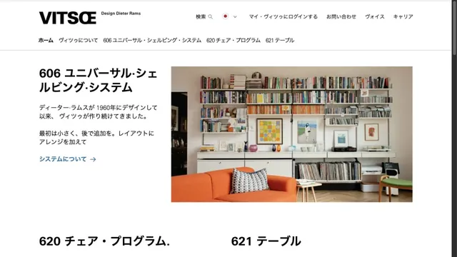
Furniture photography and orderly typography introduce products with a calm tone.
Deep purple light and dark empty space evoke a place for writing notes.
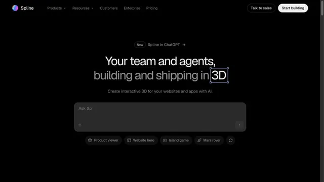
An input field in a black space shows how to start creating in 3D.
A CRM entrance that brings a short value proposition and small input fields together within white space.
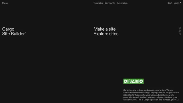
A site builder's entry point defined by expansive empty space and scattered text.
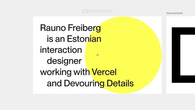
A portfolio that places an introduction on a large card, leaving room to move sideways into the work.
Pass this list of references on to your team.
Recommending a site is free. We review each one against our editorial approach.
Recommend a websitePublic pages reviewed on 2026.10.27–2026.11.13. Visit each official website for its current appearance and interactions.