No. 038ignant.com
IGNANT
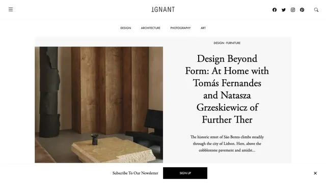
Culture & mediaAn online magazine that invites readers into an article with photography and a serif headline arranged like a magazine spread.
Large artwork photographs and a clear header support both viewing the work and planning a visit.
Apply this idea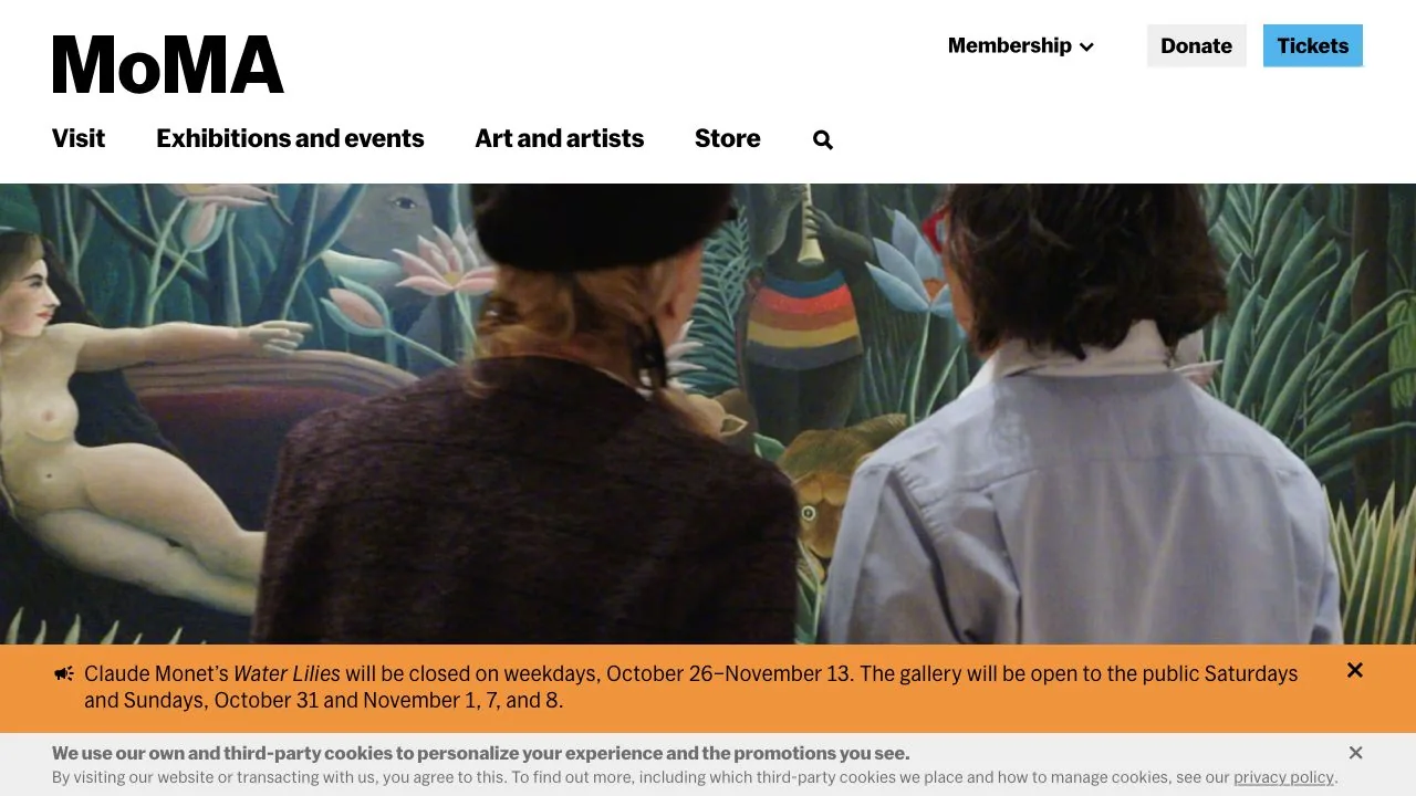
WHAT CAUGHT OUR EYE
A large MoMA logo and bold menu text in a white header match the visual strength of the artwork photographs.
Tickets occupies a small colored area, separating information browsing from the action of arranging a visit.
Wide photographs use people experiencing the exhibition space to convey the scale of the works and the distance around them.
MAKE IT YOURS
A cultural institution's website needs entry points for both people viewing the works and those intending to visit. A useful model pairs large visuals with a stable header and highlights only the ticket path in a single color.
Public pages reviewed and independently presented by Design Quest.
Screens reflect the capture date. Visit the official website for its current appearance and interactions.
From study to design
Turn the study’s observations into a brief. Fill in your project details and share it with your team or an AI assistant.
Design Quest UI example
Gradient galleryEdit the text directly. Copy your version or save it as a Markdown file.
Pass a detail you like on to your team or friends.
Link to this study with the badge. You can also ask us to correct or remove the listing.

An online magazine that invites readers into an article with photography and a serif headline arranged like a magazine spread.
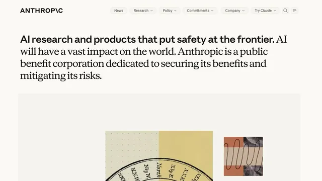
A copy-led brand expression that switches between sans serif and serif within a single paragraph.
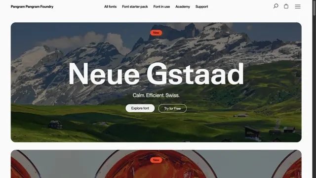
Landscape photography and large type specimens convey the character of letterforms.