No. 018akaru.fr
Akaru
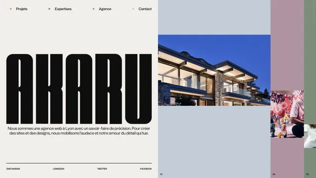
Creative studioAn asymmetric studio entrance built from an extremely tall logo and strips of project photography.
Tiles of work and serif type are combined within generous space.
Apply this idea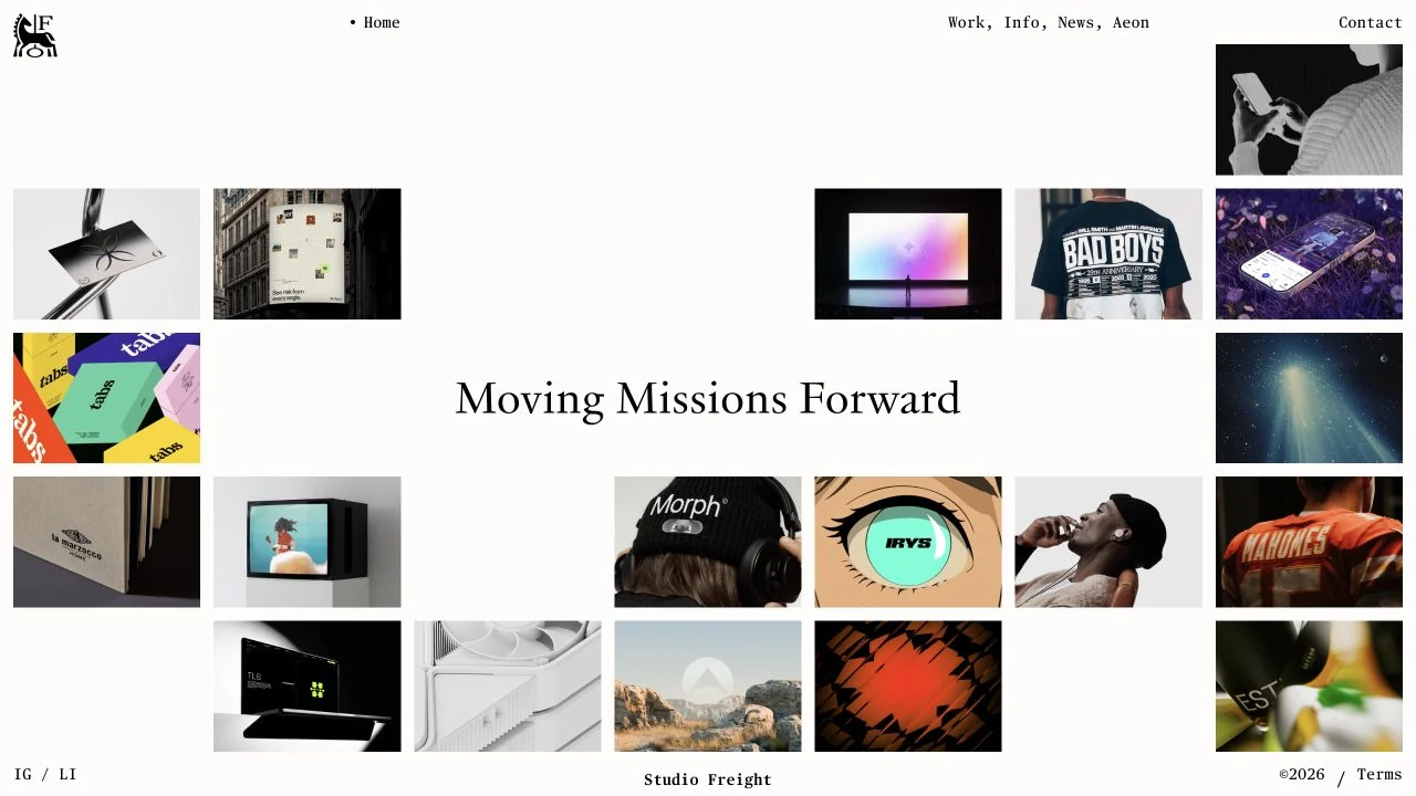
WHAT CAUGHT OUR EYE
Tiles of different projects surround the central text.
Small navigation and ample space bring out the colors of the work.
Examples spread around a short central statement, making the shape of the empty space a frame for the brand.
MAKE IT YOURS
Before arranging diverse work into a uniform list, consider how the central message relates to the examples. Varying sizes and spacing can convey the editorial intent with little text.
Public pages reviewed and independently presented by Design Quest.
Screens reflect the capture date. Visit the official website for its current appearance and interactions.
From study to design
Turn the study’s observations into a brief. Fill in your project details and share it with your team or an AI assistant.
Design Quest UI example
Creative agencyEdit the text directly. Copy your version or save it as a Markdown file.
Pass a detail you like on to your team or friends.
Link to this study with the badge. You can also ask us to correct or remove the listing.

An asymmetric studio entrance built from an extremely tall logo and strips of project photography.
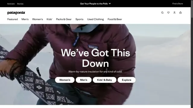
An outdoor brand's entry point, with short words layered over a large photograph.
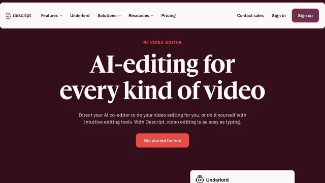
Deep wine tones and white serif type give a video editing tool an editorial voice.