No. 072folk.app

folk
Product & SaaSA CRM entrance that brings a short value proposition and small input fields together within white space.
A white grid and large monospaced type create a technical character.
Apply this idea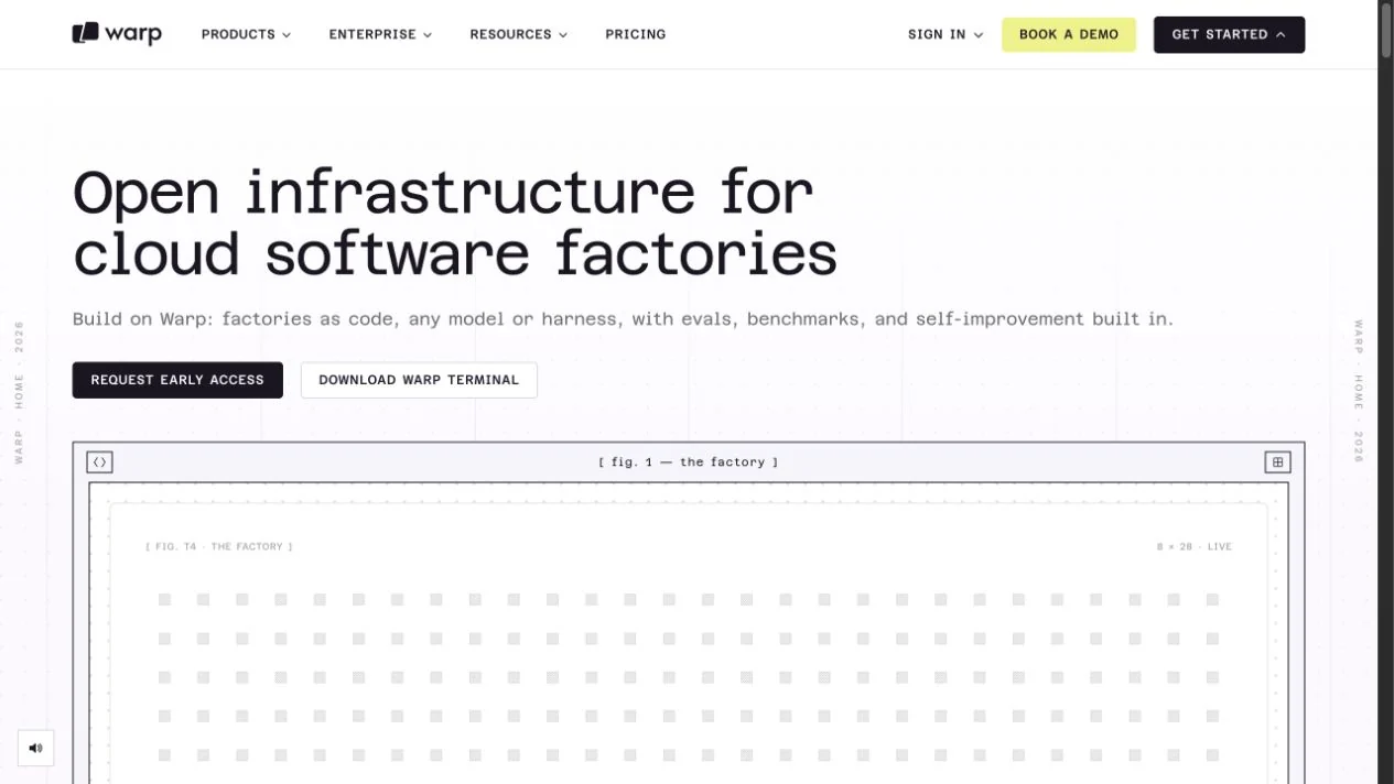
WHAT CAUGHT OUR EYE
Large monospaced headings are paired with small annotations.
Fine, diagram-like borders reveal the product's world.
Fine rules and evenly spaced dots give the white surface the regularity of technical documentation.
MAKE IT YOURS
A technical feel can come from aligned rules and grids as well as dark backgrounds. For specification-heavy product pages, this is a useful reference for pairing pale backgrounds with structural divisions.
Public pages reviewed and independently presented by Design Quest.
Screens reflect the capture date. Visit the official website for its current appearance and interactions.
From study to design
Turn the study’s observations into a brief. Fill in your project details and share it with your team or an AI assistant.
Design Quest UI example
SaaS productEdit the text directly. Copy your version or save it as a Markdown file.
Pass a detail you like on to your team or friends.
Link to this study with the badge. You can also ask us to correct or remove the listing.

A CRM entrance that brings a short value proposition and small input fields together within white space.
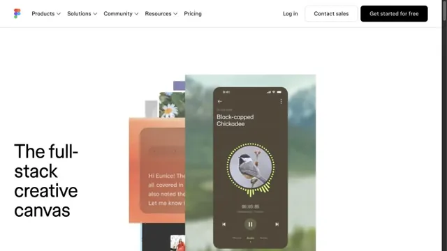
Luminous gradients paired with clear typography.
Overlapping examples of creative work convey the range of the tool.