No. 048usgraphics.com
U.S. Graphics Company
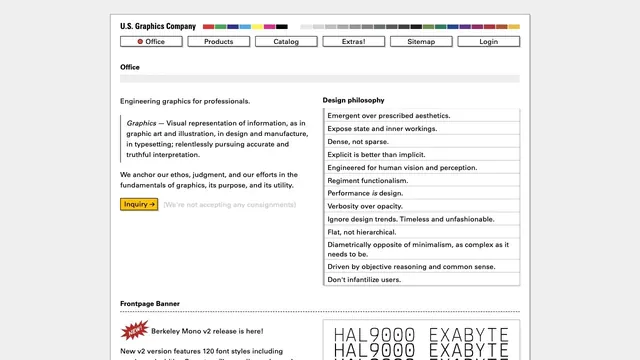
Design toolsFine rules and dense text present graphics as a tool.
An unconventional school website where unpolished text coexists with components such as a calendar.
Apply this idea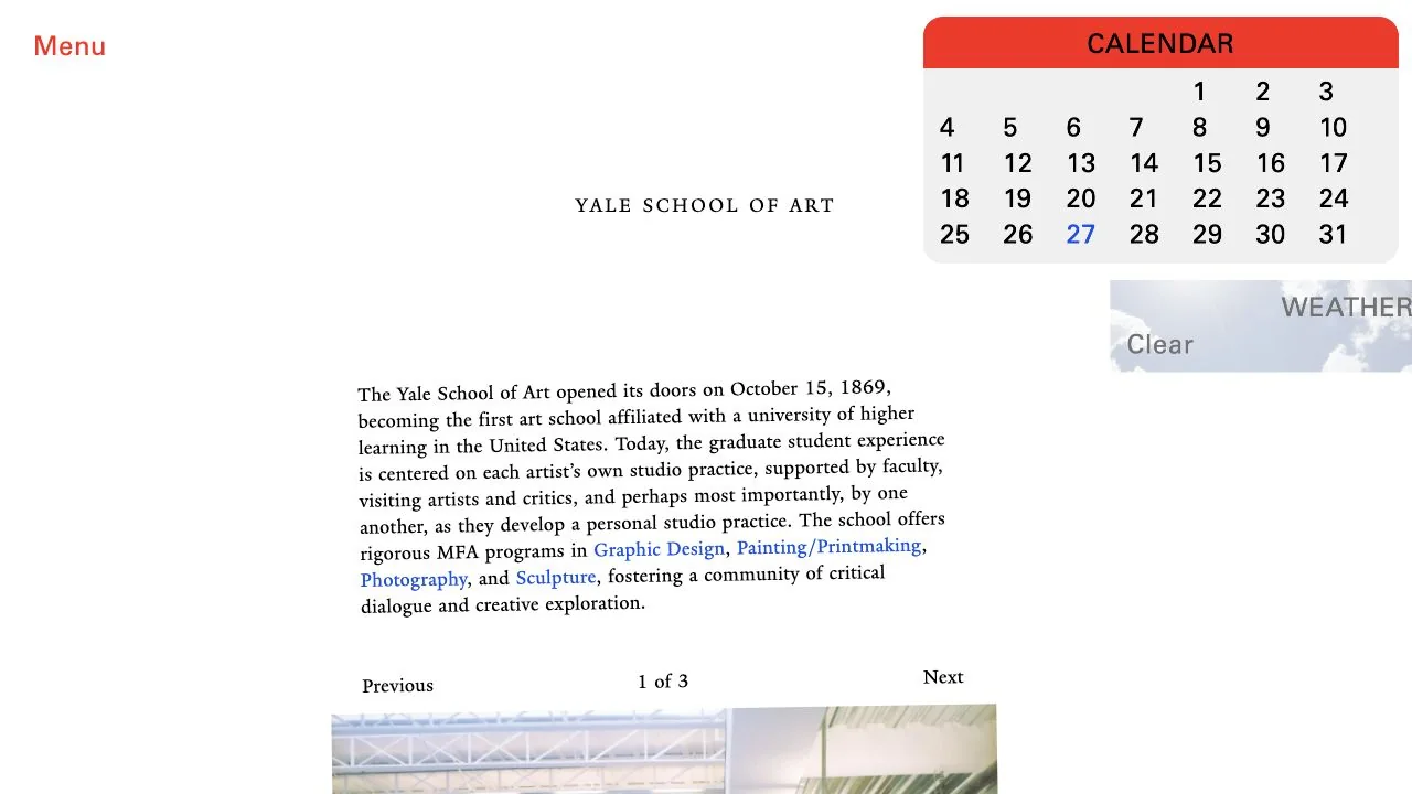
WHAT CAUGHT OUR EYE
Small serif text occupies a narrow column near the center, without a conventional large hero headline.
Calendar and weather components float on the right, retaining different UI conventions within the same page.
Familiar web cues are used directly, such as a red Menu and blue links in the body text.
MAKE IT YOURS
For cultural institutions or collaboratively edited pages, prioritizing the individuality of information over visual uniformity can be a valid choice. Even when mixing components, preserve discoverable links and comfortable text line lengths so an unpolished quality does not become difficult reading.
Public pages reviewed and independently presented by Design Quest.
Screens reflect the capture date. Visit the official website for its current appearance and interactions.
From study to design
Turn the study’s observations into a brief. Fill in your project details and share it with your team or an AI assistant.
Design Quest UI example
ComponentsEdit the text directly. Copy your version or save it as a Markdown file.
Pass a detail you like on to your team or friends.
Link to this study with the badge. You can also ask us to correct or remove the listing.

Fine rules and dense text present graphics as a tool.
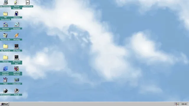
Familiar desktop controls become an entry point for exploration in the browser.
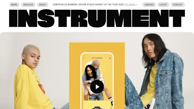
A heavy wordmark and restrained navigation set up a large reel of the studio’s work.