No. 025warp.dev
Warp
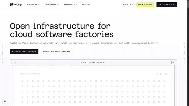
Product & SaaSA white grid and large monospaced type create a technical character.
White space and large type explain how to use the workspace.
Apply this idea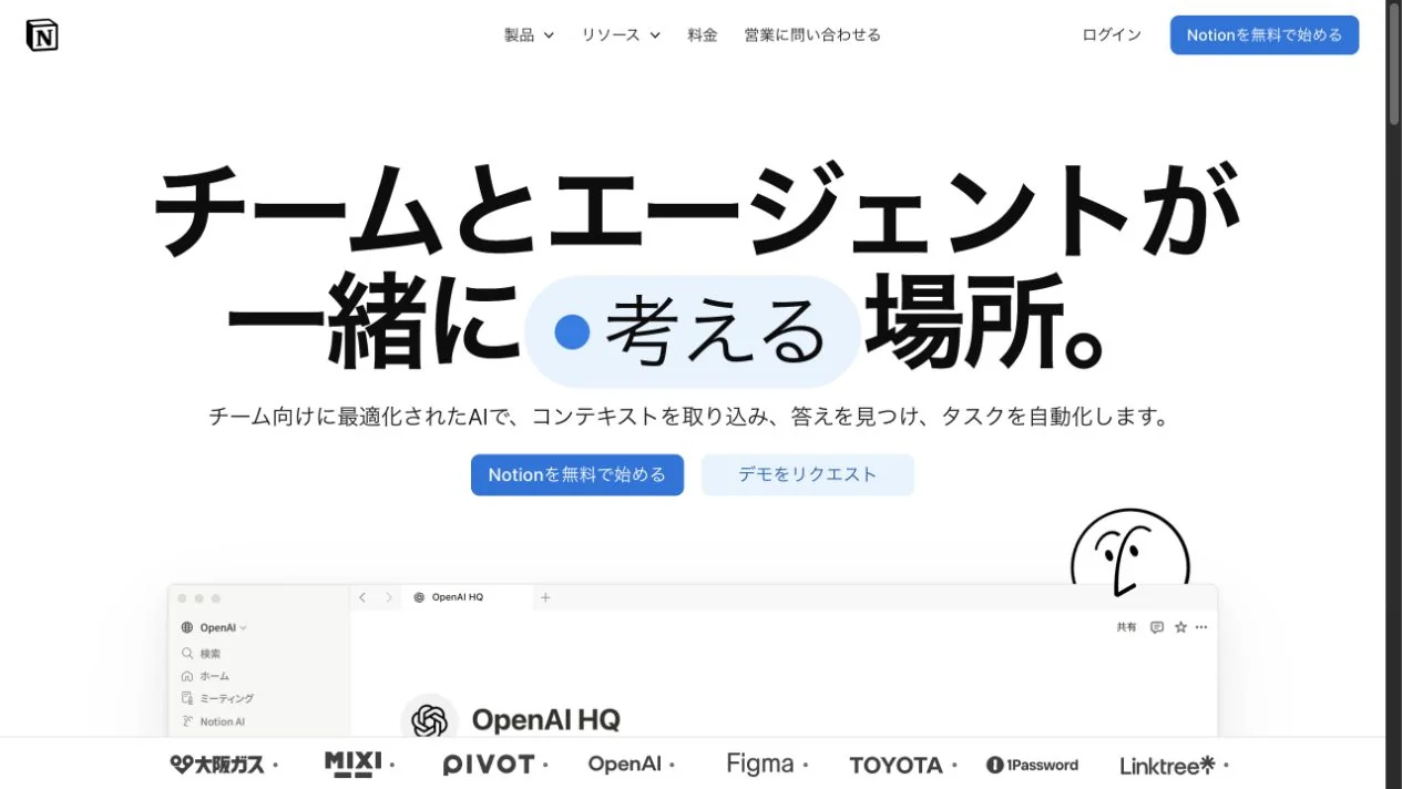
WHAT CAUGHT OUR EYE
Pale blue shapes accompany a bold heading, giving the eye a place to pause.
Actual product screens sit below the heading.
A blue primary button below the large Japanese heading is followed by company logos, guiding readers from understanding to trust.
MAKE IT YOURS
As information grows on a white page, organize the heading, primary action, and proof into three stages along one line. Limiting where color appears helps keep the entry point clear even as descriptions and logos increase.
Public pages reviewed and independently presented by Design Quest.
Screens reflect the capture date. Visit the official website for its current appearance and interactions.
From study to design
Turn the study’s observations into a brief. Fill in your project details and share it with your team or an AI assistant.
Design Quest UI example
NotionEdit the text directly. Copy your version or save it as a Markdown file.
Pass a detail you like on to your team or friends.
Link to this study with the badge. You can also ask us to correct or remove the listing.

A white grid and large monospaced type create a technical character.
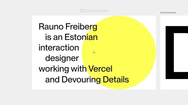
A portfolio that places an introduction on a large card, leaving room to move sideways into the work.
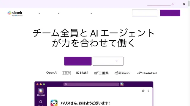
White and purple frame large headings and screens introducing teamwork.