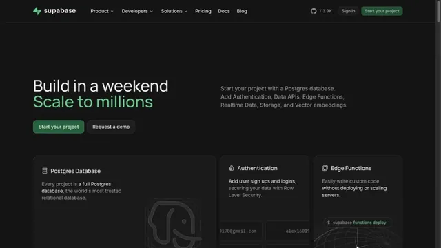
No. 071headspace.com
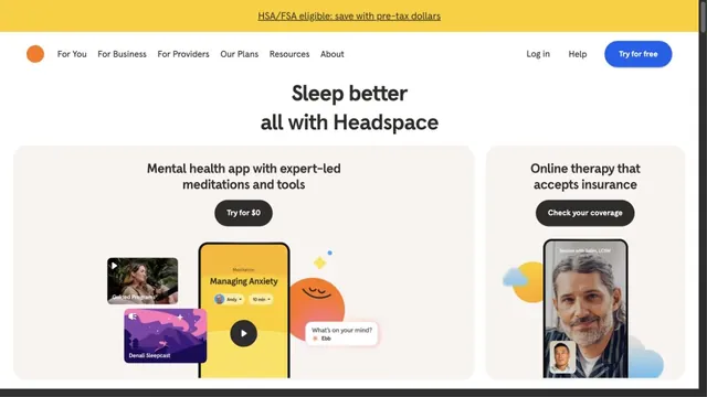
Headspace
Product & SaaSRound characters and soft colors create an approachable entry point.
Hand-drawn speech bubbles and white space convey how approachable form creation can be.
Apply this idea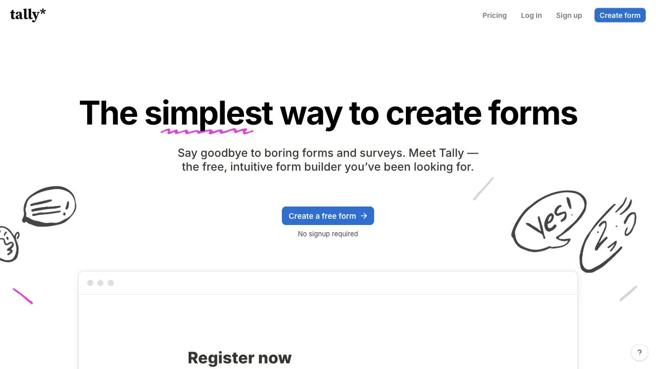
WHAT CAUGHT OUR EYE
A purple hand-drawn line accents part of the large black headline, using a small mark rather than a filled area for emphasis.
Line drawings on either side avoid the central copy, separating visual play from the reading area.
A small note below the blue start button explains the conditions for trying the product close to the action.
MAKE IT YOURS
On an approachable product page, illustration can serve as small supporting details such as emphasis lines and speech bubbles as well as large decoration. Explaining the conditions for getting started near the primary button connects the light visual tone to an easy first use.
Public pages reviewed and independently presented by Design Quest.
Screens reflect the capture date. Visit the official website for its current appearance and interactions.
From study to design
Turn the study’s observations into a brief. Fill in your project details and share it with your team or an AI assistant.
Design Quest UI example
SaaS productEdit the text directly. Copy your version or save it as a Markdown file.
Pass a detail you like on to your team or friends.
Link to this study with the badge. You can also ask us to correct or remove the listing.

Round characters and soft colors create an approachable entry point.
A focused landing page with white headings on a dark screen.
Green accents and neatly organized feature cards define the page.