No. 008noguchi.org
The Noguchi Museum
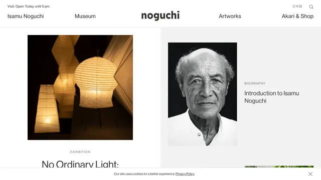
Culture & mediaA two-part layout gives the exhibition and biography separate spaces, with white space drawing attention to the photographs.
Furniture photography and orderly typography introduce products with a calm tone.
Apply this idea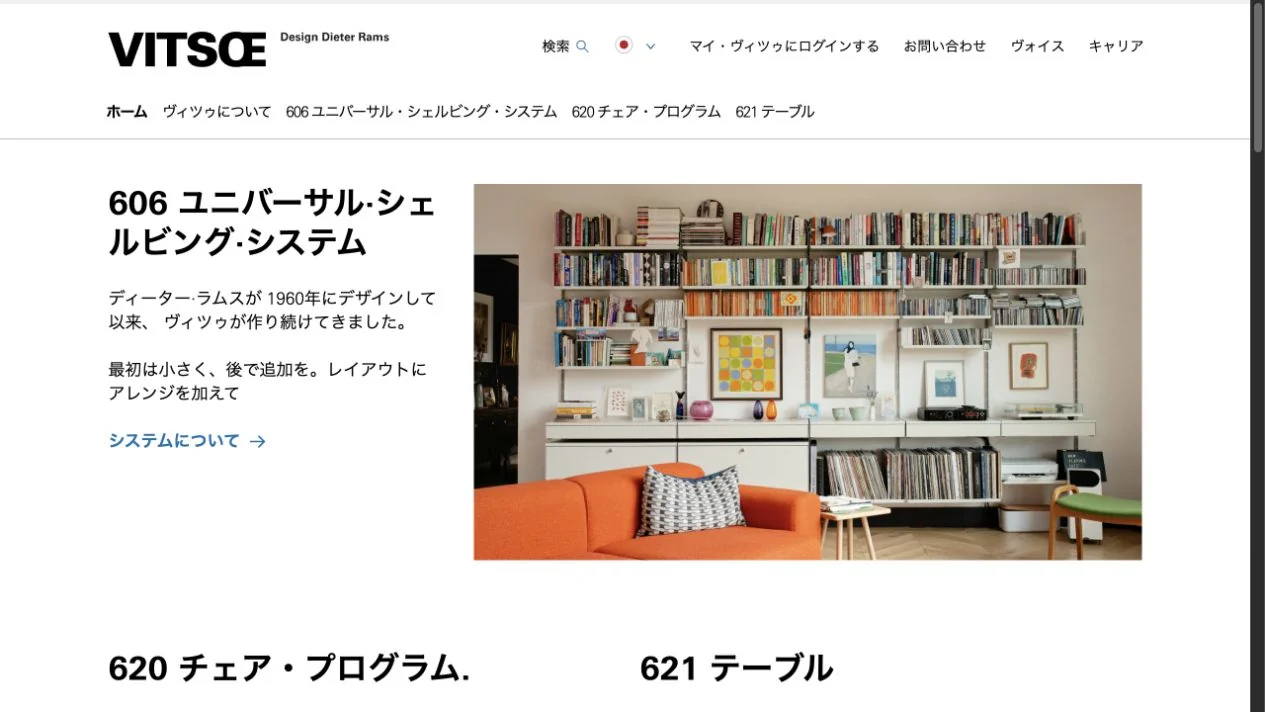
WHAT CAUGHT OUR EYE
Descriptions on the left and furniture photographs on the right fit into clear columns.
A white background and understated link colors let product photographs take the lead.
Product names, descriptions, and photographs of living spaces are divided left and right, with nearby text adding context to the photographs.
MAKE IT YOURS
When a product's value lies in a way of living or long-term use, show it in its setting as well as in isolated product shots. Keeping model numbers and descriptions nearby connects evocative photographs with concrete product information.
Public pages reviewed and independently presented by Design Quest.
Screens reflect the capture date. Visit the official website for its current appearance and interactions.
From study to design
Turn the study’s observations into a brief. Fill in your project details and share it with your team or an AI assistant.
Design Quest UI example
Gradient galleryEdit the text directly. Copy your version or save it as a Markdown file.
Pass a detail you like on to your team or friends.
Link to this study with the badge. You can also ask us to correct or remove the listing.

A two-part layout gives the exhibition and biography separate spaces, with white space drawing attention to the photographs.
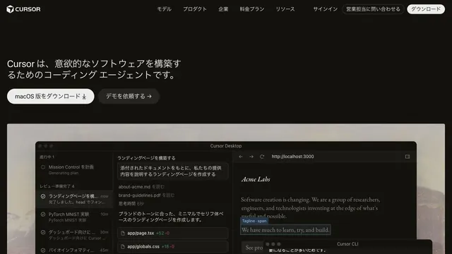
Restrained text and a large actual UI put the product itself at the center.
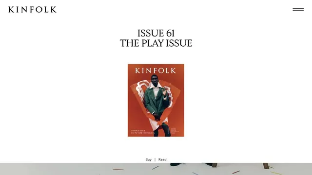
A small magazine cover set within ample space creates the sense of distance of a printed editorial object.