No. 028vercel.com
Vercel
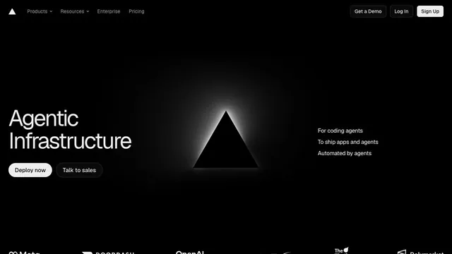
Product & SaaSAn infrastructure product entrance that anchors the eye with just a black triangle and white text.
A white headline and download path stand out amid a dark, organic texture.
Apply this idea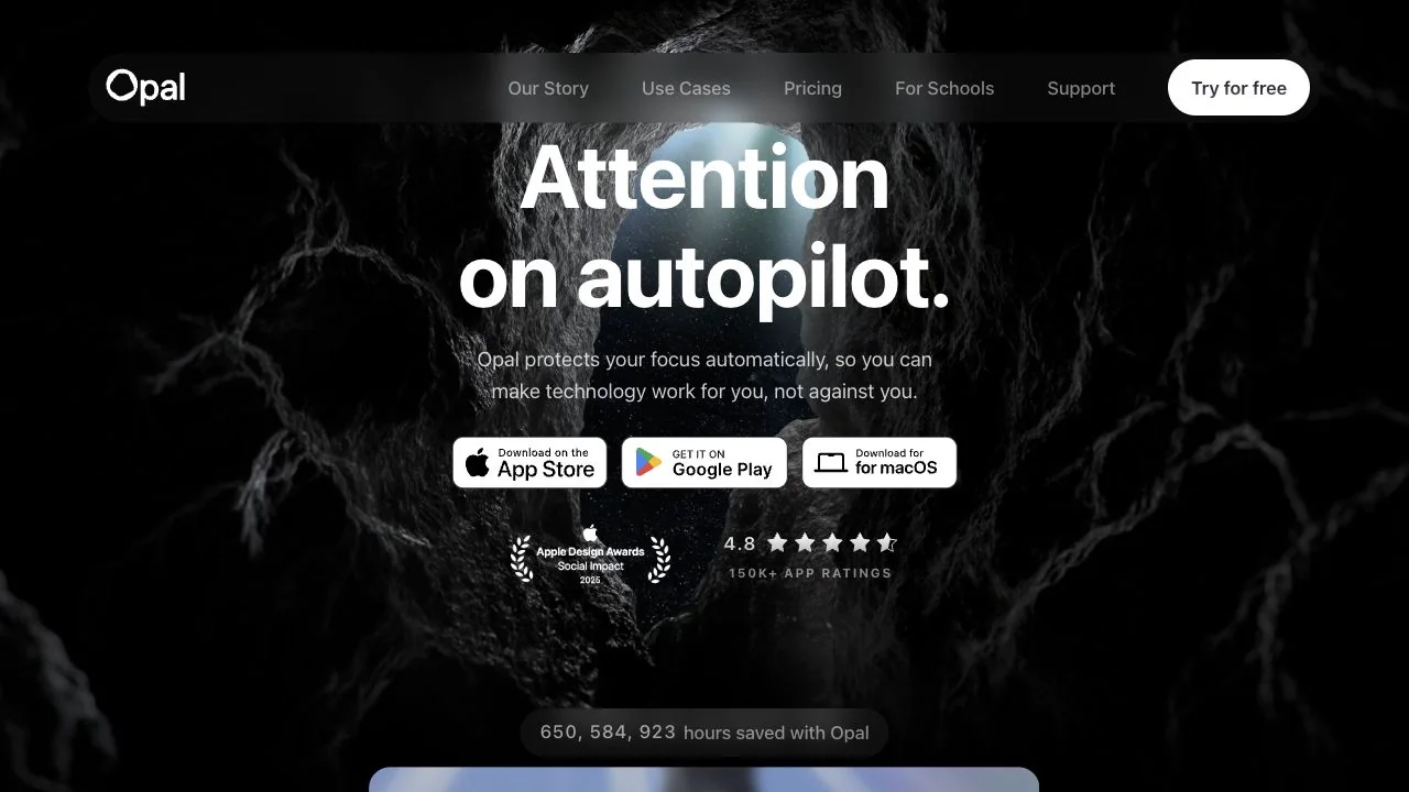
WHAT CAUGHT OUR EYE
The short white headline is limited to two lines, creating strong brightness contrast with the dark organic pattern behind it.
The rounded Try for free button at the top is separate from the download badges in the body, clarifying the roles of navigation and getting started.
Ratings are grouped below the supporting description, keeping the main message and credibility information close together.
MAKE IT YOURS
With a strongly textured background, keep the darkness uniform at least around the text. Grouping the headline, supporting copy, getting-started actions, and credibility information preserves the sequence from visual impression to action.
Public pages reviewed and independently presented by Design Quest.
Screens reflect the capture date. Visit the official website for its current appearance and interactions.
From study to design
Turn the study’s observations into a brief. Fill in your project details and share it with your team or an AI assistant.
Design Quest UI example
SaaS productEdit the text directly. Copy your version or save it as a Markdown file.
Pass a detail you like on to your team or friends.
Link to this study with the badge. You can also ask us to correct or remove the listing.

An infrastructure product entrance that anchors the eye with just a black triangle and white text.
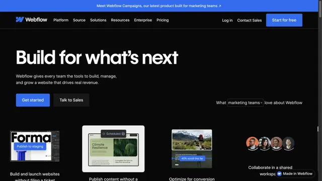
Blue accents on a black page present the product alongside its uses.
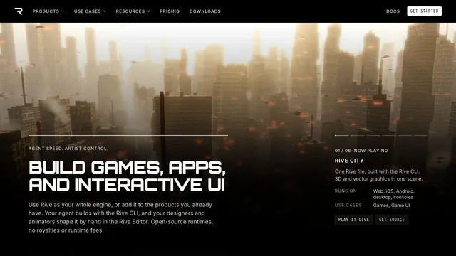
A large 3D demo and technical information share one screen, connecting visual expression with implementation.