No. 028vercel.com
Vercel
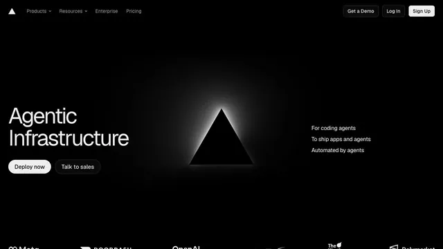
Product & SaaSAn infrastructure product entrance that anchors the eye with just a black triangle and white text.
Black-and-white contrast makes a short message stand out.
Apply this idea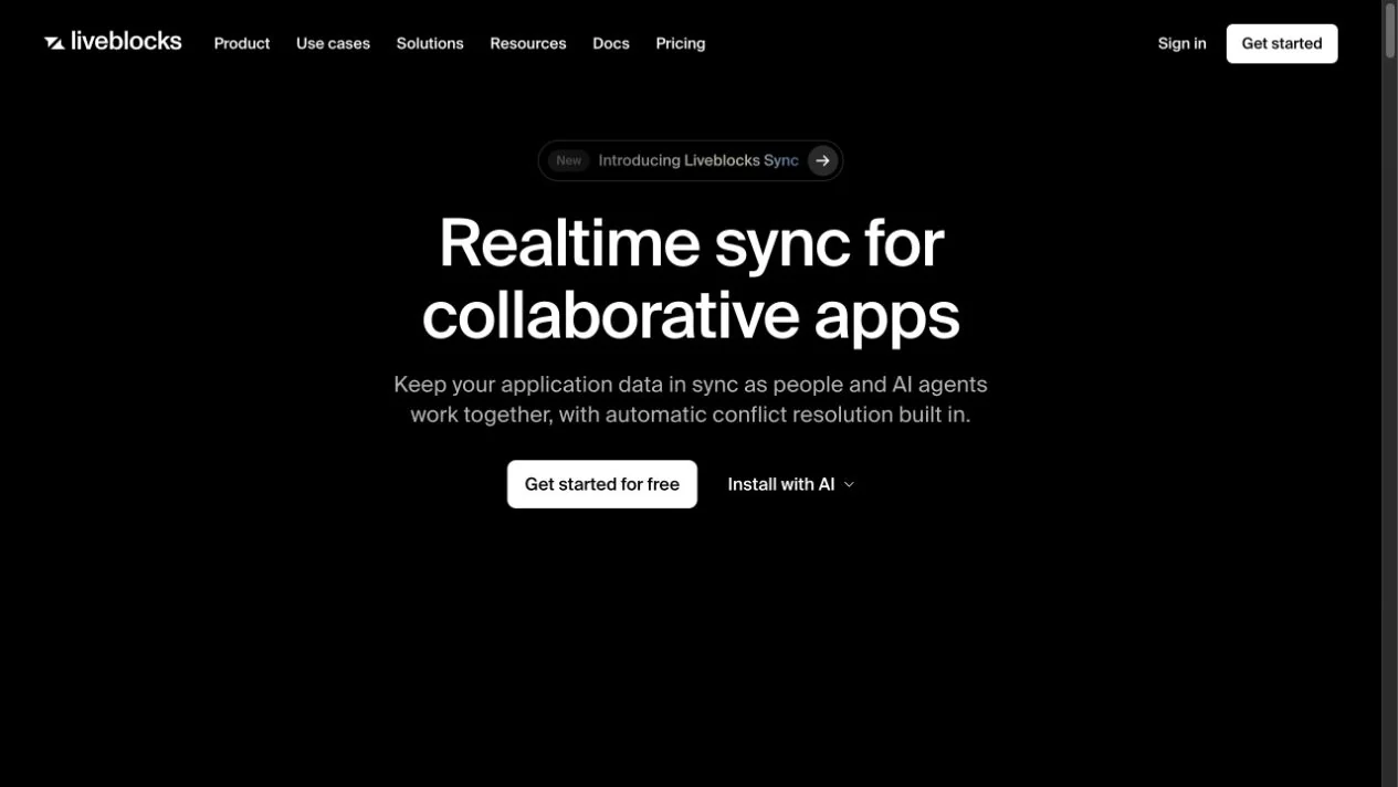
WHAT CAUGHT OUR EYE
A large centered heading brings the description and get-started button together.
A bright primary button is distinguished from a secondary text link.
A short centered description and two links form one group, with ample space keeping the hero focused.
MAKE IT YOURS
For complex features such as collaborative editing, begin with a short heading that states the outcome for users. Placing get-started and learn-more buttons together makes the choice easier for visitors with different levels of understanding.
Public pages reviewed and independently presented by Design Quest.
Screens reflect the capture date. Visit the official website for its current appearance and interactions.
From study to design
Turn the study’s observations into a brief. Fill in your project details and share it with your team or an AI assistant.
Design Quest UI example
SaaS productEdit the text directly. Copy your version or save it as a Markdown file.
Pass a detail you like on to your team or friends.
Link to this study with the badge. You can also ask us to correct or remove the listing.

An infrastructure product entrance that anchors the eye with just a black triangle and white text.
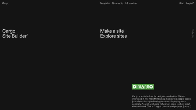
A site builder's entry point defined by expansive empty space and scattered text.
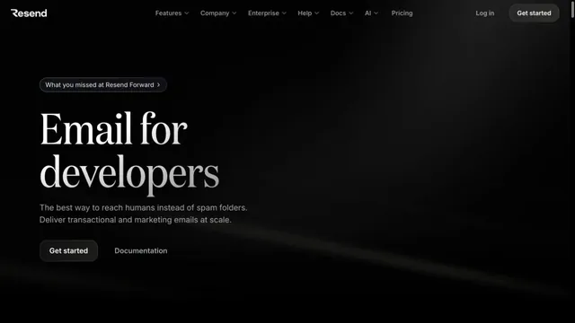
An email API site with serif headings floating in a dark space.