No. 061abcdinamo.com
Dinamo
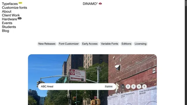
Design toolsA typeface showcase built from lists of text and bold empty space.
Typefaces, merchandise, and photography share a black surface, showing the material quality of letterforms.
Apply this idea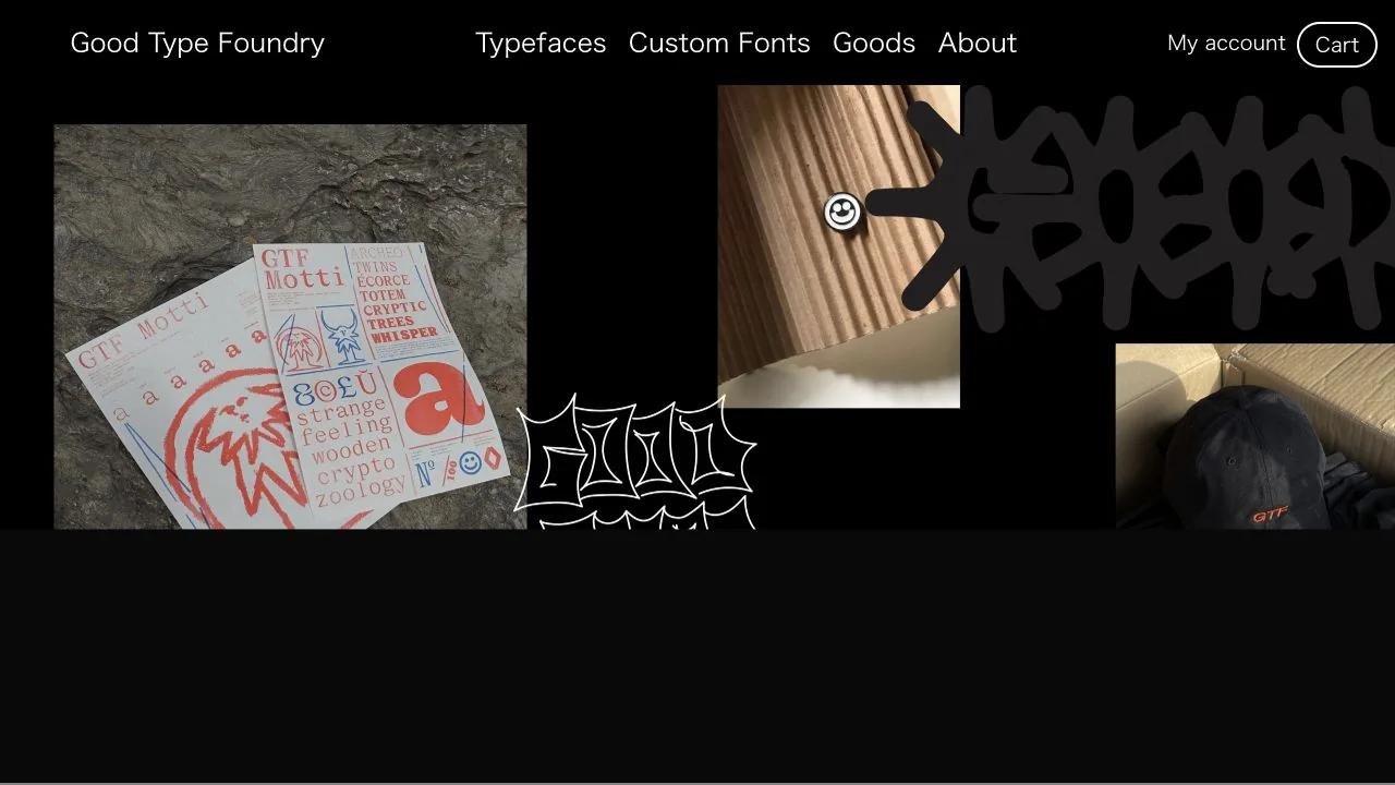
WHAT CAUGHT OUR EYE
A shared black background places the different textures of paper, photographs, and large type side by side.
Large graphic lettering overlays the work, presenting the typeface as part of the piece rather than an explanation of it.
The header is limited to simple text links and a fine Cart outline, giving the work and controls different visual weights.
MAKE IT YOURS
On a site selling type-related products, placing type specimens and photographs of physical objects in the same view shows how the type looks in use. With such expressive work, short, clear shopping and category navigation labels offer a useful counterbalance.
Public pages reviewed and independently presented by Design Quest.
Screens reflect the capture date. Visit the official website for its current appearance and interactions.
From study to design
Turn the study’s observations into a brief. Fill in your project details and share it with your team or an AI assistant.
Design Quest UI example
Gradient galleryEdit the text directly. Copy your version or save it as a Markdown file.
Pass a detail you like on to your team or friends.
Link to this study with the badge. You can also ask us to correct or remove the listing.

A typeface showcase built from lists of text and bold empty space.
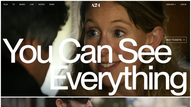
A large film image and screen-spanning type turn a film announcement into a single visual.
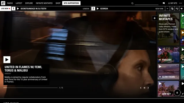
Fine dividers and square play controls bring live radio and on-demand listening together in one view.