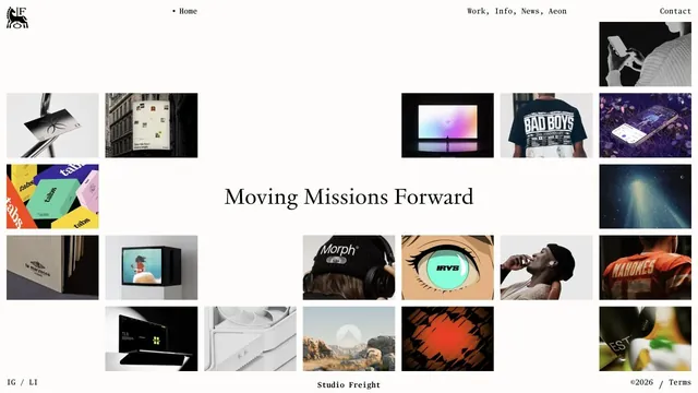
No. 012instrument.com
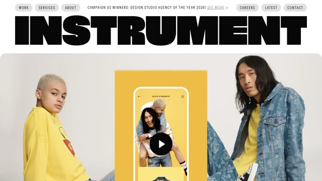
Instrument
Creative studioA heavy wordmark and restrained navigation set up a large reel of the studio’s work.
6 of the 12 Creative studio websites in the collection use the Typography style.
Observe the size contrast between headings and body text, line length, letter spacing, and overlaps with photographs to learn how type alone can create rhythm.
Notice the relationship between work presentation and navigation, and how the studio communicates its character at first sight.
| Studies | 6 of 81 (7%) |
|---|---|
| Share of Creative studio websites | 6 of 12 (50%) |
| Share of Typography style websites | 6 of 40 (15%) |
| Often paired with | Light (6), Minimal (2), Motion (2) |
A heavy wordmark and restrained navigation set up a large reel of the studio’s work.
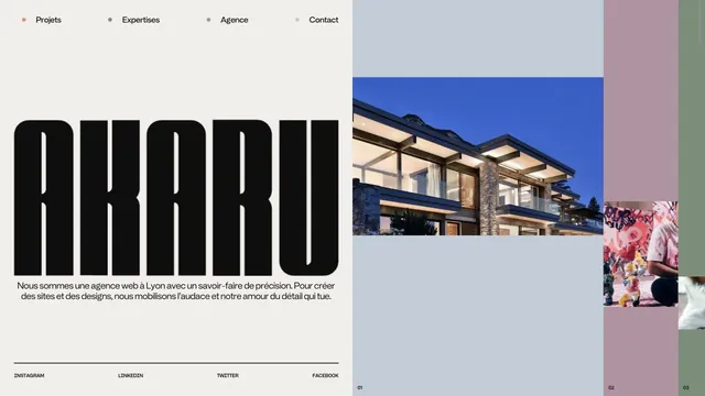
An asymmetric studio entrance built from an extremely tall logo and strips of project photography.
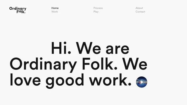
A brief introduction becomes oversized type, making the words themselves the face of the studio.
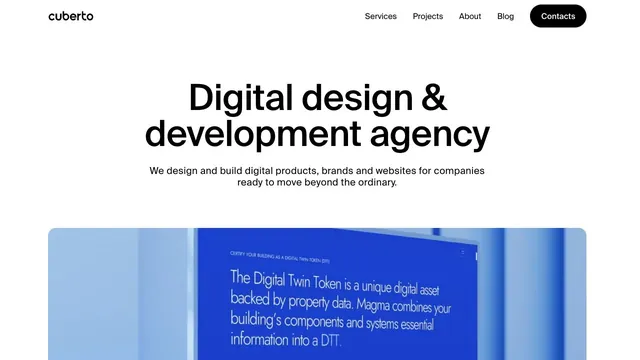
A clear, large headline and generously sized work examples immediately show what the company does.
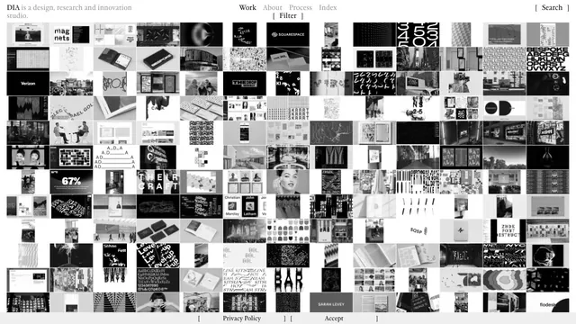
A vast body of work is packed into small tiles, making the index itself the studio's expression.
Tiles of work and serif type are combined within generous space.
Pass this list of references on to your team.
Public pages reviewed on 2026.10.27–2026.11.13. Visit each official website for its current appearance and interactions.