No. 050goodtypefoundry.com
Good Type Foundry
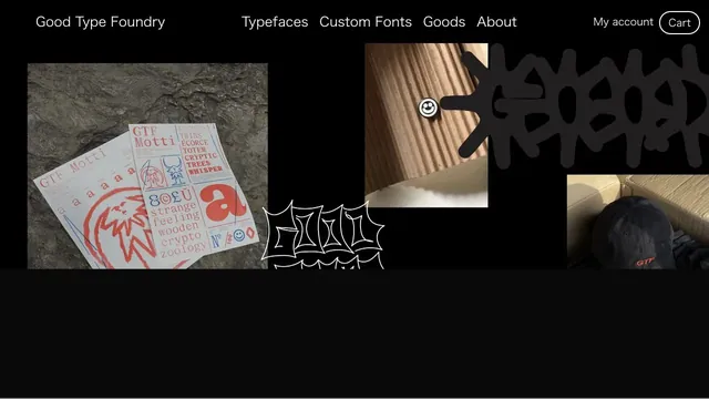
Design toolsTypefaces, merchandise, and photography share a black surface, showing the material quality of letterforms.
A site builder's entry point defined by expansive empty space and scattered text.
Apply this idea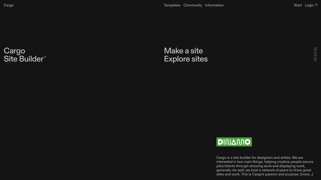
WHAT CAUGHT OUR EYE
The title, links, and description are placed apart, making space part of the composition.
Fragments of example work punctuate a screen with few colors.
Descriptions and links sit far apart, leaving an unexpected expanse of space around the small central example.
MAKE IT YOURS
A portfolio's entry page can guide the eye through space without gathering everything in the center. Keep primary link names clear to balance free placement with understandable controls.
Public pages reviewed and independently presented by Design Quest.
Screens reflect the capture date. Visit the official website for its current appearance and interactions.
From study to design
Turn the study’s observations into a brief. Fill in your project details and share it with your team or an AI assistant.
Design Quest UI example
ComponentsEdit the text directly. Copy your version or save it as a Markdown file.
Pass a detail you like on to your team or friends.
Link to this study with the badge. You can also ask us to correct or remove the listing.

Typefaces, merchandise, and photography share a black surface, showing the material quality of letterforms.
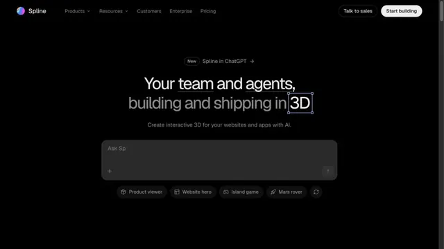
An input field in a black space shows how to start creating in 3D.
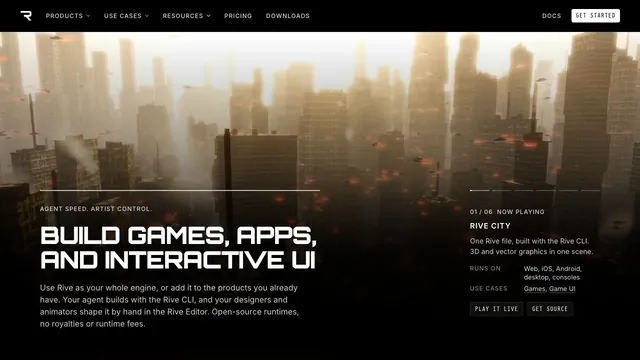
A large 3D demo and technical information share one screen, connecting visual expression with implementation.