No. 021liveblocks.io
Liveblocks
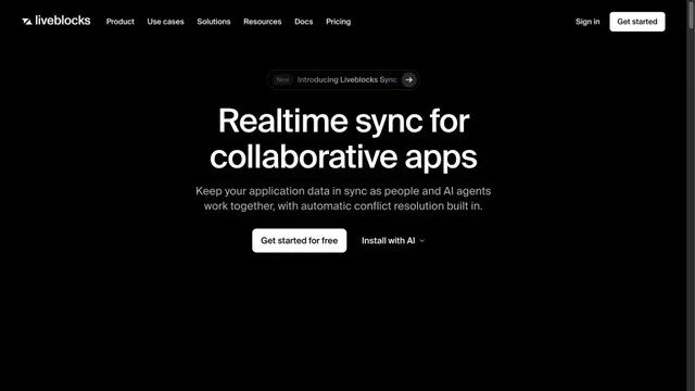
Product & SaaSBlack-and-white contrast makes a short message stand out.
A near-black background and large headings convey the shape of the product.
Apply this idea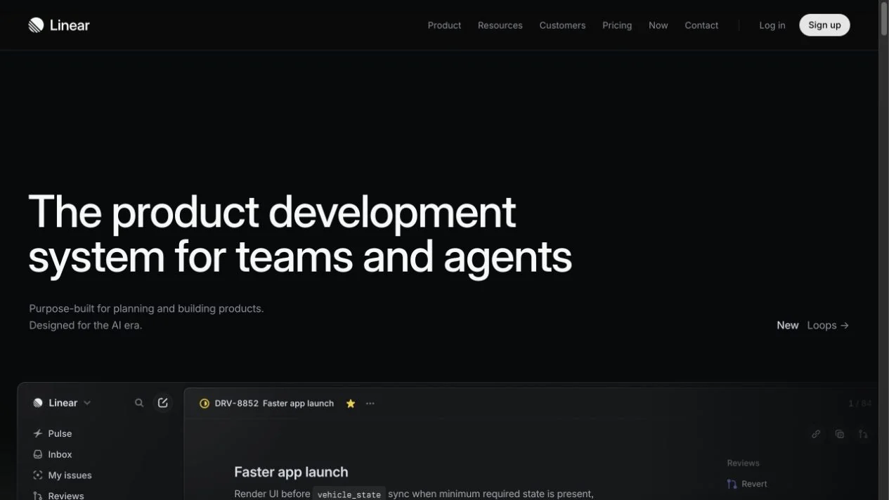
WHAT CAUGHT OUR EYE
Large, left-aligned headings contrast with slender navigation.
App screens slightly brighter than the background create hierarchy within the dark palette.
The headline and supporting copy share a left edge, leading into the app preview below.
MAKE IT YOURS
For a dark dashboard, first define the tonal steps for backgrounds, panels, and borders. Before adding more colors, highlight only important actions with brighter surfaces to help preserve priorities as information grows.
Public pages reviewed and independently presented by Design Quest.
Screens reflect the capture date. Visit the official website for its current appearance and interactions.
From study to design
Turn the study’s observations into a brief. Fill in your project details and share it with your team or an AI assistant.
Design Quest UI example
LinearEdit the text directly. Copy your version or save it as a Markdown file.
Pass a detail you like on to your team or friends.
Link to this study with the badge. You can also ask us to correct or remove the listing.

Black-and-white contrast makes a short message stand out.
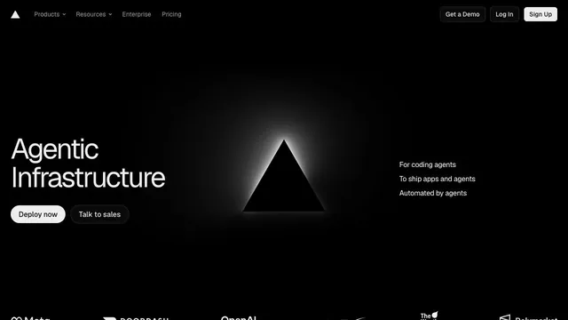
An infrastructure product entrance that anchors the eye with just a black triangle and white text.
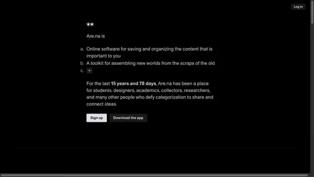
A quiet collection service site focused on short text and space.