No. 041are.na
Are.na
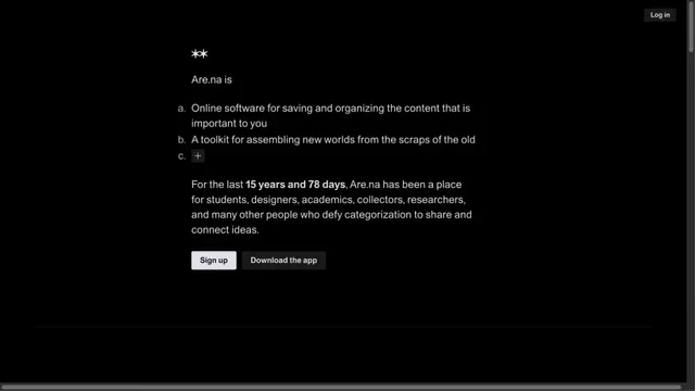
Product & SaaSA quiet collection service site focused on short text and space.
An infrastructure product entrance that anchors the eye with just a black triangle and white text.
Apply this idea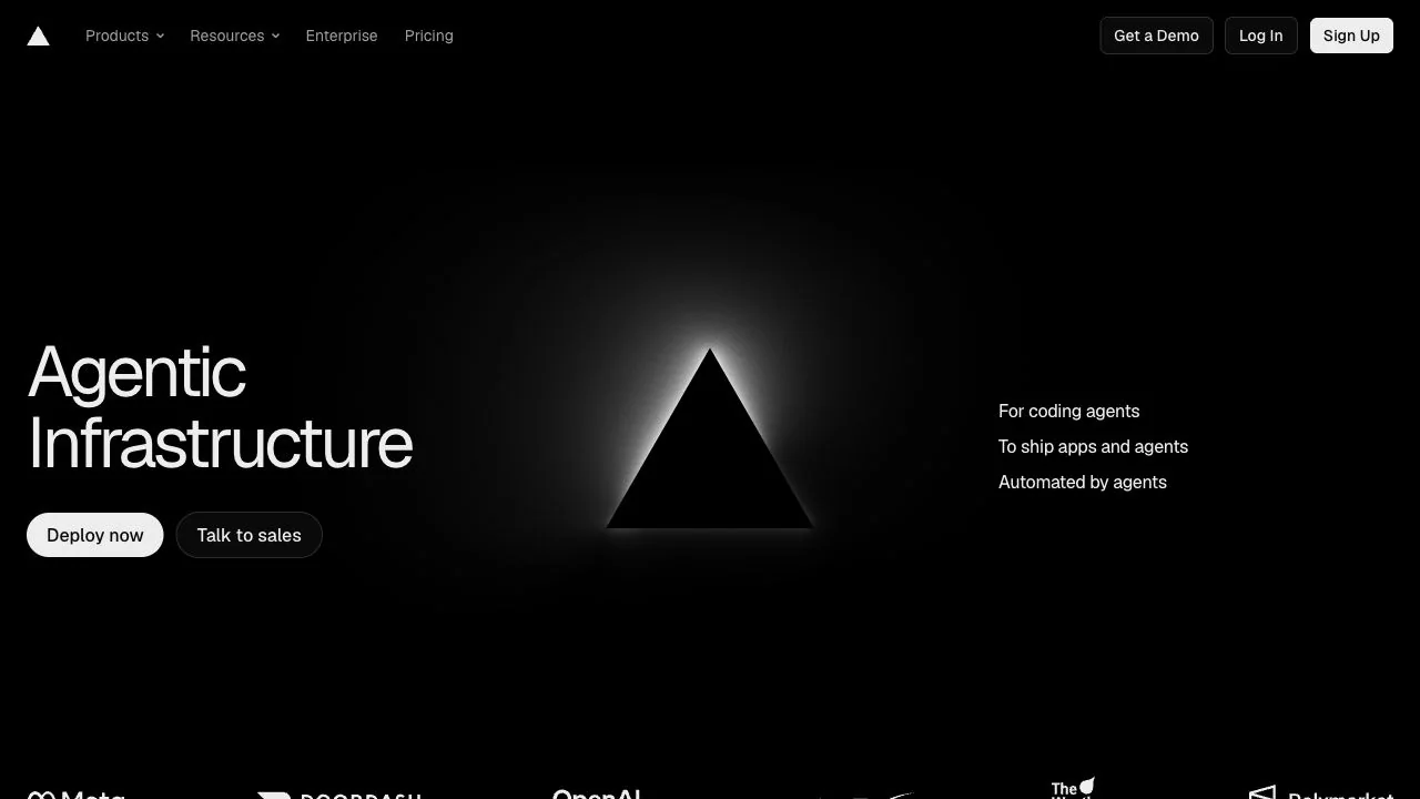
WHAT CAUGHT OUR EYE
White light outlines the central black triangle, revealing a shape that shares the background's color through differences in shading.
A headline and action links sit on the left, with a brief explanation on the right, forming a three-part composition around the central symbol.
Consistently small header text and buttons organize the information through their scale contrast with the large hero.
MAKE IT YOURS
Even a monochrome screen can establish a visual focus through variations in shape, shading, and space. When enlarging a logo symbol, keep the copy on either side brief so the symbol and explanation do not compete.
Public pages reviewed and independently presented by Design Quest.
Screens reflect the capture date. Visit the official website for its current appearance and interactions.
From study to design
Turn the study’s observations into a brief. Fill in your project details and share it with your team or an AI assistant.
Design Quest UI example
VercelEdit the text directly. Copy your version or save it as a Markdown file.
Pass a detail you like on to your team or friends.
Link to this study with the badge. You can also ask us to correct or remove the listing.

A quiet collection service site focused on short text and space.
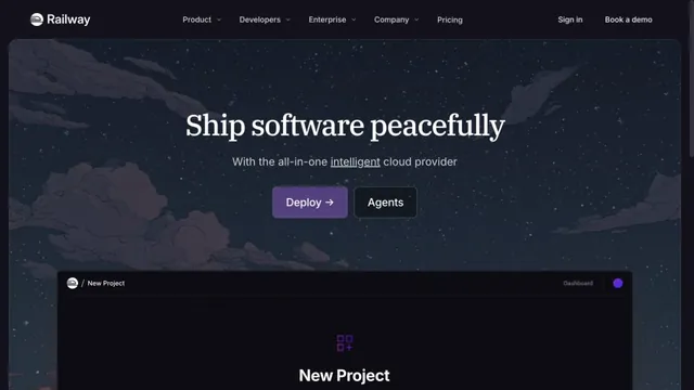
A cloud service site connecting night-sky illustrations with product screens.
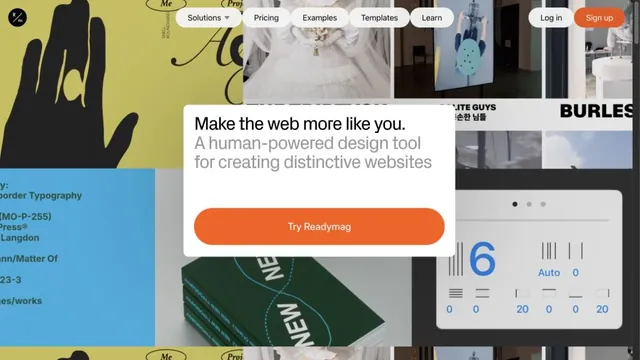
A collage of text, photographs, and examples invites free-form website creation.