No. 075teenage.engineering
teenage engineering
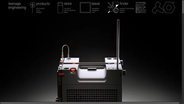
CommerceProduct photographs are paired with navigation resembling technical drawings.
An outdoor brand's entry point, with short words layered over a large photograph.
Apply this idea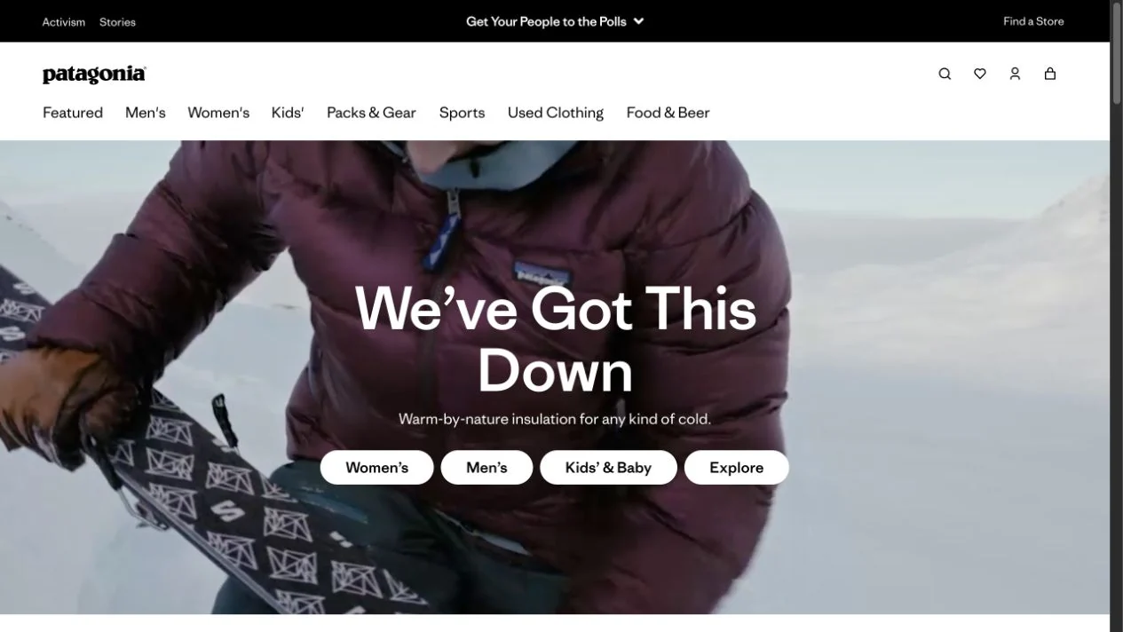
WHAT CAUGHT OUR EYE
A full-width photograph and short heading convey the setting in which products are used.
Category links over the photograph are grouped into small, bright buttons.
Short copy sits at the center of a photograph of people in motion, with product-category links in the same field of view.
MAKE IT YOURS
Even when photographs convey a brand's world, keep the path into shopping close at hand. Grouping photography, short copy, and category choices can lead naturally from affinity with the brand to exploring its products.
Public pages reviewed and independently presented by Design Quest.
Screens reflect the capture date. Visit the official website for its current appearance and interactions.
From study to design
Turn the study’s observations into a brief. Fill in your project details and share it with your team or an AI assistant.
Design Quest UI example
Gradient galleryEdit the text directly. Copy your version or save it as a Markdown file.
Pass a detail you like on to your team or friends.
Link to this study with the badge. You can also ask us to correct or remove the listing.

Product photographs are paired with navigation resembling technical drawings.
A large film image and screen-spanning type turn a film announcement into a single visual.
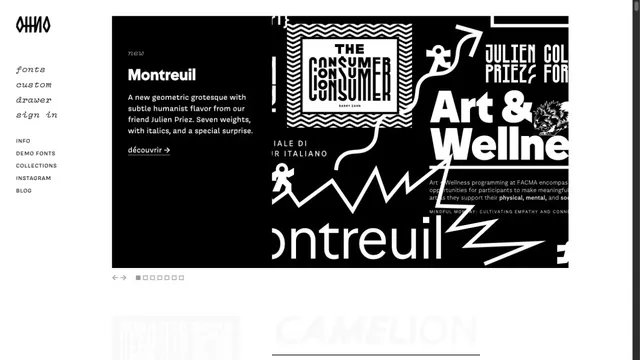
A typeface showcase centered on the shapes of letters.