No. 001linear.app

Linear
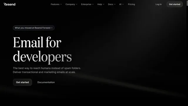
Product & SaaSA near-black background and large headings convey the shape of the product.
Deep wine tones and white serif type give a video editing tool an editorial voice.
Apply this idea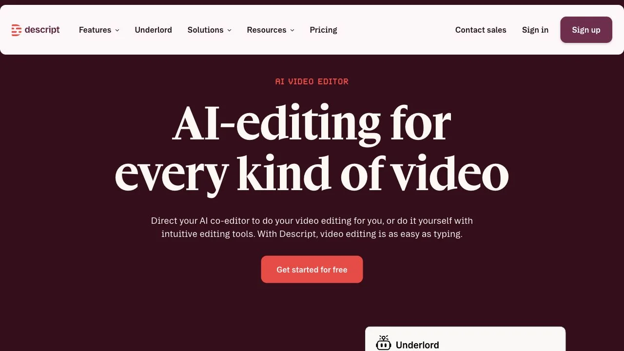
WHAT CAUGHT OUR EYE
A large white serif headline pairs with a small sans-serif description, separating the main statement from its support.
The background uses deep wine instead of black, creating a brightness contrast with the red primary button within the same color family.
A pale header forms an independent band, making navigation easy to find even above a dark body section.
MAKE IT YOURS
A dark brand site can use a deep chromatic color as its foundation, rather than only black, to establish its own sense of warmth. Different typefaces for headlines and supporting text, plus different brightness levels for the header and CTA, create both atmosphere and a hierarchy of actions.
Public pages reviewed and independently presented by Design Quest.
Screens reflect the capture date. Visit the official website for its current appearance and interactions.
From study to design
Turn the study’s observations into a brief. Fill in your project details and share it with your team or an AI assistant.
Design Quest UI example
SaaS productEdit the text directly. Copy your version or save it as a Markdown file.
Pass a detail you like on to your team or friends.
Link to this study with the badge. You can also ask us to correct or remove the listing.

A near-black background and large headings convey the shape of the product.
An email API site with serif headings floating in a dark space.
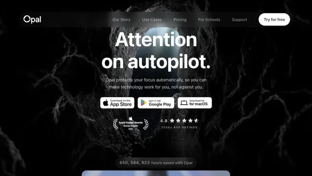
A white headline and download path stand out amid a dark, organic texture.