No. 001linear.app

Linear
Product & SaaSA near-black background and large headings convey the shape of the product.
A quiet collection service site focused on short text and space.
Apply this idea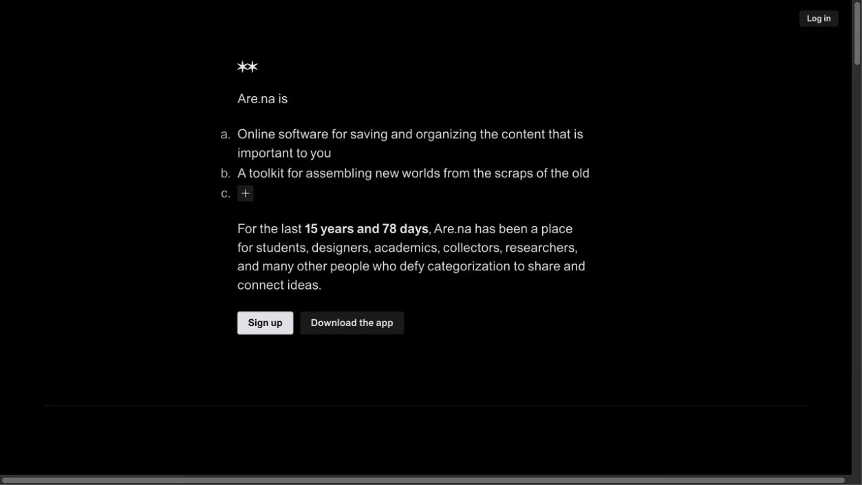
WHAT CAUGHT OUR EYE
Small, restrained symbols and text explain the service's philosophy.
A narrow text column is paired with a broad expanse of black space.
Narrow lines of text and small links woven into the prose make reading the main interaction.
MAKE IT YOURS
Pages explaining a philosophy or concept can center readable line lengths and paragraph breaks without a huge hero image. A useful reference is to offer only the necessary links as readers progress through the text.
Public pages reviewed and independently presented by Design Quest.
Screens reflect the capture date. Visit the official website for its current appearance and interactions.
From study to design
Turn the study’s observations into a brief. Fill in your project details and share it with your team or an AI assistant.
Design Quest UI example
SaaS productEdit the text directly. Copy your version or save it as a Markdown file.
Pass a detail you like on to your team or friends.
Link to this study with the badge. You can also ask us to correct or remove the listing.

A near-black background and large headings convey the shape of the product.
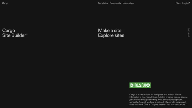
A site builder's entry point defined by expansive empty space and scattered text.
Deep purple light and dark empty space evoke a place for writing notes.