No. 041are.na
Are.na
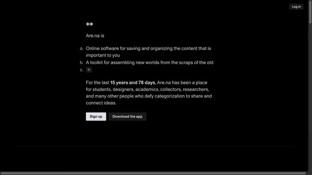
Product & SaaSA quiet collection service site focused on short text and space.
Restrained text and a large actual UI put the product itself at the center.
Apply this idea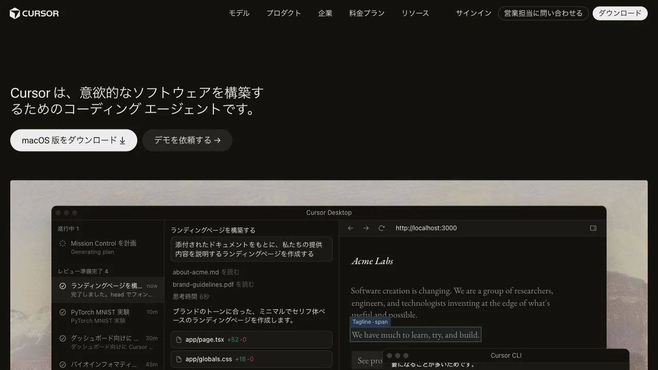
WHAT CAUGHT OUR EYE
The page begins with a brief, left-aligned product description and a getting-started button rather than an oversized, emphatic headline.
Most of the hero is devoted to the actual app screen, shown large enough to read its details.
A pale, textured surface frames the dark UI, establishing a boundary between the website background and the product.
MAKE IT YOURS
When the product interface is convincing on its own, give it more space than the tagline. A quiet outer frame helps preserve separation even when dark screens are layered together.
Public pages reviewed and independently presented by Design Quest.
Screens reflect the capture date. Visit the official website for its current appearance and interactions.
From study to design
Turn the study’s observations into a brief. Fill in your project details and share it with your team or an AI assistant.
Design Quest UI example
SaaS productEdit the text directly. Copy your version or save it as a Markdown file.
Pass a detail you like on to your team or friends.
Link to this study with the badge. You can also ask us to correct or remove the listing.

A quiet collection service site focused on short text and space.
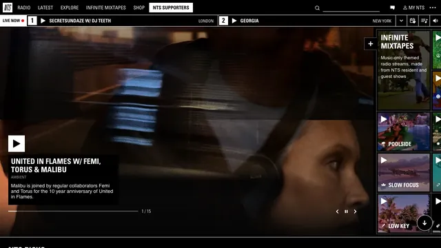
Fine dividers and square play controls bring live radio and on-demand listening together in one view.
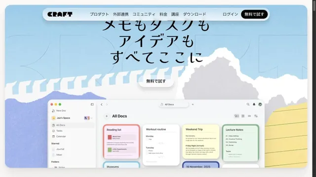
Illustrations of paper and clouds depict a space for writing.