No. 063vitsoe.com
Vitsœ
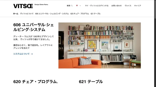
CommerceFurniture photography and orderly typography introduce products with a calm tone.
A product site that places products and brief copy in black space, using emptiness to create presence.
Apply this idea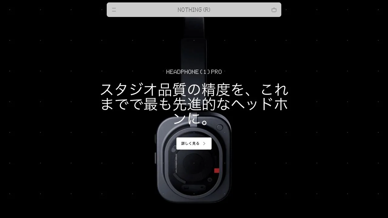
WHAT CAUGHT OUR EYE
A black product sits against a black background, with reflected edges and selective highlights revealing its form.
A slim, translucent navigation bar stays along the top edge, leaving the central product photograph unobstructed.
A short category name, headline, and white details button sit close to the product, grouping the photograph and explanation into one unit.
MAKE IT YOURS
When a product's shape or material has a strong presence, a simple background lets its contours and reflections take the lead. Beyond reducing the amount of text, position explanations and actions where they do not cover the product details you want to show.
Public pages reviewed and independently presented by Design Quest.
Screens reflect the capture date. Visit the official website for its current appearance and interactions.
From study to design
Turn the study’s observations into a brief. Fill in your project details and share it with your team or an AI assistant.
Design Quest UI example
Gradient galleryEdit the text directly. Copy your version or save it as a Markdown file.
Pass a detail you like on to your team or friends.
Link to this study with the badge. You can also ask us to correct or remove the listing.

Furniture photography and orderly typography introduce products with a calm tone.
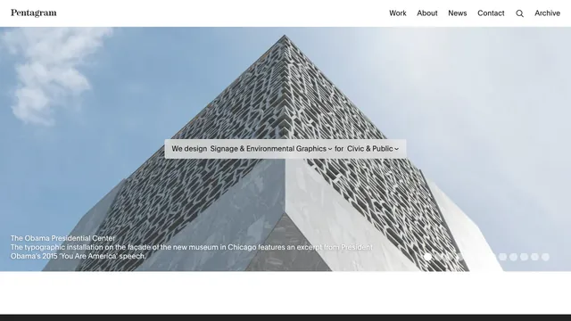
A full-bleed project photo and a sentence-shaped filter let visitors explore the studio’s work by discipline and sector.
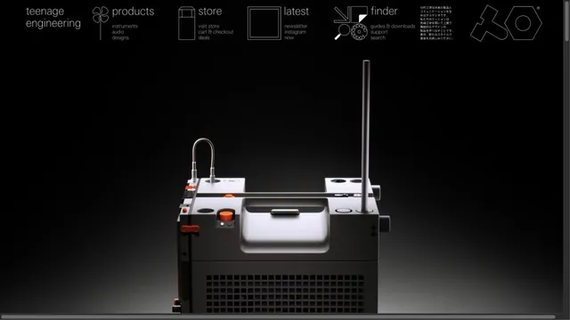
Product photographs are paired with navigation resembling technical drawings.