No. 017supabase.com
Supabase
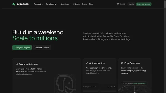
Product & SaaSGreen accents and neatly organized feature cards define the page.
A focused landing page with white headings on a dark screen.
Apply this idea
WHAT CAUGHT OUR EYE
Generous space around the centered heading keeps the message focused.
Fine navigation outlines and bright buttons indicate where to act.
Space surrounds the large white heading, while the download button at the top is bright enough to find easily.
MAKE IT YOURS
For a hero focused on one message, secure space around the heading before adding explanations. Pair a dark background with a white primary button to clarify the first action you want visitors to take.
Public pages reviewed and independently presented by Design Quest.
Screens reflect the capture date. Visit the official website for its current appearance and interactions.
From study to design
Turn the study’s observations into a brief. Fill in your project details and share it with your team or an AI assistant.
Design Quest UI example
SaaS productEdit the text directly. Copy your version or save it as a Markdown file.
Pass a detail you like on to your team or friends.
Link to this study with the badge. You can also ask us to correct or remove the listing.

Green accents and neatly organized feature cards define the page.
Restrained text and a large actual UI put the product itself at the center.
A near-black background and large headings convey the shape of the product.