No. 006apple.com/jp/iphone
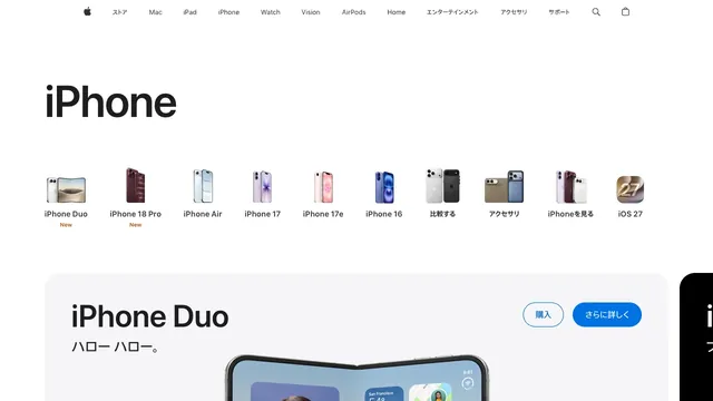
Apple iPhone
CommerceSmall product silhouettes introduce the lineup before the page moves into individual products and purchase links.
A collection of websites that communicate the appeal of products through photography and brief copy. Compare how different brands present themselves through actual screens.
Compare the space devoted to photography, the amount of explanation, and entry points to product categories.
| Studies | 7 of 81 (9%) |
|---|---|
| Top styles | Editorial (4), Dark (3), Light (3) |
| Representative studies | Apple iPhone, Nothing, Gumroad |
Small product silhouettes introduce the lineup before the page moves into individual products and purchase links.
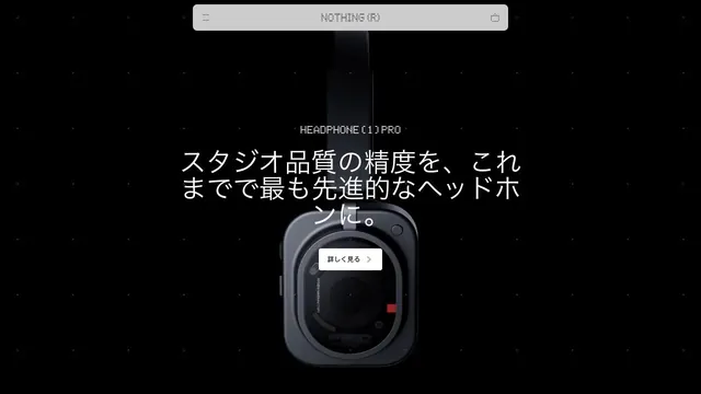
A product site that places products and brief copy in black space, using emptiness to create presence.
Strong black-and-pink contrast is paired with three-dimensional coins.
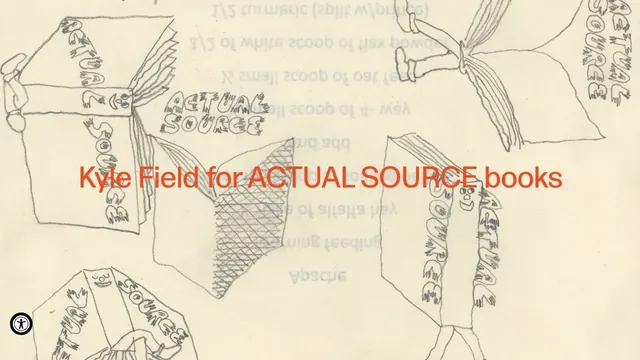
Hand-drawn lines and large red product names make the shop look like a single poster.
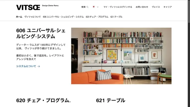
Furniture photography and orderly typography introduce products with a calm tone.
An outdoor brand's entry point, with short words layered over a large photograph.
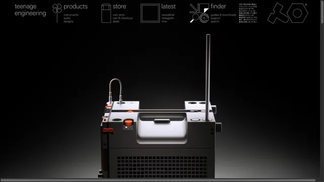
Product photographs are paired with navigation resembling technical drawings.
Pass this list of references on to your team.
Recommending a site is free. We review each one against our editorial approach.
Recommend a websitePublic pages reviewed on 2026.10.27–2026.11.13. Visit each official website for its current appearance and interactions.