No. 001linear.app

Linear
Product & SaaSA near-black background and large headings convey the shape of the product.
Explore sites that communicate the qualities of products and services through headlines, feature introductions, and actual interfaces. Compare landing pages for SaaS products and apps.
Compare the first screen's message, the order in which product screens appear, and the relative emphasis of getting-started buttons.
| Studies | 31 of 81 (38%) |
|---|---|
| Top styles | Light × Product & SaaS (16), Minimal × Product & SaaS (16), Dark × Product & SaaS (15) |
| Representative studies | Linear, Huly, Craft |
A near-black background and large headings convey the shape of the product.
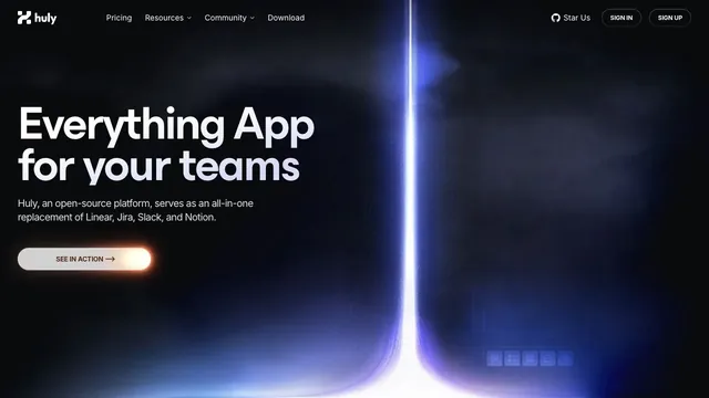
A landing page for a team tool, with blue-violet light cutting through a dark surface.
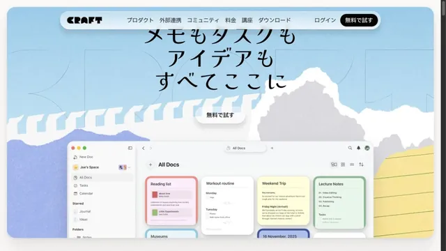
Illustrations of paper and clouds depict a space for writing.
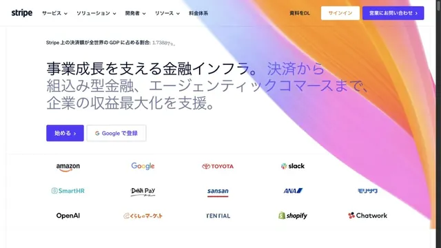
Luminous gradients paired with clear typography.
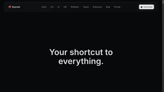
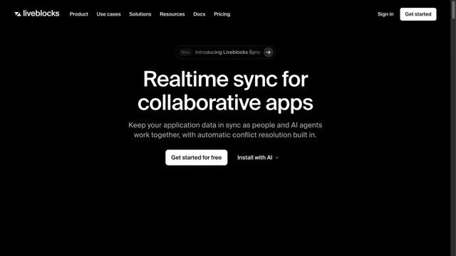
A focused landing page with white headings on a dark screen.
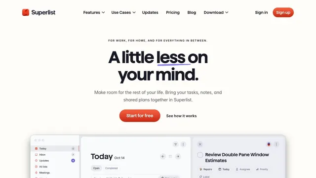
Soft white and a compact red call to action make everyday tasks feel lighter.
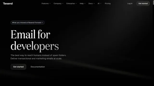
An email API site with serif headings floating in a dark space.
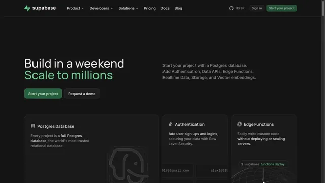
Green accents and neatly organized feature cards define the page.
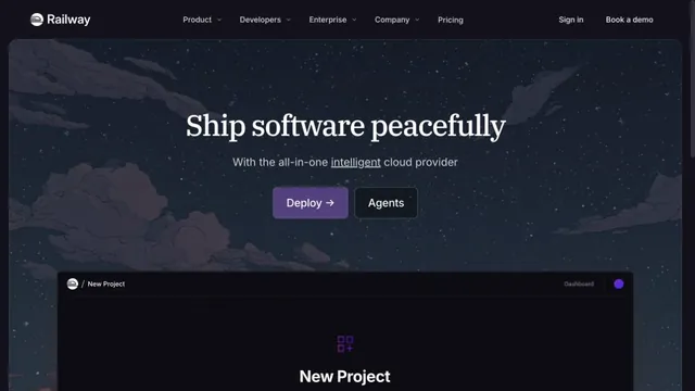
A cloud service site connecting night-sky illustrations with product screens.
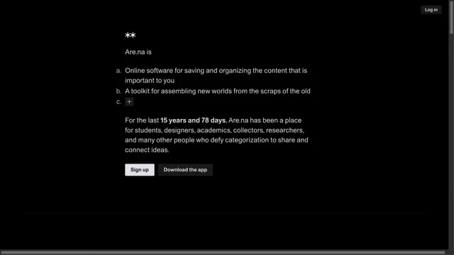
Black-and-white contrast makes a short message stand out.
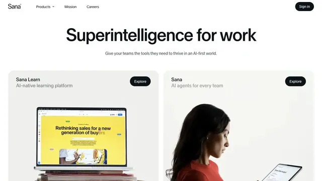
A quiet white product hub presenting two products through a shared card structure.
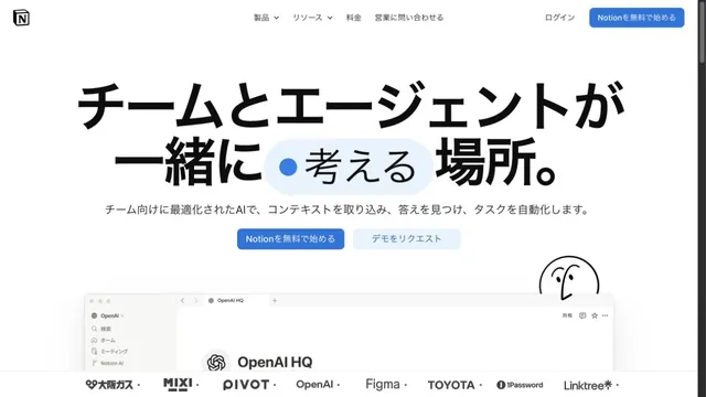
White space and large type explain how to use the workspace.
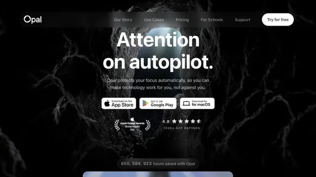
A white headline and download path stand out amid a dark, organic texture.
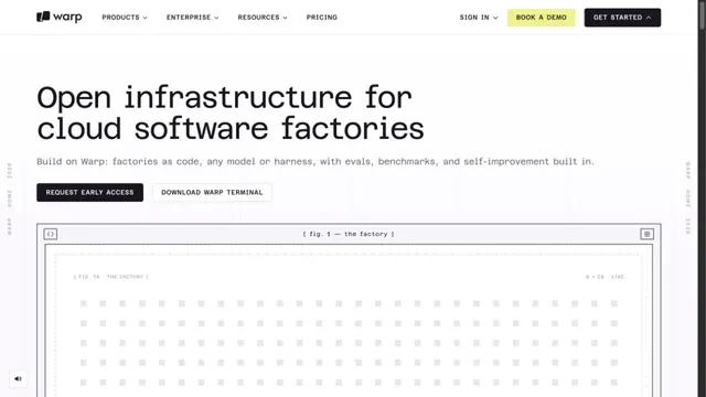
A white grid and large monospaced type create a technical character.
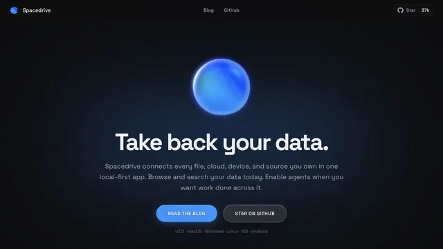
A blue sphere and a quiet pool of light give a data tool a tactile impression.
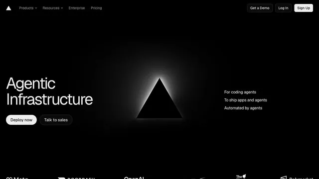
An infrastructure product entrance that anchors the eye with just a black triangle and white text.
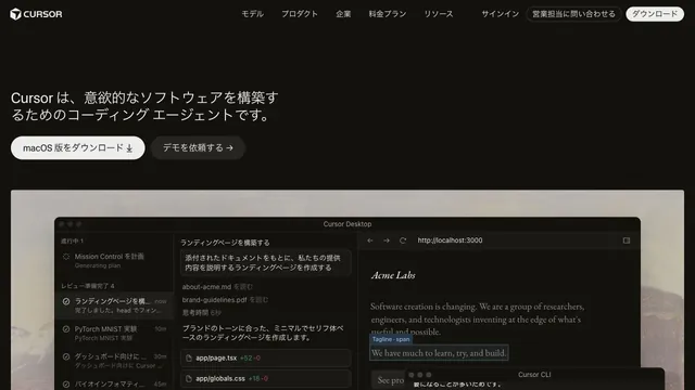
Restrained text and a large actual UI put the product itself at the center.
A copy-led brand expression that switches between sans serif and serif within a single paragraph.
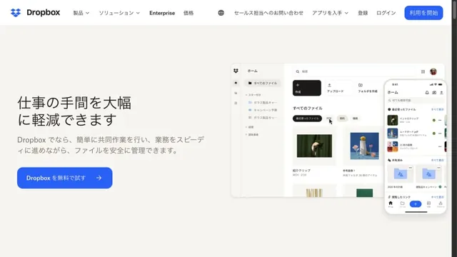
Files and screens float lightly across a soft white background.
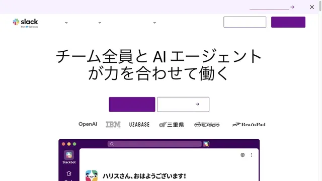
White and purple frame large headings and screens introducing teamwork.
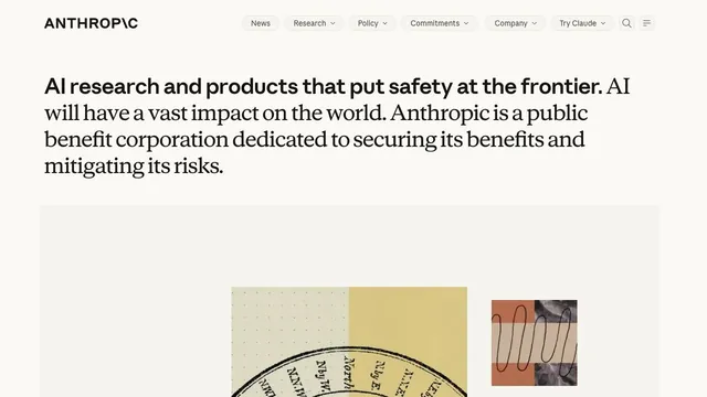
A quiet collection service site focused on short text and space.
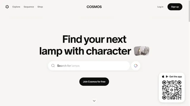
A gateway to visual discovery centered on a large search field and short heading.
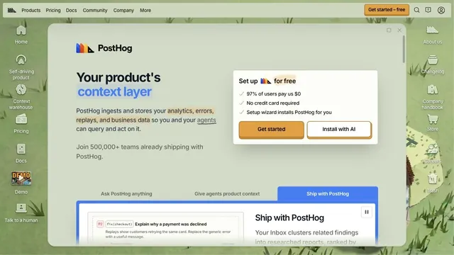
Desktop-style windows and a hand-drawn world turn entering the product into an exploration.
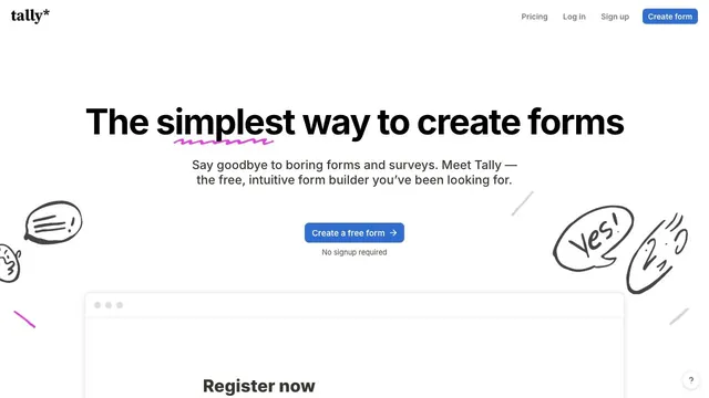
Hand-drawn speech bubbles and white space convey how approachable form creation can be.
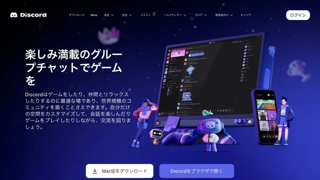
Characters and devices gather in a blue-violet space, giving a place for conversation a three-dimensional form.
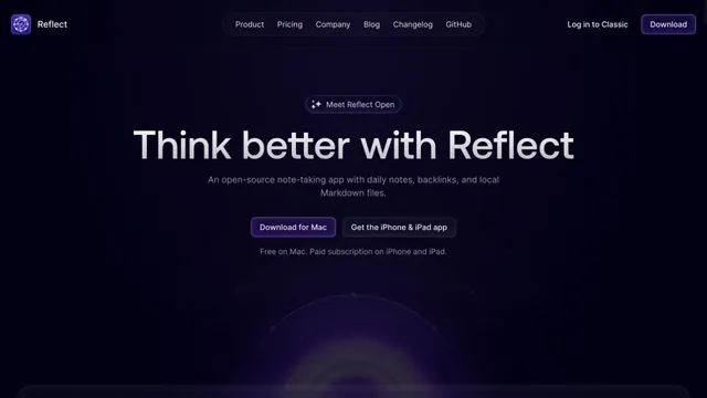
Deep purple light and dark empty space evoke a place for writing notes.
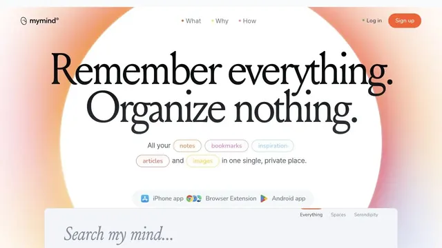
A ring of soft color and large serif type create the impression of a place to entrust your memories.
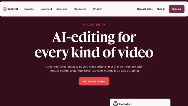
Deep wine tones and white serif type give a video editing tool an editorial voice.
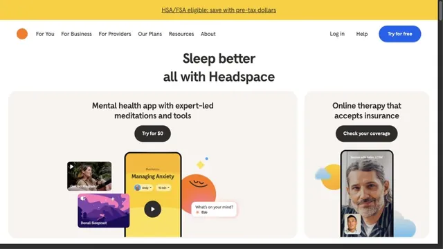
Round characters and soft colors create an approachable entry point.
A CRM entrance that brings a short value proposition and small input fields together within white space.
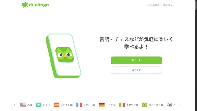
Characters and green buttons lead into learning.
Pass this list of references on to your team.
Recommending a site is free. We review each one against our editorial approach.
Recommend a websitePublic pages reviewed on 2026.10.27. Visit each official website for its current appearance and interactions.